So, curious ones, you return. Or perhaps you’re just joining us, if you picked up one of our Comic-Con fliers or otherwise are dropping in for the first time. In any case, welcome to the third and final installment of my blogs regarding my Zombie Ranch scripting method! You can check out the previous ones here and here, should you wish.
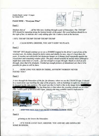
This final example image comes from a much more recent sample of writing. Once again, you may click on the image below to see a larger version.
Now sad to say, yes, I still hadn’t updated the header when I printed this out. I’m a terrible person, I know. This is not a 12 page script. In fact, this is also a whole new MS Word file I started as an “Issue 2” since I felt it a bit unwieldy to keep going with the original. Perhaps one day I will find out it was a mistake to keep the webcomic numbered in pure sequence while I started the script page counts over… but then again, once we get enough of an archive I may want to reorganize things, regardless.
All of that’s pretty much a long-winded way of saying this is the script for the ninth page of the second “issue”, which is story comic #32. You can check out the final version here: LINK
You’ll notice there’s been a bit of photoshopping done, mostly because I already know the character’s name and use it in my scripts, but you lot haven’t been formally introduced to her yet. Her name has been floating around in a couple places, but for those of you still scrupulously waiting to be surprised, I figured I would do you the favor of not shoving the spoiler in your faces. You’re welcome (and here’s hoping I didn’t overlook anything!).
Moving on, this page shows a feature I took way too long to actually start adding to the script, which is a title for that week’s comic! Prior to this, Dawn would be asking me as deadlines approached what the post title should be, and sometimes I’d find to my horror I either hadn’t thought it through, or might have thought it up earlier but had since forgotten. The practice of having a title for every comic page is something fairly unique to webcomics, I think. Some just use plain numbers or dates, but I’d already dug the hole of trying to be clever with it, and if I left it up to Dawn madness would follow.
Anyhow, the simple solution (which, again, I took a stupidly long time implementing) was to start including a title with each page. Of course, I ended up changing the title for this one prior to publication, but at least there was something there, right? “Everyone Wins”.
Look, Dawn always prints the script page out before she starts drawing, sometimes days in advance, so, you know… rewrites happen. Ever seen one of the online drafts of a screenplay for a well-known movie? The shooting script for Airplane is almost unrecognizable from what made it to the screen. Here, we’re just changing a few words around and configuring panels.
In the upper right you’ll see two panel layouts I sketched as suggestions, neither of which Dawn ended up using in favor of her own idea. This happens a lot, and for the most part I let it happen, since effective visuals are more in her area of expertise. On the flip side of that, you’ll notice I’ve gotten much more detailed in my descriptions, for instance the word balloon placement in panel 1. Dawn had a better idea for how the sound effects should go, but otherwise she followed what I wanted and I think it turned out effectively. I truly believe that sequential art is a medium where even the placement of a speech bubble can change the feeling and “timing” of a panel.
More specifics (and some research blurbs) crop up in the following panels. It’s entirely possible Dawn’s artist eyes may have started glazing over with all the words, so in the third panel I made sure to unleash the secret weapon of the Internet age: I went out, found reference pictures, scaled them down and pasted them right into the document. Boom. This is really easy to do, and can be very helpful if you want to make sure you and your artist are thinking of the same things. That said, I still also ended up drawing a quick sketch of how I imagined everything fitting together, framed in the binoculars. Collaboration can be a messy and redundant business.
And that brings me to the last part of the discussion/lecture/whatnot. Redundancy is a good thing when communicating with your artist. Redundancy is not a good thing in the actual comic. This is what I call my “Stan Lee Test” when writing. Much respect for Stan the Man and his contributions to comicsdom, but as a writer he did have certain faults, and one of those was an alarming tendency to unnecessarily restate whatever was going on visually in a panel. So, for example: the art would show the supervillain firing a laser blast from his eyes that was cutting right through our hero’s armor like it was paper. Then the hero would inevitably think (or say!) something like:
“Good lord! Laser blasts… from his eyes! Cutting through my armor like it was paper!”
Now, to be fair, Stan was not the only writer who operated like this. The Silver Age was rife with the practice, but he’s just the biggest name that occurs to me when I think of cluttering a comic with words that serve no function except to narrate something we as readers can already see happening. That’s one of the whole points of having the pictures, right? It’s probably one of the greatest pitfalls of a purely text-based writer trying to move into comics writing, since they’re used to carrying the entire narrative burden by themselves. I suppose I’m lucky there since I majored in Theater in college, so I’m used to writing more like a playwright where a lot of the details are going to ultimately be conveyed in a visual manner.
Still, I do like my words, and it’s a constant struggle to make sure they serve a purpose and aren’t crowding out or being redundant to the images. One of the reasons I’m happy to have Zombie Ranch as a project is because the subject matter doesn’t lend itself to big narrative captions or interior monologues where I’d be tempted to ramble on and on and on, in love with my own verbiage and thinking I’m providing some deep perspective on life, the universe, and everything. I mean, that’s what this blog is for, right?
But seriously, there’s a prime example in the script image above where I had to apply the Stan Lee Test to myself, and it’s another reason I chose this particular page. It didn’t occur to me until after I’d printed out the page and was explaining/sketching out to Dawn how a zombie ranch is identified to passerby, i.e. the biohazard warnings tacked onto the ranch sign. I suddenly realized that if this is supposed to be such a universal symbol in this world, then the lady looking through the binoculars didn’t really need to narrate what she was seeing. Also, you the readers already had all the information, since you knew by now what the Z Ranch is. I came to the conclusion that it was unnecessary text, so I lined it out and reduced it to a simple utterance of “HMM”, trusting instead to the art and context to get the idea across.
Was it the right decision? I like to think so. It just seems like a waste of space to repeat the same idea in both text and pictures, unless maybe you’re making an instruction manual. Scott McCloud calls it a “Duo-Specific” combo and is glad it has fallen out of use with most modern comics (except Silver Age homages/parodies and other specific exemptions), and I agree. After all, when I consider what our hero should really be saying or thinking when a laser blast is cutting through his armor, I can only come up with “Oh crap!” — or perhaps just, “Argh!”
Ahh, Scott McCloud. Gonna stalk that guy at Comic-Con and make him sign my copy of his Making Comics book. So much good stuff in there, for writers and artists both. Ideally I’m going to corner him at the panel he’s hosting for his old friend Kurt Busiek, so I can also get Kurt Busiek to sign my copy of Astro City.
Hopefully that goes better than my abortive attempt at getting Jim Steranko’s autograph earlier this year. Maybe I can even ask Kurt Busiek about his scripting methods. He’s been at this a hell of a lot longer than I have, and even though this is the last in my series for the time being, you better believe I’m still looking for ways to improve my own process and my communication with Ye Artist.
For now, off to San Diego we go! See you next week!


3 thoughts on “Final round drafts…”
Andrew
It’s been really cool reading about your methodology. I keep wanting to ask where you learned this, and I keep having to remind myself that you’ve been involved with visual story telling since Ixeldaugh and Fridge way back in the day.
Elkee
Wow………this is super helpful. I’m currently putting together a comic and having a hard time finding an artist at the moment. You are so lucky you are married to one! Love “The Stan Lee Test”!
Clint
Thanks Elkee and Andrew. The strange thing is probably how many years it took before Dawn and I finally started working on something together, when there’s so many artists out there looking for writers and vice-versa.
As for where I learned this, well, in addition to the *cough* very early projects mentioned, I think some is from seeing how the minimalist scripts of plays get turned into full productions, and then there’s just reading a lot of comics. Plus, I highly recommend the books on comics and comics storytelling published by Scott McCloud, who I mentioned above, and Will Eisner, who I mentioned several months ago.
I remember once in college I took a creative writing class and got frustrated because no matter what I did, everyone kept criticizing me that I wasn’t providing enough detail in the prose. So I guess comics is a way to turn that (supposed) weakness into a strength.
Comments are closed.
Calendar
BlueSky Latest Posts
Writer’s Blog Archives