The debate on writing vs. visual art in comics has probably been around for as long as there have been comics. I’ve already admitted that it’s possible to have a comic composed entirely of images, with no words attached… in fact, some of the most highly acclaimed sequences or even entire stories out there are just that.
On the other hand, take away the visuals and leave the words, and you’ve basically got poetry or prose, not a comic. The art component is kind of important, and it gets even more important once you realize that the artist (penciller, whatever, I’m just gonna use artist as shorthand here) is as much of a storyteller as the writer is. Last week Dawn brought up the whole issue of paneling layouts, and while that’s something I myself like to be involved in and sometimes get very specific about, the drawings themselves are something I can only give descriptions on such as “He gazes with forlorn vagueness at the campfire in the distance”. It’s up to her how that comes out, but by and large I feel like she does a great job capturing the subtleties of human (and zombie!) expression.
That’s important for a comic like ours that often hinges on character interactions. I also enjoy her ability to change it up and get kooky for the “infomercials” (as reader Barn0wl last week termed them), so it’s always a joy to work on those with her.
Sometimes, though, I contemplate what Zombie Ranch would look like under the care of a different artist. The only way I’ll probably ever see that happen (or, truthfully, would want to see that happen) would be as a guest strip, but if you’ve ever looked at the guest strips of other comics you’ll know how much of a different feel there can be, even though it’s the same characters acting in much the same way.
Marvel Comics knows how important the artwork is in contributing to a comic story, which is why they came up early on with a “house style” that all their artists were expected to adhere to, albeit allowing for slight variations on the theme. If you’ve ever wondered why mainstream superhero comics all seem to look the same, I’d say this is a fairly decent answer to the question, whether it’s a formal set of guidelines or just a tendency only to hire artists with a certain look to their work. We’ve gotten some more diversity in recent times, which is good, but with an ongoing title I can definitely see the pluses in keeping a certain consistency of look, especially if the writer is remaining the same. If I was an idly rich, influential sort, I might try giving the exact same script to say, Ben Templesmith and Cory Walker, and seeing what the end result was with each. Or how about Jim Lee vs. Lea Hernandez? J. Scott Campbell’s Ghost World! R. Crumb’s Justice League!
You see what I’m getting at here. Comic stories can end up very, very different when in the hands of different artists, and some seem like better fits than others… like Ben Templesmith doing “nightmare dream” style horror comics. But then again, if all the stories of a genre look a certain way, that can be its own pitfall.
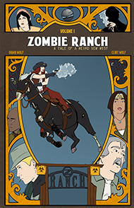
Zombie Ranch does not look like your typical horror comic. Or your typical western comic, for that matter. Dawn’s style is not what could be called “gritty”, and a lot of the crop out there wants that heavily pencilled and shadowed look, like dirt and sorrow were scrubbed into every panel. When other writers and publishers have approached Dawn in the past, they’ve offered her projects involving modern day romance comics a la the early issues of Strangers in Paradise. She would rather draw zombies, but she’d been told her style isn’t right for that.
Luckily, she ended up with a husband willing to write for her, and a distribution that didn’t require a publisher at all. The end result is a much different stylistic look than most of our peer offerings, which might be off-putting to some. But for me it’s good we have that difference in look, because we also have a difference in tone. This isn’t Tales From The Crypt, or Jonah Hex, or Transmetropolitan or even The Walking Dead. We’re probably closer in look and feel to some of our fellow webcomics, with their similar freedom from mainstream expectations. We’re getting the story out on our own terms, and time (and you the readers) will tell how well we succeed.


4 thoughts on “The artistic element”
Andrew
Interesting discussion on genre. I have no problem seeing this as a western. I really don’t see it as horror. You’ve done a good job of putting it in the context of the “dangerous job” reality shows. Horror suggest something that is not normal, and thus fear inducing. Your characters have a dangerous job, but it’s normal to them.
Clint
It might be normal to the characters, but it’s up to the reader to decide if that’s enough to make it normal. The end of Episode 1 was all about that question.
Also, I happen to think fear and horror are two entirely different concepts.
Barn0wl
Good discussion about story vs. art. And I completely agree that the story and art should compliment each other in a comic. But while the artwork is important, a good story is a must. A good example is “Selkie” (http://www.selkiecomic.com/) by Dave Warren. Dave’s art style (considerably refined since the start of Selkie) is somewhat simple, but very much his own. But the story is excellent and his art works in very well.
In the case of “Zombie Ranch”, you and Dawn work extremely well together and the art and story show that. You’ve come up with a new twist on an old theme. I love that. Zombie apocalypse stories can be fun, though there are a lot of them … it’s good to find the ones that really stand out the way “Zombie Ranch” does. The idea is what caught my attention first … the story and the art are what have kept me here.
Clint
The “classic” zombie apoc story a la Night of the Living Dead has been done quite a bit, and although I’m still a fan whenever I see one of those done well, I have a love for the quirkier takes on the genre like Fido. I’m also a man who wants a good story to keep reading a comic, no matter how pretty the artwork is.
So all in all, I’d say it sounds like you and I think along similar lines. 🙂
Comments are closed.
Calendar
BlueSky Latest Posts
Writer’s Blog Archives