It’s a new century. A digital age. Thirteen years ago in his book Reinventing Comics, Scott McCloud looked to the future with shining eyes and pondered the possibilities of the “infinite canvas” that digital comics storytelling would enable.
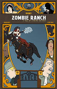
Thirteen years later, people like me and my wife are publishing a comic online that still hews to the practices and philosophies of the distant past.
Oh, certainly, we’ve had our bits of experimentation, but even the partially animated pages we’ve done were composed with an eye towards how they could be published in print without much change. From the beginning we also established a ratio for each page that makes it easy to put into a standard comic book format.
Part of this can be explained by the fact that in its whirlwind infancy, Zombie Ranch was originally intended for print, and only later did we decide on the web as its primary distribution method. The other part can be explained by us (or at least, me) being stubborn bastards. My primary goal is not to innovate entirely new forms of comics storytelling, it’s to get a story told… and I feel like “the old ways” still provide plenty of interesting ways to do that, ways that are often lost in the flash and bang of modern comics. Too many of them seem to end up trying to imitate movies, and comics aren’t movies (don’t even get me started on the abomination of motion comics… well, okay, if you don’t mind a little NSFW language, here’s one of my rants).
The truth is that, for better or worse, I’ve fallen in love with the traditional, multi-panel comics page method of storytelling, because it showcases all the elements that are unique about the medium. Unlike a movie or cartoon, everything is there at once to be taken in… but now you as an author can arrange that “everything” to an illusion of sequential events, and the ways you can do that are all but limitless. In the best cases, you can weave this so that it’s not only the individual panels of a page but the overall page itself that helps tell the story.
You can blame Will Eisner for this. He devoted an entire chapter of Comics and Sequential Art to the idea of “framing”, to how the choices you make on what sort of panels to use and how they fit together are just as important to the meaning of your comic as the contents inside those panels. Reading some of Eisner’s works really opened my eyes to the potential bag o’ tricks available to someone with the time and skill to make use of them, and you can see more modern examples in J.H. Williams III’s art or that New 52 Flash #1 comic I gushed over in a previous blog.
And this is why, beyond the questions of whether or not we’d even begin to meet whatever standards of quality they want, I have yet to try to get Zombie Ranch onto someplace like ComiXology, even though earlier this year they put out a call to independent creators to submit their works for free. “Guided View” frightens me, as does any other app that takes a comic page and splits it up panel-by-panel. I know the whole idea is to make things fit better on the small screen of a mobile device, but reading it that way destroys any hope of getting meaning from the overall layout. I try to imagine reading that Flash page I discussed in a panel-by-panel style and just cringe at how much impact (pardon the pun) would be lost. Panel-by-panel works fine for strip formats like Diesel Sweeties, but splitting up an Eisner graphic novel like Life on Another Planet in that manner would be much more complicated and also feels like a borderline criminal act against both creator and reader, on par with removing the string section from a Beethoven symphony.
I’ve heard Guided View can be easily toggled off to permit viewing the page as a whole, and certainly not every page of ours has been ambitious in its layouts… but since ComiXology supposedly will take on the task of doing the formatting if you’re accepted, I wonder what they’d make of this? Or this? Or even this? That last one seems simple on the surface, but we really tried to engage the notion of the reader finding the source of the “smoke” just as Suzie does, especially if you’re reading online and having to scroll down.
I suppose that last might fly in the face of my diatribe on traditionalism, this admission that occasionally we do play around with providing experiences you’d only encounter in one method of reading versus another, and what you get out of reading might indeed be different depending if you come here for your page a week, you do a power dive through the web archive, or you wait to read the individual print issues as we get them published. But still, I do love that potential of experimenting with a nice full-sized comic page to manipulate time, space, and emotion.
Of course, I’m not so much a purist that if ComiXology came asking, I’d say no. But that isn’t likely. Getting approved if we went and applied isn’t likely either, but even trying it requires an output of effort that I’m not convinced wouldn’t be better spent elsewhere, especially if I’m still iffy about the end results.
It’s yet another way we conspire to stifle innovation and limit our potential audience like the silly little homespun project we are. But is it a bad thing for us to want to focus our creativity on the story itself rather than pushing the envelope on how it’s being conveyed? I don’t think so. I certainly have no small amount of admiration for works like Homestuck or When I am King that do break the traditional mold in glorious ways, but ours is a humbler corner of the Internet, serving up more old-fashioned fare. As long as our repeat customers are finding that tasty, we’re good for now.


One thought on “Stuck in the past (but liking it there)”
Comments are closed.