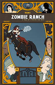
As you might be aware if you’ve ever checked out our creators page, Zombie Ranch is pretty damn close to what would be termed a “mom and pop” operation. If our computers have trouble, I’m the IT guy who fixes them (and does our backups). If our websites have issues, Dawn is there combing over the code to see what happened. I take care of all our permits and licenses and taxes, while she figures out our booth setups and transportation. She’s the sole artist for the comic, while I’m both writer and editor.
Oh yeah, and then there’s the lettering.
I have a feeling that for most people producing their first comic or webcomic, the lettering is a low-priority thing, if not almost an afterthought. I see a lot of first efforts out there that will just have blocks of text with no balloons, sometimes with a thin line indicating who might be speaking, and sometimes not. There are comics out there, particularly in the case of editorial cartooning, which thrive in that format, but mostly I think it’s less of an artistic decision than one of either not thinking on it much or just plain not knowing any better.
We weren’t much different when we started. I actually just delegated the lettering to Dawn along with everything else, and she did her best, but it took a long time before we even decided on a consistent font, and it was longer than that before I finally started taking on the burden of getting all those words and sound effects properly presented on the page. I like to think this was less a matter of laziness on my part as lack of confidence in being able to “do it right”, or at least to do it efficiently… but in the latter case we’re right back to that situation of the lettering being that afterthought, that red-headed stepchild you have to deal with once all your prettier and more important kids get attention.
I’ve come to the realization over the years of producing this comic that treating lettering as a throwaway aspect is not a great way to go. It’s sort of like the soundtrack to a movie in that for the most part, if you’re doing it right, people won’t even consciously notice it’s there unless there’s certain moments you want them to… but try to think for a moment how Star Wars would have been as an experience without the music of John Williams?
Not a perfect analogy, and (as with many things I often preach here… I know…) we’re still not consistent at living up to the ideal. But thinking from a writing perspective, what better way to get your words onto the comics page in the way you imagined than to figure out this whole lettering business and start taking care of it yourself? In fact I noticed this actually seemed to be a trend in creator-owned comics with a writer-artist team, such as the critically acclaimed Chew: Rob Guillory does all the artwork, but John Layman does the lettering in addition to the scripts.
I’m not to Layman’s level yet (I’m sure there’s a joke to be made about “layman’s work”, just as I’m sure he’s probably heard it)… but I’ve definitely tried to step up, taking the work off Dawn’s hands and hopefully retaining if not expanding upon the quality.
And if you haven’t noticed except where we want you to? Well, I’ll take that as the best compliment.


2 thoughts on “Struggling with your letters”
the leaking pen
Lettering has been the one thing to really cause argument with Dyluthus and myself on anti heroes. our new comic is of a slightly different format, so I’m in large part handing over font and lettering duties to him completely, after the script is done. and staying out of his way, but I have some other projects that if I ever get a partner for, I think I might handle the lettering myself, heh. As writers, I get the idea of thinking of the words as WORDS and not pieces of art, but it really IS an important aspect of the comic world.
Clint
Yeah, it’s still uncomfortable for me at times, but I’ve been in a steady process of trying to “hybridize” my brain to think of the words as a total package on the page, having a visual rhythm and flow as well as one for reading.
By all means if your artist wants to handle all that it’s probably the best solution since they have the entire composition in mind, but if you’re splitting up work and they feel like they’re already wearing too many hats it seems like the most logical way to go. As a writer you already have that sense, for instance, of “Screw Strunk and White, this single word needs to be its own sentence!”… and from there you can transition into that word being on its own in a word bubble, and then as you grow more confident you might experiment with extra visual bells and whistles to make it stand out even more.
I’m still working on it, but even on the simplest levels it does give a lot of interesting control options when you’re the guy putting certain words in boldface or shrinking or enlarging font sizes. Whisper to a scream, etc. etc.
Comments are closed.
Calendar
BlueSky Latest Posts
Writer’s Blog Archives