I have it in my head, whether true or not, that every writer feels certain aspects of the craft come more easily to them than others. For some it’s effortlessly weaving intricate plotlines. Others have wonderful and memorable sensory descriptions spring readily to their fingers.
Me? I’ve always thought I had a good sense of dialogue. When characters are talking to each other, or even to themselves, I’m in my element. So when I saw this article linked on one of my webcomic creator groups, I felt compelled to go give it a look.
http://webcomicry.com/dialogue/
The gentleman responsible, C. S. Jones, creates a webcomic that couldn’t really be termed “dialogue heavy” so far, but that doesn’t mean he didn’t have some interesting things to say on the subject. I don’t agree with everything he put forth in his piece (for example he’s not a fan of boldface, and I expressed a quite recent conflict of opinion there), but if nothing else it got me thinking and examining how near or how far I was from some of the conventions he brings up. For instance, this little bit which is technically a quote of a quote, since it originally comes from Tyler James on Comic Related:
“Steven Forbes turned me on to the following rule of thumb that was supposedly given to Alan Moore by his editors at DC comics. (If it’s good enough for Alan Moore, it’s good enough for you.)
– No more than 35 words per panel.
– No more than 25 words per word balloon or caption.
– No more than 120 words on a page.”
Now anyone who has read From Hell knows Alan Moore eventually wiped his Northampton-born arse with those dictates, a good example of which is the page shown here. But I understand why the dictates are there. Writers—even experienced writers—get too wordy and suddenly there’s no room for the art, or you’re unnecessarily repeating the visuals in textual form. If you’re self-editing, it’s worthwhile to keep things like this in mind. They may seem arbitrary (and they are), but they will keep you honest about whether or not you really need to wax loquacious at a given time.
Then there was this:
“One word balloon contains one concept.
1. Something’s been scaring the cats lately. Miffles hid under the bed all morning.
2. Plus, I keep hearing these weird rumblings at night.
Punctuation goes a long way towards capturing the nuance of speech. Consider the difference between “Get in here” and “Get. In. Here.”
Both of these are great points, especially the first if you happen to be someone who is regularly struggling with where your word balloons should begin and end. But have you ever considered how word balloons and captions are themselves are a form of punctuation in comics?
Think about the definition of a paragraph: “…a group of sentences with one topic.” That sounds an awful lot like “One word balloon contains one concept”, doesn’t it? I would go so far as to declare a good rule of thumb would be that if you would start a new paragraph in prose, you should be starting a new word balloon in a comic.
Mind you, the reverse notion doesn’t hold as true for me. There are times where I feel that a prose version of “Yes. I am.” would be better served in a comic by separate word bubbles, depending on just how much I want those words to have weight to the reader, and trying to fit some of Charles Dickens characters’ speeches into a single word bubble seems like an exercise in eye-squinting insanity. Comics can and should be able to break apart (and reduce) textual paragraphs in the service of a greater visual understanding.
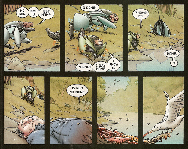
I’m not done talking about all this by a long shot, but for now I leave you with an example of just how much the choice of how word balloons are placed and structured can affect a comic, from the pages of Grant Morrison and Frank Quitely’s We3. We3 was something of a take on those old Disney “lost animal” movies like The Incredible Journey, where a group of somehow abandoned pets have to survive danger on a long trek to safety— but in this case, the “pets” are escaped secret military experiments given limited sentience and wired into powered armor suits. The dog, known simply amongst the group as “1”, has been leading them “home”, and at this point in the narrative the skeptical cat, “2”, finally presses him to define what exactly “home” is supposed to be, since the dog doesn’t seem to have any actual destination in mind. 1’s (quite beautiful) response?
“Home? Home is run no more.”
Or that’s at least how it might appear in prose. In the original comics, here’s how it’s presented (click to enlarge):
This is very compact, stylized dialogue, and yet even then the word balloons are heavily broken up, both to emphasize the halting nature of the animals’ speech and the weights of concepts. Of particular note is the third panel where the question mark gets its own balloon after the previous balloon is a one-word statement. It’s a fantastic way of showing the “gears turning” in 1’s head as he wrestles to express an abstract concept. Where, precisely, are they running to? And then in the last, amazing row of panels, he slowly but surely provides his answer. Home is no more and no less than the place where you are safe. HOME IS… RUN. NO. MORE. Even the choice to space that out over two panels feels deliberate and correct as the animals progress through space, time, and understanding, and bring the reader along with them.
Thus, it’s pretty baffling what ended up happening in subsequent reprints (again, click to enlarge).
“Butchered” might be too strong a term here, but this inexplicable alteration on the bottom row is not a good one, in my opinion. Maybe Morrison and Quitely did change their minds? Or (more likely) it was just some editor deciding they knew best? But I feel like squashing the words together is a comparatively terrible choice that robs the moment of the power it had in its previous version, not to mention endangering the multiple-placement illusion of progressing the same characters across panels through a contiguous background. Lest you consider me alone in this, I’m only aware of it due to a post highlight on Brian Cronin’s Comics Should Be Good column for CBR where the comments thread mentioned the change, and much similar gnashing of teeth ensued.
In any case, maybe you don’t agree, or don’t care, but I think the above at least illustrates how important something as simple as the word balloon decisions can be as a storytelling element.
What does this have to do with writing good dialogue? Nothing. And also everything. With comics we are dealing in a medium that’s one step up from prose, in that there is a visual element to go with the textual, but we still lack a lot of the subtleties that go into face-to-face communication. So it behooves us to use whatever cheats we can to convey a certain tone and meaning, a “body language” accompanying what is demonstrably a bodiless form. The art is one tool, the words another, but never forget the potential intersections between the two.


5 thoughts on “A little back-and-forth discussion”
The Leaking Pen
I’ve been thinking about this more and more myself lately, as I look at spacing and panel filling. I’m doing an experiment on one comic right now where what would have been 10-15 pages of action is turning into a Bard singing a ballad about events, while a puppet show goes on behind him, and trying to determine the pacing of the words versus the sequence of the events in the puppet show is MADDENING! Thanks for the article, and for another web comic making site that I should visit regularly but probably wont. (i kid, i kid, well.. maybe not. )
You know, this make me think… In writing and art, there is lots of practice, and training, and contests, for fun. I’ve seen lots of, write this scene, stuff, and lots of , draw this character, or draw this action, stuff, but i’ve never seen a LETTERING contest. Heres the images, heres the dialogue, letter it for us. I may have to do something about that.
Clint
Probably for the same reason you don’t see a lot of inking and coloring contests? There’s an argument that the best lettering is the kind you don’t notice at all, but people make that same argument about movie soundtracks, even as they thrill to a properly loaded action cue from a John Williams score.
the leaking pen
not neccesarily inking, but I see LOTS of coloring contests, where the plain black and white inks are given, and people color them. it always interests me how the different shades and coloring techniques can so completely change the feel and style of a page.
C.S. Jones
I’m very glad you wrote this, and that I found it; I noticed I was getting traffic from here via analytics, and decided to come see what it was about.
Anyway, I agree with most of it, but the word balloon thing may not be as common-sense as you’d think. If you’ve read a lot of amateur fiction, you’ll know that a lot of people have no idea where to break paragraphs either. Also, I’d never really thought of word balloons as punctuation in themselves before, but I definitely am now, so thanks.
And whether or not you use bold is entirely up to personal taste, I just choose not to because it’s been so overused, usually badly, and makes every script in which it’s used seem a little more like a cheesy superhero comic. I used it in my first two comic scripts, but later decided to abandon it because I didn’t think it was necessary. After all, every other medium gets by without it.
By the way, my comic will have dialogue, just not for a while.
But overall, thanks again for an excellent post.
Clint
Every other medium does get by without boldface, true, but comics aren’t any other medium. Still, this isn’t to say such things are necessary any more than the ALL CAPS convention is, I just do choose to have it in the toolbox as part of this particular project. Interestingly enough, sometimes I’ll see the comics that use sentence case capitalize a word for the exact same effect (i.e. “Everybody wants to be you, John, but no one wants to BE you.”). But YMMV.
My point is mostly just that we’re dealing in a unique hybrid of text and visuals. The closest analog I can think of (which I might bring up in a future blog) is free verse poetry, where the structure of the words is often treated as importantly as the words themselves.
Actually no, that will be a future blog. Comics writing and lettering as akin to free verse poetry makes a lot of sense to me, since one of the things I want to get to talking about is establishing a certain “rhythm” to the dialogue.
Thanks for dropping by!
Comments are closed.
Calendar
BlueSky Latest Posts
Writer’s Blog Archives