Last week I talked about the idea that the placement of word balloons and captions in comics can actually be a very important storytelling element. Let’s take that even further. Have you ever noticed how they have the potential to guide the reader’s eye?
Most of us are familiar with the basics of how we tend to read in the so-called Western World, a habit that’s been ingrained into us since childhood: left-to-right, top-to-bottom. That’s our default, and it’s not even something you have to think about when you write in prose.
Comics can be another matter entirely. Art and paneling layouts are suddenly part of the composition, and you may have to engage in some fancy gymnastics to get all those words and sound effects you wanted to fit comfortably. Now of course, the first pass is to make sure you absolutely need all those words and sound effects, but if you honestly believe they’re needed, you want to try to make the progression of the reader through the story is as natural as possible. I’ve had several times as a reader over the years where I had to stop and get back on track after reading the wrong dialogue balloon first or even the wrong panel out of intended sequence, neither of which is a good thing.
The most primitive and direct solution for this is the ol’ arrow method where you’ll see a creator literally place a graphical arrow in the gutters between panels to show which ones you should be reading next. You’ll rarely see this in works from experienced pros, and I shy away from calling out any direct examples because of that, but you probably know what I mean. It’s a last resort, in my opinion, something to be avoided at all costs. And there are definitely creative ways to avoid it, one of which happens to be your lettering.
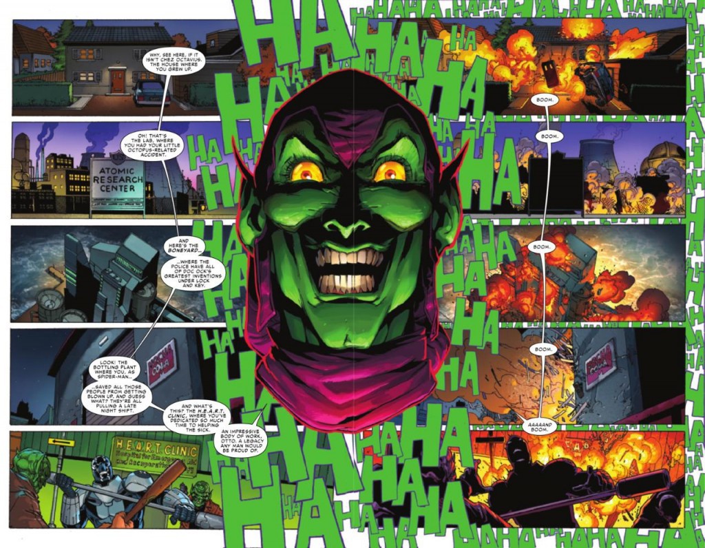
I think I’m going to just dive right in the deep end here with an extreme example from the pages of Superior Spider-Man. The script calls for the Green Goblin to taunt his foe by naming off several locations, and then one after another he detonates bombs planted in all of them, laughing maniacally all the while. The paneling layout, however, is very non-standard. (click the image to enlarge)
Now admittedly this has the dimensions of a splash page, so we’re actually looking at two separate pages of the comic, but as a single design I think it still works swimmingly at guiding you down the left side first and then the right, with the Goblin and the visual representation of his laughter serving as the border. I even like the happy accident (or maybe design?) of the word balloon stem in the lower left panel. It points to the Goblin’s mouth as it should, but if you look past him it also points to the the upper right panel where the quite literal cascade of “boom” begins. The laughter serving as a background to the right side panels also serves to divide the two spaces.
You could technically still read this left to right and have it work, but I don’t believe that’s the intent, and that’s why those thin little stems are there crossing the gutters to provide the vertical (but not horizontal) connection. They could have all had individual stems pointing to the Goblin or no stems at all and still serve their minimal purpose, but it would have been a less clear choice.
Now that we’ve seen a cool bigtime pro page, I’d like to provide these three pages from our own past work that also hopefully illustrate what I’m getting at, and hear your thoughts on how well they might (or might not) have worked for you.
https://www.zombieranchcomic.com/episode/a-la-cart/
https://www.zombieranchcomic.com/episode/99-event-horizon/
https://www.zombieranchcomic.com/episode/118-brewing-and-stewing/
If you’ve got no opinions to give, I’ll just do my retrospective on them next week to say what we were going for and how well I think we achieved what we intended in terms of guiding the reader. But since you folks are the actual readers, it could make an interesting addition to the discussion.


2 thoughts on “Dialogue as navigation”
the leaking pen
interesting example. even with the lines, i found myself going left right left right, up until the last two, I read the last two descriptions together, then boom AAAND boom. I think you’re right on the intent though, no idea why i read it that way.
Ashley
The movement of all three pages work really well, following the boxes and the speech bubbles in a very organic movement. I particularly like the setup for page 99. The long panel on the right side works as amazing visual foreshadowing / build up.
The first panel with Suzie talking to Oscar, the reader sees the third panel out of the corner of their eye. Looking at it, they think ‘Cloud?’ Then they get to the second panel with “any more trouble” and realize it’s not a loud but smoke, and it builds tension. Where’s this smoke coming from? What’s on fire? Then the third panel segues directly into the fourth panel; that’s when they realize that the smoke is coming from the distant ranch. This only brings up more questions and ends the chapter on a cliff-hanger.
Comments are closed.
Calendar
BlueSky Latest Posts
Writer’s Blog Archives