Last time I linked to three of our past pages and asked you folks what you thought of them in terms of fulfilling my ideas of word balloons being able to “lead the eye”. Response was pretty positive, but we still haven’t heard from the nastiest, fussiest critic of all: me. And since I’ve shown time and time again to be not at all afraid of offending myself, let’s put on our big boy/big girl pants, take a calming breath, and see what me has to say about these efforts.
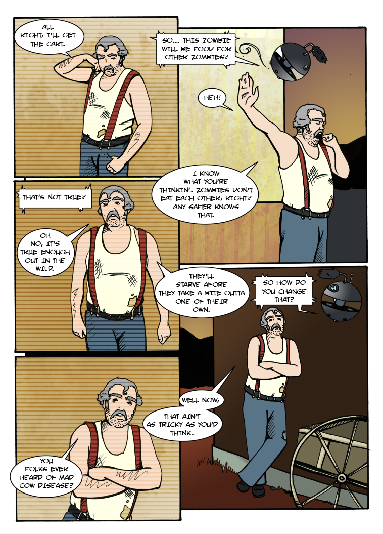
EXHIBIT A: Page 16, “A La Cart”
This page takes us all the way back to Episode One, and it shows in certain things like the font not being as crisp, the rampant “crossbar I” usage in inappropriate places, etc. I have yet to hear anyone complain that rendered things unreadable, but I admit at cringing a bit when I look at it now.
On the other hand, I do still very much like the pattern we established with the word bubbles themselves. Using them to cross the borders between panels provides a connective tissue that forms a “U” shape with enough momentum to it that I feel we get away with the weird sin of having “That’s not true?” being ordered sequentially after the balloon to its right. The balloons continue to loop back and forth through and across the panels until the final one, which again in defiance of convention is occupying the extreme lower left spot rather than lower right.
That last balloon is one that in retrospective I have a problem with. Chuck has a meandering style of speaking that fits in with the visual loops, but since he’s obviously intending to keep talking at the end I feel like there should be more of a sense of traditional left-to-right momentum and we might have been better served placing the final balloon to his right. Not only did we go left but we broke the panel border, which sends the reader’s eye off into the great white ether and is especially egregious in the print issue where this page ends up on the left side as book is open. I feel like a reader has to “hit the brakes” and turn their attention around in order to properly continue to the top of the next page over. It’s not fatal, but given the opportunity I might change the course of that particular flow.
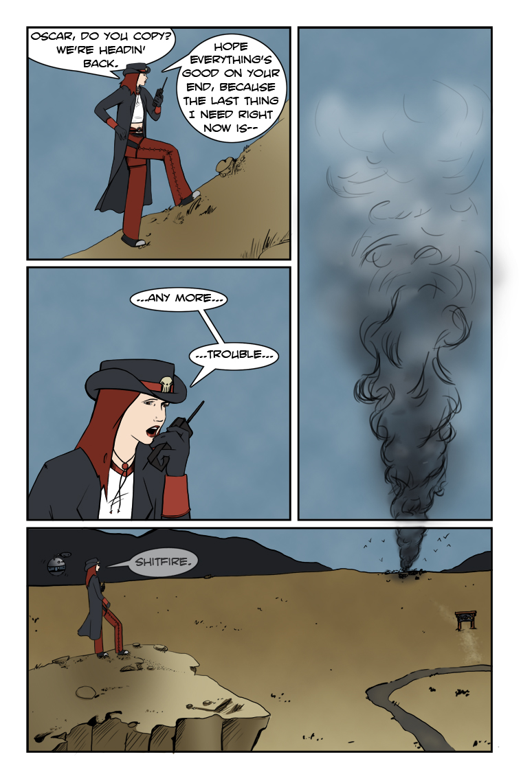
EXHIBIT B: Page 99, “Event Horizon”
Reader Ashley zeroed in on this one in last week’s comments and gave a great breakdown:
“The first panel with Suzie talking to Oscar, the reader sees the third panel out of the corner of their eye. Looking at it, they think ‘Cloud?’ Then they get to the second panel with “any more trouble” and realize it’s not a loud [sic] but smoke, and it builds tension. Where’s this smoke coming from? What’s on fire? Then the third panel segues directly into the fourth panel; that’s when they realize that the smoke is coming from the distant ranch. This only brings up more questions and ends the chapter on a cliff-hanger.”
Since this is pretty much exactly the effect we wanted, Critical Clint lets this pass with an approving nod. The only quibble to make is that the page is arguably that much more powerful when viewed online, assuming the bottom of the page is hidden until the reader scrolls down. Even if viewed all at once, I believe the cloud shape remains vague enough not to drag the reader’s eye down until it’s time for the reveal. Sometimes a page doesn’t work out as well for us in execution as it does in conception, but this is one of those times I think the intent came through quite admirably.
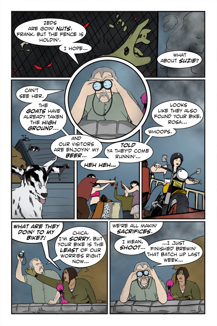
EXHIBIT C: Page 118, “Brewing And Stewing”
This is one of the more questionable pages in our archive in terms of navigation, so I’m pleased no one really called it out even when prompted. Critic Clint, on the other hand, ponders the wisdom of a top panel meant to be read left to right, featuring an unanchored word balloon on the right that gives no clue where to go next. Could be better, that, especially with the circular panel of Chuck breaking up the normal flow. Arguably the flow isn’t broken enough that the eye doesn’t return to the left and seek out the proper sequence starting with “Can’t see her.”, but following the counter-clockwise pattern of balloons around as far as they go ends up with “Whoops” being positioned conspicuously below the final statement, not to mention the danger of the reader’s eye being flung out into space.
I think what saves things at that point is the artwork of the joyriding Darlene on the motorcycle, since it pulls the eye down, but if someone were to term the layout “clunky” I doubt I’d be inclined to argue, especially since I can’t remember any real artistic reason for it other than a simple desire to fit the text. If it weren’t for the rounded pattern and continual connection across panels this might really have gotten out of order due to the lettering sin of having previous balloons appearing lower down than subsequent ones. For some readers it probably still does.
Speaking of sins, there’s the crossing of the balloon stems in the lower left panel. It’s a no-no, traditionally speaking, but here I actually like how it shows the conflict of words between Rosa and Chuck, and echoes the visual of Rosa reaching across Chuck in an attempt to snag the binoculars. I’m guessing a professional editor would probably send it back with a “DO BETTER”, but for once I relish the freedom of the comparative amateur. If we ended up doing it all the time it would suck and show nothing more than us being careless, but in this case I actually find it kind of cool.
So there we have it, a guided tour through some of our past successes and/or imperfections in guiding the eye. Some practice of my preaching. Some money where my mouth has been. And next week, mercifully enough, I think I’ll get back to critiquing the efforts of others again.
