Here’s another in my series of posts about the flow of visual comic page navigation, so if you’ve been bored by the ones so far, then— well, truth be told I don’t think I’m stopping anytime soon, so I’ve got no consolation for you there. It’s just too rich and valuable a concept, in my opinion.
Last week I took a self-critical walk down memory lane with some of our own past pages of Zombie Ranch. This week I turn my eyes outwards again, specifically to this article by Dale Jacobs of the University of Windsor’s Comics Theory Class Blog. It’s a discussion of the concept of “Guided View” and how it can change the comics reading experience.
If you’re not familiar with Guided View, it’s a process used by Comixology and other digital readers whereby a page is broken down into discrete elements (often panel-by-panel) and presented to the reader in prepackaged sequential parts, mostly for the sake of reading on small screens like you’d get on a mobile device. The theory is that this is exactly what your eyes are doing anyhow when reading a comic, focusing on parts one after another, so why not just show things that way?
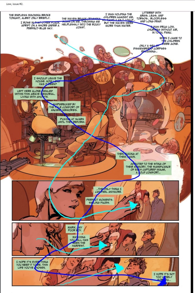
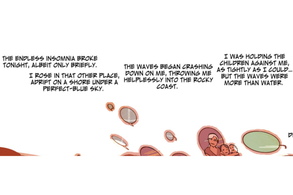
Well, I highly encourage you to click on the article and read it if you haven’t already, or at least look at the example of how the full page differs from the Guided View experience. I’ll imbed the full page example here, along with the added overlays by Jacobs denoting the paths described by art and text. From the Image comic Low by Rick Remender and Greg Tocchini:
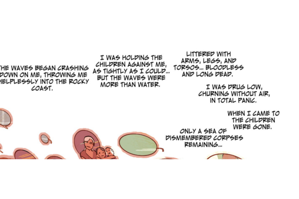
In previous weeks I talked about using word balloons or captions to establish a pattern for the reader’s eye to follow, one that if done strongly enough can break the ingrained left-to-right-top-to-bottom defaults of most Western World readers. This is a really fine example of that, as denoted by the dark blue line marking out the sinuous serpent of captions (both bordered and borderless) winding its way downwards, and it’s doubly impressive to me for maintaining its shape and momentum while covering up a minimum of art. Meanwhile the art starts its own complementary path, as shown by the light blue line, even though it gets a bit more broken up towards the end. The overall effect has a dreamlike visual poetry to it which reinforces the surreal recollections of the character’s thoughts. I dig it. And Guided View utterly fails to replicate it. All the same parts are there, but without any sense of the whole. I’m not going to show all of it here since Jacobs already did a fine job of it on his own page (seriously, go look), but as a taste here’s how “Panel 1” appears in a reader:
Keep in mind that when you move forwards in the reader, you will no longer see this, but instead will be able to see nothing except Guided View’s decision on what constitutes “Panel 2”:
The overlap is somewhat aggravating in of itself, but beyond that it becomes much harder to discern the pattern that was originally there. Guided View does its best by eventually providing a full view of the top half of the page once it presents all the broken up text and images composing it, but compared to just having the full page available we are definitely, as Jacobs diplomatically puts it, having “completely different experiences.”
Now, true, you can say Guided View only breaks down when comics creators are gettin’ all fancy with their layouts, but… if you’re not doing a “newspaper style” comic where the panels are nothing to you or the reader but boxes where things happen, then I feel like if you’re not at least occasionally “gettin’ fancy”, you’re losing some unique opportunities for storytelling.
I get asked occasionally if we’re going to put Zombie Ranch on Comixology and I have to admit to people that I haven’t pursued it, even with their Comixology Submit program geared towards independent creators. Assuming we were accepted, their in-house team would be breaking up our pages for Guided View, and while some of our pages would do just fine, others would not survive the transition very well. I don’t honestly know what would be worse, letting complete strangers hack our baby to bits, or (like some other reader sites have occasionally offered) having them give us the tools to do the hacking ourselves. Probably the latter, since that’s a ton of work for 200+ pages in addition to the rough decisions and compromises we’d have to be making as we went along.
It doesn’t seem like Comixology or Guided View are going away anytime soon, though. They may even truly be the way of the future, and the art of comics will have to adjust to them accordingly. But for now, the “flow” of a well-arranged comics page is one of my favorite things to enjoy, both as a creator and a reader. So for now, I go with the flow.
