Cart
Product categories
Support Us!
If you like what I do please support us on Ko-fi or Patreon.
Follow Us!
Join Our Newsletter!
Vote For Us!
Login
Polls
Events
-
Pasadena Comic Con
Dates: May 24
Location: Pasadena Convention Center, 300 E Green St, Pasadena, CA 91101, USA ( MAP)Details:We will be at the Pasadena Comic Con on January 26th. See some of you there for this one day event!
Purchase tickets online at here: https://www.tixr.com/groups/pcc/events/pasadenacomiccon-pasadena-comic-con-2025-115248
-
San Diego Comic Con: SP-N7
Dates: Jul 23 - 27
Location: San Diego Convention Center, 111 Harbor Dr, San Diego, CA 92101, USA ( MAP)Details:Clint & Dawn Wolf will be at San Diego Comic Con, as Lab Reject Studios. We will be at booth N7 in Small Press.


3 thoughts on “543 – Cradles And Graves”
Keith
Oh lordy, they really are a great couple…though, I suggest adopting.
Anonymous
Consequences be damned, because doing nothing might be worse.
Tommyguada
hi
Latest Comics
#566. 543 – Cradles And Graves
64 Apr 23, 2025
#565. 542 – Catching Up
85 Apr 09, 2025
#564. 541 – Graverobbers
62 Mar 19, 2025
#563. 540 – Trick Hello
39 Feb 26, 2025
#562. EPISODE TWENTY-THREE
10 Feb 24, 2025
#561. 539 – A Knife In The Dark (END OF EPISODE 22)
26 Dec 25, 2024
#560. 538 – Astute Paranoia
50 Dec 11, 2024
#559. 537 – Kooky And Spooky
64 Nov 20, 2024
#558. 536 – Great State Of Tech Sass
61 Oct 30, 2024
#557. 535 – Suzie Schadenfreude
63 Oct 16, 2024
#556. 534 – Compliments To The Cook
68 Sep 18, 2024
#555. 533 – Just Asking Questions
159 Sep 04, 2024
#554. 532 – Food For Naught
40 Aug 21, 2024
#553. 531- Inquisitional Etiquette
55 Jul 10, 2024
#552. 530 – After Dinner Stints
54 Jun 26, 2024
#551. 529 – Kitchen Gossip
93 Jun 12, 2024
#550. 528 – Snitches Get Glitches
110 May 29, 2024
#549. 527 – Rosa Ex Nihilo
276 Apr 24, 2024
#548. 526 – The Union Of The Sneak
79 Apr 10, 2024
#547. 525 – Creeping Suspicions
57 Mar 27, 2024
Latest Chapters
Episode 22
Episode 21
Episode 20
Episode 19
Episode 18
Episode 17
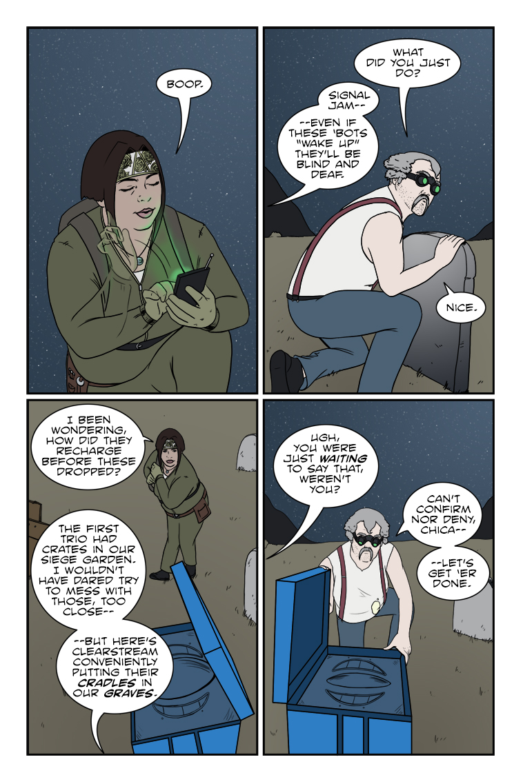
543 – Cradles And Graves
Chuck sez: "Never let a covert operation get in the way of a bad pun."
Positivity in rejection
Calendar
BlueSky Latest Posts
Writer’s Blog Archives