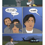
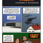
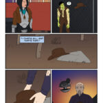
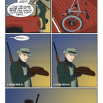
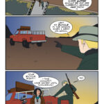
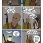
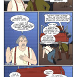
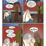
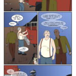
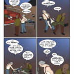
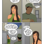
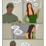
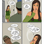
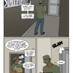
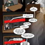
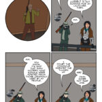
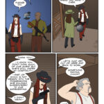
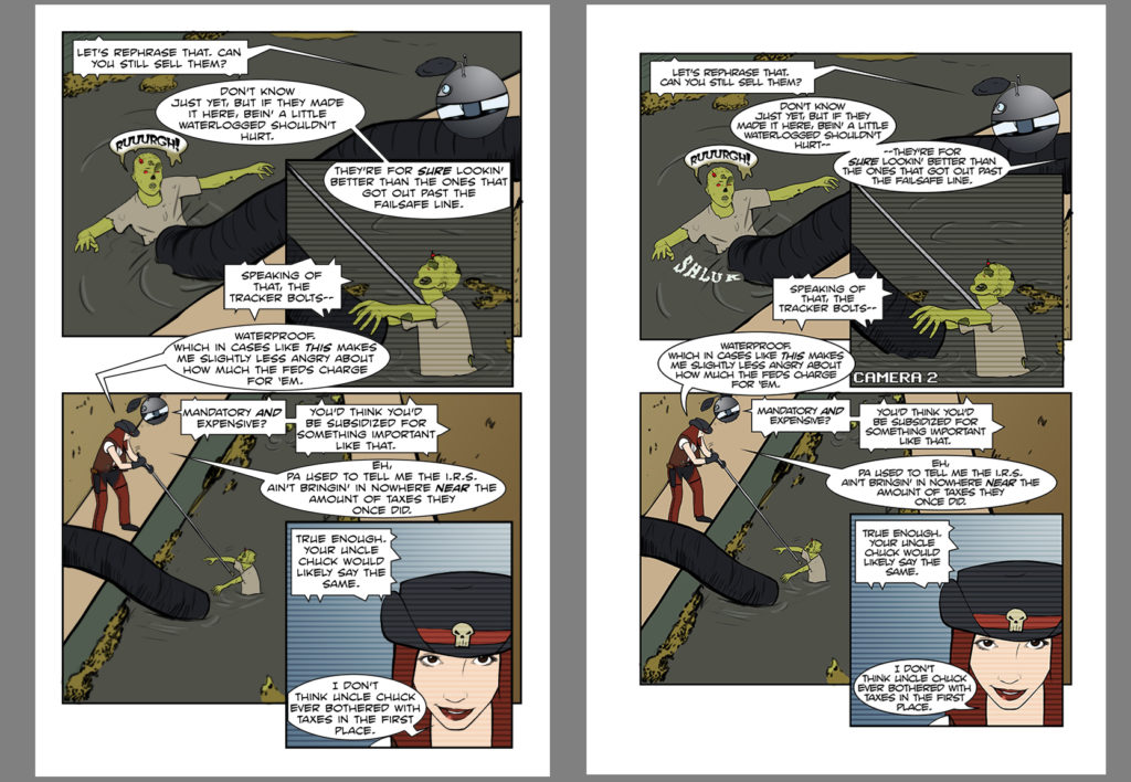
 The first thing you may note is the extra white space around the edges. This is added because during the printing process printers want what’s called a “trim,” which is basically extra room around the art so nothing gets cut off. “Bleed” is another related concept and you may still see pages in the book where the art extends all the way to the edge, or nearly so, but most importantly there’s a third imaginary border defining what’s called the “text safe” area and you want to keep all your word balloons within that.
So the art has to be slightly rescaled to keep its proportions and make sure that it looks good when trimmed. In addition, when you’re dealing with a 200-plus page book another factor to keep in mind is the binding. If the white margin on the left of the revised page looks bigger than the right, good eye — that’s intentional. This will be a right side page in the book so I’ve adjusted slightly to make sure nothing gets lost in the “spine” when everything is put together. I had to do the opposite for all the left side pages, and then lined up left and right in Photoshop to make sure they looked properly even.
In addition to that, I made a pass at the text and in some cases like this one even rearranged some word balloons I was never quite happy with. Hopefully it makes for some easier flow and reading. Also, yeah, I added a sound effect. Seemed right, plus there was a chink in the drawing of the tube where it fit perfectly.
If this all sounds like a lot of work, especially repeated over the course of a couple hundred pages, well… yep. But it’s done, and I think I’ll be pretty happy with the end result. Which is important when you’re pulling the trigger on a print run costing well upwards of a thousand dollars!
Now if we can just get our place fixed and cleaned, that’ll be nice, too.
 How 'bout them spook stories now, Chuck?
