Cart
Product categories
Support Us!
If you like what I do please support us on Ko-fi or Patreon.
Follow Us!
Join Our Newsletter!
Vote For Us!
Login
Polls
Events
-
Pasadena Comic Con
Dates: May 24
Location: Pasadena Convention Center, 300 E Green St, Pasadena, CA 91101, USA ( MAP)Details:We will be at the Pasadena Comic Con on January 26th. See some of you there for this one day event!
Purchase tickets online at here: https://www.tixr.com/groups/pcc/events/pasadenacomiccon-pasadena-comic-con-2025-115248
-
San Diego Comic Con: SP-N7
Dates: Jul 23 - 27
Location: San Diego Convention Center, 111 Harbor Dr, San Diego, CA 92101, USA ( MAP)Details:Clint & Dawn Wolf will be at San Diego Comic Con, as Lab Reject Studios. We will be at booth N7 in Small Press.


3 thoughts on “543 – Cradles And Graves”
Keith
Oh lordy, they really are a great couple…though, I suggest adopting.
Anonymous
Consequences be damned, because doing nothing might be worse.
Tommyguada
hi
Latest Comics
#245. 235 – Attention Horde
20 Dec 10, 2014
#244. 234 – Trouble Standard
14 Dec 03, 2014
#243. 233 – Dead River
15 Nov 19, 2014
#242. 232 – Gate Expectations
14 Nov 12, 2014
#241. 231 – Unskilled Labor
14 Nov 05, 2014
#240. 230 – Undeath And Taxes
13 Oct 29, 2014
#239. 229 – Rancher’s Answer
14 Oct 22, 2014
#238. 228 – Unintentional Roughness
15 Oct 15, 2014
#237. 227 – Flyaway Blues
17 Oct 08, 2014
#236. 226 – The Sky’s The Limit
15 Oct 01, 2014
#235. 225 – Transportation Breakdown
45 Sep 24, 2014
#234. 224 – Time To Get High
45 Sep 17, 2014
#233. EPISODE TEN
56 Sep 15, 2014
#232. 223 – Surrounded (END OF EPISODE 9)
45 Aug 27, 2014
#231. 222 – Network Overhead
49 Aug 20, 2014
#230. 221 – This Hat Remembers Him
12 Aug 13, 2014
#229. 220 – Cope Springs Eternal
15 Aug 06, 2014
#228. 219 – Rejection Notice
16 Jul 16, 2014
#227. 218 – Property And Loss
15 Jul 09, 2014
#226. 217 – Out Of Focus
19 Jul 02, 2014
Latest Chapters
Episode 22
Episode 21
Episode 20
Episode 19
Episode 18
Episode 17
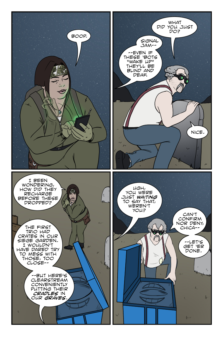
543 – Cradles And Graves
Chuck sez: "Never let a covert operation get in the way of a bad pun."
Did they miss me?
Calendar
BlueSky Latest Posts
Writer’s Blog Archives