Cart
Product categories
Support Us!
If you like what I do please support us on Ko-fi or Patreon.
Follow Us!
Join Our Newsletter!
Vote For Us!
Login
Polls
Events
-
Pasadena Comic Con
Dates: Jan 26
Location: Pasadena Convention Center, 300 E Green St, Pasadena, CA 91101, USA ( MAP)Details:We will be at the Pasadena Comic Con on January 26th. See some of you there for this one day event!
Purchase tickets online at here: https://www.tixr.com/groups/pcc/events/pasadenacomiccon-pasadena-comic-con-2025-115248


3 thoughts on “536 – Great State Of Tech Sass”
Anonymous
Amusing spam above … Things are about to get weird with Casa De Chuck!
Dawn
Ugh, I try to get to the SPAM quicker but we have a new kitty and I have been distracted. It is gone now. 😀
Anonymous
New kitty tops spam any day … and I enjoy getting to see it in it’s brief lifespan.
Latest Comics
#497. 477 – Dead Inside
42 Mar 03, 2021
#496. 476 – Sneer Review
41 Feb 24, 2021
#495. 475 – Not Quite Sun Tzu
42 Feb 17, 2021
#494. 474 – Tales From The Hood
49 Feb 10, 2021
#493. 473 – Beware The Speecer!
43 Feb 03, 2021
#492. 472 – The Origins Of Specie
43 Jan 27, 2021
#491. 471 – Old School Metal
43 Jan 13, 2021
#490. 470 – Weighty Matters
44 Jan 06, 2021
#489. 469 – The Specie Must Flow
44 Dec 16, 2020
#488. 468 – Whatcha Gonna Do?
43 Dec 09, 2020
#487. EPISODE TWENTY
65 Dec 07, 2020
#486. 467 – Mischief Managed (END OF EPISODE 19)
44 Nov 18, 2020
#485. 466 – Trust Issues
43 Nov 11, 2020
#484. 465 – Attention Plans
47 Nov 04, 2020
#483. 464 – Adding Interest To Injury
47 Oct 28, 2020
#482. 463 – Body Impolitic
45 Oct 21, 2020
#481. 462 – Humble Pride
46 Oct 14, 2020
#480. 461 – Math Is Hard
46 Oct 07, 2020
#479. 460 – Running Commentary
46 Sep 30, 2020
#478. 459 – I Drink Therefore I Am
45 Sep 23, 2020
Latest Chapters
Episode 22
Episode 21
Episode 20
Episode 19
Episode 18
Episode 17
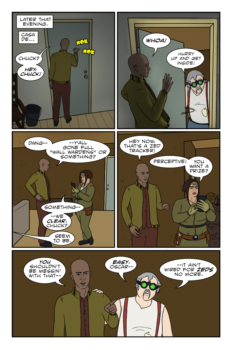
536 – Great State Of Tech Sass
Welcome to Team Paranoid, Oscar! Spoiler alert: they really are out to getcha!
Next comic page planned for Nov. 20th. In the meantime, please accept this documentary evidence of new kitten Morgoth as he discovers the enigma that is the empty soda box.
International Letters
Calendar
Writer’s Blog Archives