UPDATING OCCASIONALLY (FOR NOW)

5 thoughts on “Issue 22 Cover

  1. Dr. Norman (not a real doctor)

    Ooohhh … He looks – desperate.

  2. No hat. He lost his hat. Which had a lot of his personality. Alert! Alert! We have a Lost Hat emergency! This is Not a Drill! Alert! Alert!

  3. Hang in there, I’m a retired fireman, and those pictures/videos have me sweating… The closest thing to a forest fire I ever fought was when a stupid tried to burn raked leaves on a windy day. 4 houses! Mostly grass and bush fires but, yeah.

  4. Good news, we are back at home and there was a home to return to. It’s been a crazy week and a serious near miss seeing as several other homes on our block burned. Terrible stuff but the Ranch persists.

    1. Welcome back.
      My mom’s whole town, Monrovia, seems to have survived so far, too, but it ain’t over yet.

Leave a Reply

Your email address will not be published. Required fields are marked *

*


Issue 22 Cover

Traditional post-issue comic cover! Episode 23 is currently TBA but we're hoping to have the first page out on January 22nd so as to not leave y'all hanging from the proverbial cliff for too long.

[1/9/2025 NOTICE: Some of you may know we live in the Greater L.A. Area and if you've heard about the wildfires here: yep, we're currently evacuated from our home and still unsure as to its fate. We grabbed our computers and backup drives so whatever happens we still have our files, but definitely expect some delays and cross your fingers that the worst we're going to end up having to do is throw food out of the fridge due to power loss.]

[1/11/2025 UPDATE: Good news, we are back at home and there was a home to return to. It's been a crazy week and a serious near miss seeing as several other homes on our block burned. Terrible stuff but the Ranch persists.]

[1/22/2025 UPDATE: In the post-fire chaos we forgot to mention, no comic this week. Things are intact but there's still cleanup of smoke and ash to do, insurance to wrangle, etc. We had a really close call.

Since we're between issues anyhow we're going to push the start date of Episode 23 back to February 26th. Gives us some room to breathe (literally!).]

Dialogue as navigation

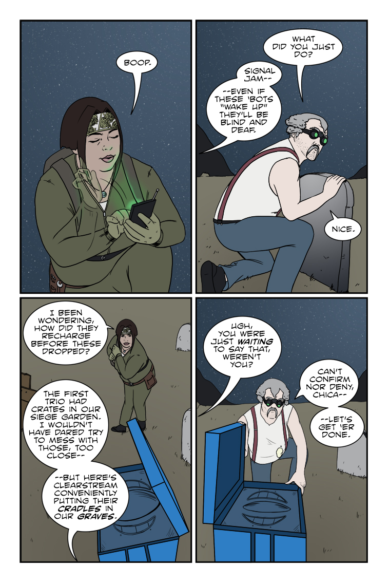
Last week I talked about the idea that the placement of word balloons and captions in comics can actually be a very important storytelling element. Let’s take that even further. Have you ever noticed how they have the potential to guide the reader’s eye? Most of us are familiar with the basics of how we tend to read in the so-called Western World, a habit that’s been ingrained into us since childhood: left-to-right, top-to-bottom. That’s our default, and it’s not even something you have to think about when you write in prose. Comics can be another matter entirely. Art and paneling layouts are suddenly part of the composition, and you may have to engage in some fancy gymnastics to get all those words and sound effects you wanted to fit comfortably. Now of course, the first pass is to make sure you absolutely need all those words and sound effects, but if you honestly believe they’re needed, you want to try to make the progression of the reader through the story is as natural as possible. I’ve had several times as a reader over the years where I had to stop and get back on track after reading the wrong dialogue balloon first or even the wrong panel out of intended sequence, neither of which is a good thing. The most primitive and direct solution for this is the ol’ arrow method where you’ll see a creator literally place a graphical arrow in the gutters between panels to show which ones you should be reading next. You’ll rarely see this in works from experienced pros, and I shy away from calling out any direct examples because of that, but you probably know what I mean. It’s a last resort, in my opinion, something to be avoided at all costs. And there are definitely creative ways to avoid it, one of which happens to be your lettering. I think I’m going to just dive right in the deep end here with an extreme example from the pages of Superior Spider-Man. The script calls for the Green Goblin to taunt his foe by naming off several locations, and then one after another he detonates bombs planted in all of them, laughing maniacally all the while. The paneling layout, however, is very non-standard. (click the image to enlarge)   ssmballoonsample3 Now admittedly this has the dimensions of a splash page, so we’re actually looking at two separate pages of the comic, but as a single design I think it still works swimmingly at guiding you down the left side first and then the right, with the Goblin and the visual representation of his laughter serving as the border. I even like the happy accident (or maybe design?) of the word balloon stem in the lower left panel. It points to the Goblin’s mouth as it should, but if you look past him it also points to the the upper right panel where the quite literal cascade of “boom” begins. The laughter serving as a background to the right side panels also serves to divide the two spaces. You could technically still read this left to right and have it work, but I don’t believe that’s the intent, and that’s why those thin little stems are there crossing the gutters to provide the vertical (but not horizontal) connection. They could have all had individual stems pointing to the Goblin or no stems at all and still serve their minimal purpose, but it would have been a less clear choice. Now that we’ve seen a cool bigtime pro page, I’d like to provide these three pages from our own past work that also hopefully illustrate what I’m getting at, and hear your thoughts on how well they might (or might not) have worked for you. https://www.zombieranchcomic.com/episode/a-la-cart/ https://www.zombieranchcomic.com/episode/99-event-horizon/ https://www.zombieranchcomic.com/episode/118-brewing-and-stewing/ If you’ve got no opinions to give, I’ll just do my retrospective on them next week to say what we were going for and how well I think we achieved what we intended in terms of guiding the reader. But since you folks are the actual readers, it could make an interesting addition to the discussion.