I’m going to keep this installment of the blog somewhat short since we’re on our Holiday break, but I wanted to be sure to clue you guys in to a great article for your reading pleasure. Last week I discussed at length the idea of using boldface type as a storytelling element, but that’s merely scratching the surface of the kinds of things you can choose to do or not do with comics lettering, and Balloon Tales is home to a fantastic roundtable discussion on the subject featuring some of the most respected names in the business.
The discussion is supposed to be about obsolete and/or abandoned techniques, but these are folks who know their stuff enough to not just be content with blanket bans and omissions, expressing their frustration with editors over the years who have enforced such things regardless of whether it might actually be appropriate. This discussion, incidentally, is where I got my insight that the misuse of boldface might have been due to printing errors more than any errors on the part of writers or letterers, and yet because it could be done badly in the past, there were those with veto power who had barred it from consideration— a rather irritating situation for dudes like Kurt Busiek who damn well were putting a lot of thought and care into their decisions, only to be overridden because others had been careless before.
Which is sort of like outlawing science fiction films because bad science fiction films have been made, isn’t it? Speaking of which, the roundtable begins right off with the worry that comics these days are being expected to be too much like movies, to the point where a lot of comics-specific techniques have been nixed by editors as being, ludicrously enough, “too comic-booky”. Sound effects, for example, and boy howdy did I have my own say on that.
But I, for all my opinions, am still but a small fish. Without further ado, I bid you read the words of some of the true movers and shakers: LETTERING ROUNDTABLE
Oh, and Happy New Year!


4 thoughts on “543 – Cradles And Graves”
Keith
Oh lordy, they really are a great couple…though, I suggest adopting.
Anonymous
Consequences be damned, because doing nothing might be worse.
Tommyguada
hi
Crazyman
That was really bad…have an upvote. 😎
Latest Comics
#566. 543 – Cradles And Graves
103 Apr 23, 2025
#565. 542 – Catching Up
87 Apr 09, 2025
#564. 541 – Graverobbers
63 Mar 19, 2025
#563. 540 – Trick Hello
39 Feb 26, 2025
#562. EPISODE TWENTY-THREE
10 Feb 24, 2025
#561. 539 – A Knife In The Dark (END OF EPISODE 22)
26 Dec 25, 2024
#560. 538 – Astute Paranoia
50 Dec 11, 2024
#559. 537 – Kooky And Spooky
66 Nov 20, 2024
#558. 536 – Great State Of Tech Sass
61 Oct 30, 2024
#557. 535 – Suzie Schadenfreude
64 Oct 16, 2024
#556. 534 – Compliments To The Cook
69 Sep 18, 2024
#555. 533 – Just Asking Questions
159 Sep 04, 2024
#554. 532 – Food For Naught
39 Aug 21, 2024
#553. 531- Inquisitional Etiquette
54 Jul 10, 2024
#552. 530 – After Dinner Stints
54 Jun 26, 2024
#551. 529 – Kitchen Gossip
96 Jun 12, 2024
#550. 528 – Snitches Get Glitches
108 May 29, 2024
#549. 527 – Rosa Ex Nihilo
277 Apr 24, 2024
#548. 526 – The Union Of The Sneak
79 Apr 10, 2024
#547. 525 – Creeping Suspicions
58 Mar 27, 2024
Latest Chapters
Episode 22
Episode 21
Episode 20
Episode 19
Episode 18
Episode 17
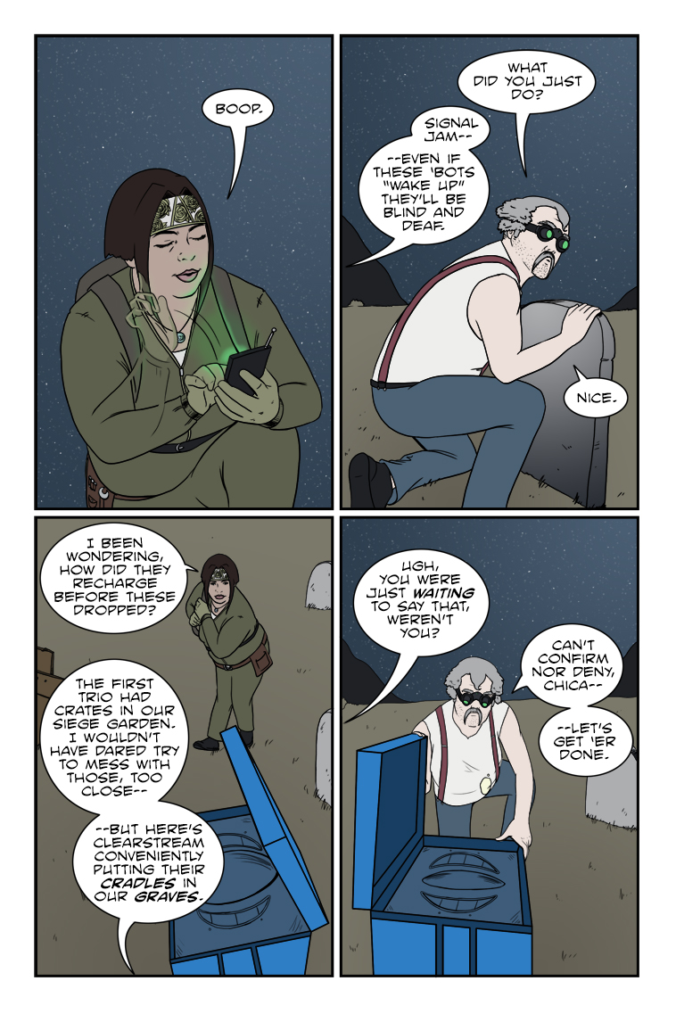
543 – Cradles And Graves
Chuck sez: "Never let a covert operation get in the way of a bad pun."
Rounding out the year…
Calendar
BlueSky Latest Posts
Writer’s Blog Archives