So, for the last several months I’ve mostly taken over the lettering duties for
Zombie Ranch, except on those rare occasions where I beg Dawn to help me with a certain visual effect I don’t feel confident of pulling off with my shaky non-artist hands. Even before I started doing the actual balloons and captions, though, I had begun the practice of formatting the text itself in certain ways, the most common of which was deciding to present certain words in
boldface, for emphasis.
Not every comic does this. In fact it fell out of favor for a long time because careless hand lettering and/or print errors would make the sentence seem like it was being said by an insane person if you tried to read it out loud. Traditional comics lettering being all capitals, you would read “
GREAT SCOTT!!
THE MISSILE IS
ONLY SECONDS FROM IMPACT
WITH THE CITY!!”, and if you care to think about that, Superman now sounds like a malfunctioning voice synthesizer. “GREAT scott!! THE missile is ONLY seconds from impact WITH THE city!!”. Linkara occasionally loves to call this phenomenon out as part of his
Atop the Fourth Wall reviews, although it’s perhaps unfair to do so for anything published before the advent of digital lettering.
Mind you, if digital lettering is used, then there’s really no excuse for using boldface badly. You can continue not to use it at all, and that’s a perfectly valid choice, but I personally have really fallen in love with it as a part of my comics writing toolbox. I feel it helps me in my simulation of the rhythms of how people would talk, and as such becomes an important storytelling element.
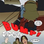
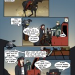
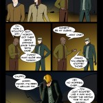
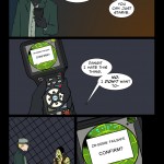
Examples, you say? All right, take a look at
this page from Episode 7 (the link should open a new window/tab for you). Note how Frank starts off with no boldface in his speech, which suggests an even keel, even when he declares Eustace’s kin as good as dead. The one exception is the boldface on his exclamation regarding Muriel, where I let his simmering frustration with the situation briefly spike through.
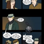
Eustace meanwhile is making all sorts of desperate pleas. What about
this? Or
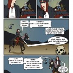
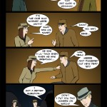
this? Finally Frank cuts him off with my favorite bit of the page, one of our “whisper balloons” we’ve already established that
blends with the background and is in a smaller font, but is still
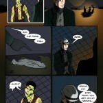
boldface so that I, at least, can almost hear Frank hissing the command. Frank continues with a non-whisper and some emphasized words to drive his point home, but the font remains slightly smaller than the rest of the page. Even if a reader doesn’t consciously register that, I hope subconsciously there’s still a sense of restraint that comes through.
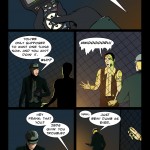
Panel 4 is back at regular size font, but not one word is bolded, suggesting an almost monotone speech that reinforces what’s being said. Slow and steady. Keep your cool. Don’t draw attention. In Panel 5 Eustace is, of course, too panicky a sort to follow that advice to the letter (heh), so his fear still bubbles up when he asks about the stampede, but Frank’s response is very simple and neutrally delivered, capping off the page.
So there’s a prime example of my using boldface (or lack thereof) to help show character, establish rhythms, and reinforce the story. Another thing you may notice (or at least may notice on another read-through) is that almost any time speech is coming from the camera drones or walkie-talkies, there is no boldface involved, which is my choice to show the detached and/or more “lo-fi” nature of such communications. On the other hand, the overproduced media interludes run
rampant with emphasis to make
sure the viewer is as
excited as
possible!
Now all this would be obnoxious in a pure prose story, but if we accept the idea of lettering being a visual element in comics as much as anything else on the page, then shouldn’t we be considering how to present it visually? As long as some care and thought is involved in the usage, I see no reason that you can’t
boldly go forwards with some
boldface type.


12 thoughts on “540 – Trick Hello”
Scarsdale
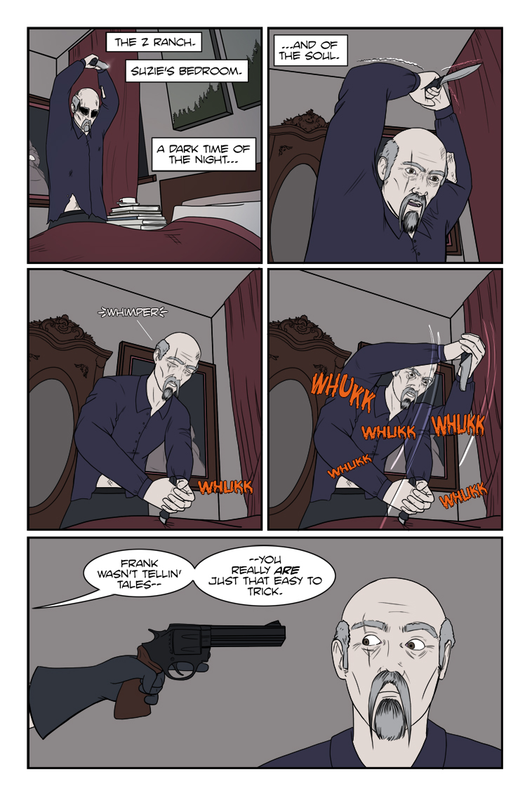
Called it, she figured he’d do this, if by choice or by zombie voodoo. I’m sure the “friendlier” questioning will start soon, if she doesn’t just kill him out-right. Or just add him to the herd.
Crazyman
Gotcha!
Zombatar
This turn of events is a surprise only to Eustace. And, maybe, Eustace’s subconscious. After all, this way he doesn’t have to actually risk actually attacking Suzie, which gives him a greater chance of survival than actually attacking her. I wonder what he was promised/threatened with?
ConcordBob
Not to nit-pick, but since sights are on target, finger should be on the trigger. Especially this close.
The usual rule is “keep finger straight and off trigger until sights are on target”.
Dr. Norman (not a real doctor)
Not to nit-pick, but since that was current philosophies regarding trigger discipline have evolved.
Of course, it will depend on who you get/got your training from.
Experiments have determined that the fraction of a second to go from finger off the trigger to finger firing when appropriate is insignificant, and the risk of firing unintended is greatly reduced.
Dr. Norman (not a real doctor)
I did the google thing and I believe I saw how you reached this conclusion … but there are two parts to it – One should not omit the second part.
“Trigger Finger Discipline: · The practice of keeping your finger “off the trigger” until your sights are on target AND YOU ARE READY TO DISCHARGE THE FIREARM.” (Caps are my own)
Crazyman
She wants him alive so she can question him; otherwise, he’d already be dead.
ConcordBob
Good discussion on trigger discipline!
His skin is very pale / gray. Is this malnourishment, or has he been poisoned with a mind-control drug? I would have to go back and look a t all various of skin tone.
TKG
On a prior page we discussed what he’s likely got running in his system. I suggested that it’s probably Borrochero (Brugmansia arbora) which is already used by Colombian cartels to eradicate the free will of their victims.
ConcordBob
Oh, the gray is just the dim light. Here is McCarthy eating dinner, and has the typical white dude flesh tone.
https://www.zombieranchcomic.com/comic/531-inquisitional-etiquette/
Dawn
Yeah, I was trying to show that it was dark. But went with the old Hollywood method of adding a blue grey tint over everything.
Dr. Norman (not a real doctor)
Now can we satisfy my curiosity? Colt, Smith & Wesson, Ruger, or other timeline variant?