So here’s a thing that happens sometimes in fiction. You have a character who’s a young teenager, but a writer who’s in, say, their thirties. If said writer isn’t careful (or perhaps just flat out
doesn’t care), you can end up with a 13 year old girl talking and acting like someone much closer to that writer’s age. Alternately they could end up as the author’s vague memory of what being a teenager was like, or perhaps a crankily rendered stereotype of “those damn kids” that the author is certain they were never, EVER like in THEIR youth, uttering all manner of unintelligible slang when they don’t just have their noses buried in their Twitters or Instaspams or whatnot.
I may have mentioned this before, but I went to Junior High School (not sure foreign equivalents here but think around ages 12-16) in the Valley. Not just any valley; the San Fernando Valley. THE Valley that brought the phrase “
Valley Girl” to the world, with all of its attendant “ohmuhGAWDS” and “totally tubular to the max”‘s and “gag me with a spoon!”s. Except… I don’t really remember any of my peers at that time actually talking like that, except when they wanted to make fun of the TV shows and such that insisted we did. The male equivalent was the surfer dude a la
Jeff Spicoli, and to go by the media of the day, all us damn kids at Walter Reed Junior High should have sounded like that. We didn’t. Well, not all of us. All stereotypes do have their elements of truth, after all.
Is this a terrible thing? Perhaps not. I doubt I should be casting too many stones when I’ve made a conscious decision to have most of my characters talkin’ like twangy cowpokes (y’all), even though many modern day Texans don’t sound too different from, say, Californians, barring certain pronunciations of words and names for things. What can be more jarring to me is a 13 year old in 2014 who suddenly starts ranting about how the Star Wars prequels are so inferior to the original trilogy. Or rattles off a multi-page statement on the dichotomy of Church and State in America. Or instantly recognizes and starts gushing over a Snake Plissken figurine.
I’m not saying it’s impossible for a 13 year old to be capable of any or all of these things, but as they are things my 40 year old self is totally capable of I feel a certain alarm and closer examination might be in order before they go live in the mouth of a character who could be being reduced to little more than a mini-me sock puppet.
It’s a challenging thing, perhaps, to put yourself in the shoes of a generation different than your own. You can find far more webcomics characters nostalgic for Super Nintendo and Gargoyles than you can find ones nostalgic for the Apple II and Johnny Carson. Even more challenging, though, is to put yourself in the kicks of the younger generation (it is “kicks”, right? Damn kids). What are the things that they’ll be pining for 20 years from now? And looking back at my own youth, I have to admit, my fondness for the music of
Creedence Clearwater Revival comes straight from my dad… so it’s not *just* the new stuff that kids might end up carrying through to adulthood.
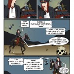
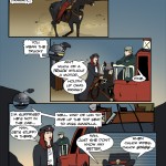
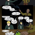
According to his bio that I myself wrote, Uncle Chuck scavenges “pre-plague memorabilia”. Well, what’s that mean? License plates and coca-cola signs, the kind of vintage stuff you might see on a show like
American Pickers? That’s the memorabilia of *this* day and age. There’s no reason he can’t since he very well might have watched that show as a kid, just like he watched
Deadliest Catch. Obviously I have at least one nod to the 1980s in his love for ZZ Top (a band which itself cultivates an even more retro image with its classic cars, etc.). ZZ Top is
still touring to this day, but maybe might be considered “old people” music? Still, like I said, I’m all into CCR and they broke up before I was born. I think the ZZ Top vibe is one Chuck would similarly appreciate, especially since they’re Texas boys.
You know who else is Texan? Sandy Cheeks from
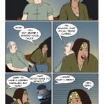
Spongebob Squarepants. So yeah, her presence amongst Chuck’s acquisitions is my speculative nod to future nostalgia, the kind even a zombie apocalypse won’t be able to fully extinguish. Or considering how much would have been lost, maybe it would just make it all the more keen.






2 thoughts on “543 – Cradles And Graves”
Keith
Oh lordy, they really are a great couple…though, I suggest adopting.
Anonymous
Consequences be damned, because doing nothing might be worse.