Cart
Product categories
Support Us!
If you like what I do please support us on Ko-fi or Patreon.
Follow Us!
Join Our Newsletter!
Vote For Us!
Login
Polls
Events
-
Pasadena Comic Con
Dates: Jan 26
Location: Pasadena Convention Center, 300 E Green St, Pasadena, CA 91101, USA ( MAP)Details:We will be at the Pasadena Comic Con on January 26th. See some of you there for this one day event!
Purchase tickets online at here: https://www.tixr.com/groups/pcc/events/pasadenacomiccon-pasadena-comic-con-2025-115248


3 thoughts on “537 – Kooky And Spooky”
Dr. Norman (not a real doctor)
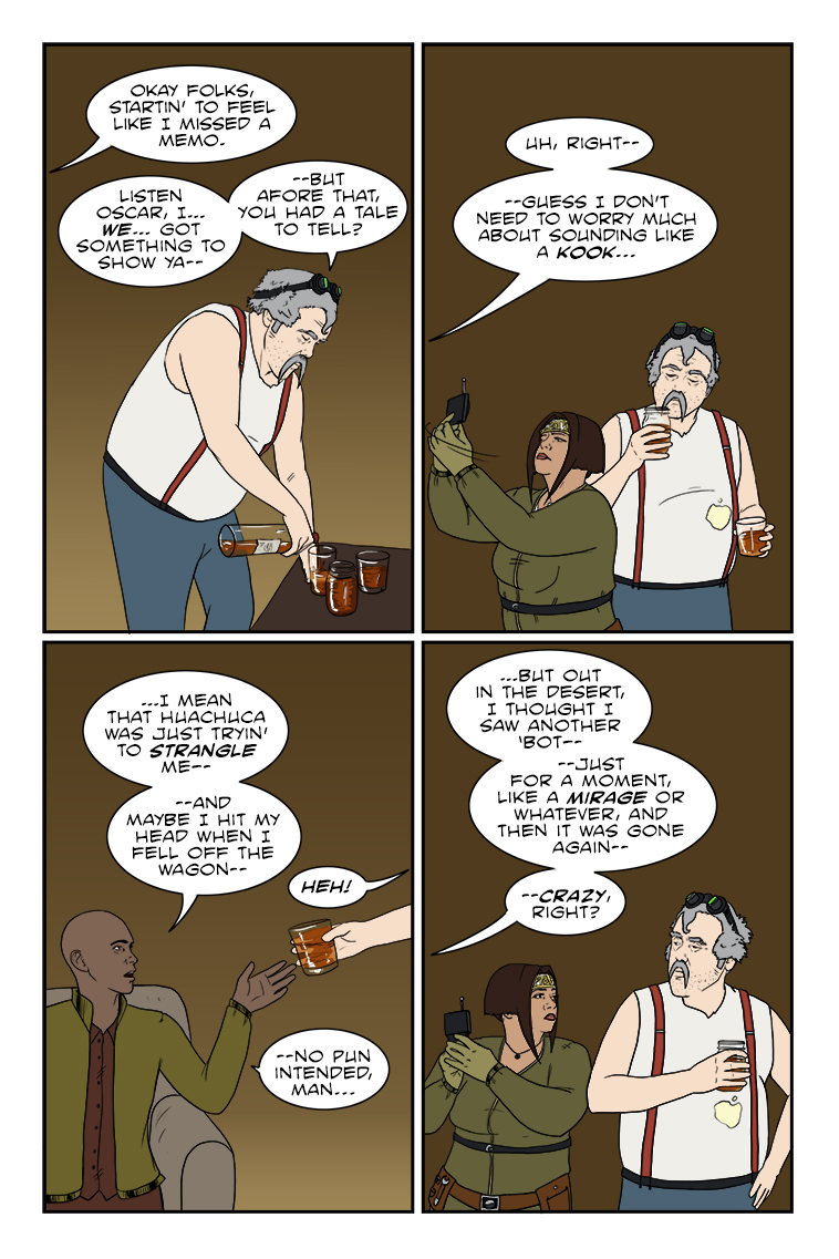
Obligatory William Gibson reference for the excellent novel “Spook Country”. I’ve read it fourteen times and still find something new each time – the man does not waste a word. No, not crazy at all.
Clint
Hurray, people in the comments can have names again (if they choose to)!
Evervigilant
Yay for names! I love the pun as he takes the offered drink.
Latest Comics
#318. 305 – Insufficiently Armed
10 Aug 31, 2016
#317. 304 – BMX-ceptions
10 Aug 10, 2016
#316. 303 – Lines In The Sand
13 Aug 03, 2016
#315. 302 – Hazy Optimism
10 Jul 13, 2016
#314. 301 – Conflicting Directions
28 Jul 06, 2016
#313. 300 – Errors Of Judgment
38 Jun 29, 2016
#312. 299 – Not Ready For Primetime
38 Jun 22, 2016
#311. 298 – Who Wakens The Watchmen?
38 Jun 08, 2016
#310. 297 – Going Under Cover
43 Jun 01, 2016
#309. 296 – Victims And Circumstances
41 May 25, 2016
#308. EPISODE THIRTEEN
44 May 23, 2016
#307. 295 – Reality Ensues (END OF EPISODE 12)
44 May 11, 2016
#306. 294 – Let It Go
43 May 04, 2016
#305. 293 – Laughing Sass
14 Apr 27, 2016
#304. 292 – Pointing The Finger
12 Apr 20, 2016
#303. 291 – Informed Decisions
15 Apr 13, 2016
#302. 290 – Omission Briefing
12 Apr 06, 2016
#301. 289 – Gut Feelings
10 Mar 23, 2016
#300. 288 – Dawning Unease
13 Mar 16, 2016
#299. 287 – Radio Interference
13 Mar 09, 2016
Latest Chapters
Episode 22
Episode 21
Episode 20
Episode 19
Episode 18
Episode 17
537 – Kooky And Spooky
The lettering of the law…
Calendar
Writer’s Blog Archives