I might have to draw out what their kid would look like. First thought is that their kid would look like Ongo Gablogian from “It’s Always Sunny In Philadelphia”
He’s pushing 60, she’s maybe 30, more likely less. Chuck is most likely shooting blanks, and besides, he’s talking to her like a baby sister than a love interest.
It is really hard to have a favorite character, as there are so many good ones. But I think Rosa is my favorite. Chuck is a good accomplice in sneaking work, but not much for romance. Uugh.
I mean, if they don’t have at least an inkling of what’s going down, I’m actually disappointed in Clearstream. If anything, I’m starting to wonder if they caught on and realized “Wait, we can use this.”
I’m way ahead of you – I’ve been waiting for you to catch up. From November 2020:
I would hope for nothing less – her and Chuck have the potential for a great deal of positive mischief.
Speaking of which, I received the email notifying me that my order for the NSFW “Chuck and Rosa Finally Do It” (age verification required) limited edition hardcover is going to be delayed due to the pandemic. I think it’s really cool that you’ll be adding some additional stretch goal goodies when it ships – thanks for all your story and art.
As for the inscription, ” We owe it all to you ” will be sufficient.
As you might be aware if you’ve ever checked out our creators page, Zombie Ranch is pretty damn close to what would be termed a “mom and pop” operation. If our computers have trouble, I’m the IT guy who fixes them (and does our backups). If our websites have issues, Dawn is there combing over the code to see what happened. I take care of all our permits and licenses and taxes, while she figures out our booth setups and transportation. She’s the sole artist for the comic, while I’m both writer and editor.
Oh yeah, and then there’s the lettering.
I have a feeling that for most people producing their first comic or webcomic, the lettering is a low-priority thing, if not almost an afterthought. I see a lot of first efforts out there that will just have blocks of text with no balloons, sometimes with a thin line indicating who might be speaking, and sometimes not. There are comics out there, particularly in the case of editorial cartooning, which thrive in that format, but mostly I think it’s less of an artistic decision than one of either not thinking on it much or just plain not knowing any better.
We weren’t much different when we started. I actually just delegated the lettering to Dawn along with everything else, and she did her best, but it took a long time before we even decided on a consistent font, and it was longer than that before I finally started taking on the burden of getting all those words and sound effects properly presented on the page. I like to think this was less a matter of laziness on my part as lack of confidence in being able to “do it right”, or at least to do it efficiently… but in the latter case we’re right back to that situation of the lettering being that afterthought, that red-headed stepchild you have to deal with once all your prettier and more important kids get attention.
I’ve come to the realization over the years of producing this comic that treating lettering as a throwaway aspect is not a great way to go. It’s sort of like the soundtrack to a movie in that for the most part, if you’re doing it right, people won’t even consciously notice it’s there unless there’s certain moments you want them to… but try to think for a moment how Star Wars would have been as an experience without the music of John Williams?
Not a perfect analogy, and (as with many things I often preach here… I know…) we’re still not consistent at living up to the ideal. But thinking from a writing perspective, what better way to get your words onto the comics page in the way you imagined than to figure out this whole lettering business and start taking care of it yourself? In fact I noticed this actually seemed to be a trend in creator-owned comics with a writer-artist team, such as the critically acclaimed Chew: Rob Guillory does all the artwork, but John Layman does the lettering in addition to the scripts.
I’m not to Layman’s level yet (I’m sure there’s a joke to be made about “layman’s work”, just as I’m sure he’s probably heard it)… but I’ve definitely tried to step up, taking the work off Dawn’s hands and hopefully retaining if not expanding upon the quality.
And if you haven’t noticed except where we want you to? Well, I’ll take that as the best compliment.


9 thoughts on “542 – Catching Up”
Keith
Some friction, but yeah. IRL, I’d like these two…they should have kids. 😉
Dawn
I might have to draw out what their kid would look like. First thought is that their kid would look like Ongo Gablogian from “It’s Always Sunny In Philadelphia”
Scarsdale
He’s pushing 60, she’s maybe 30, more likely less. Chuck is most likely shooting blanks, and besides, he’s talking to her like a baby sister than a love interest.
Keith
Up in these hills, sometimes family is all y’gots. 😉
ConcordBob
It is really hard to have a favorite character, as there are so many good ones. But I think Rosa is my favorite. Chuck is a good accomplice in sneaking work, but not much for romance. Uugh.
Otaku
I mean, if they don’t have at least an inkling of what’s going down, I’m actually disappointed in Clearstream. If anything, I’m starting to wonder if they caught on and realized “Wait, we can use this.”
Because of course they can. 😉
Dr. Norman (not a real doctor)
I’m way ahead of you – I’ve been waiting for you to catch up. From November 2020:
I would hope for nothing less – her and Chuck have the potential for a great deal of positive mischief.
Speaking of which, I received the email notifying me that my order for the NSFW “Chuck and Rosa Finally Do It” (age verification required) limited edition hardcover is going to be delayed due to the pandemic. I think it’s really cool that you’ll be adding some additional stretch goal goodies when it ships – thanks for all your story and art.
As for the inscription, ” We owe it all to you ” will be sufficient.
Crazyman
Partners in crime! 😈
TKG
A crime so perfect she went full on wall-eye!
Latest Comics
#505. 485 – Proof Of Life
51 May 12, 2021
#504. 484 – Words Of Wisdom
47 Apr 28, 2021
#503. 483 – Solar Systems
51 Apr 21, 2021
#502. 482 – His Body His Business
46 Apr 14, 2021
#501. 481 – Re-capitulation
46 Apr 07, 2021
#499. 479 – Guilty Measure
45 Mar 17, 2021
#498. 478 – Mirthful Stereotype
44 Mar 10, 2021
#497. 477 – Dead Inside
46 Mar 03, 2021
#496. 476 – Sneer Review
45 Feb 24, 2021
#495. 475 – Not Quite Sun Tzu
46 Feb 17, 2021
#494. 474 – Tales From The Hood
53 Feb 10, 2021
#493. 473 – Beware The Speecer!
49 Feb 03, 2021
#492. 472 – The Origins Of Specie
47 Jan 27, 2021
#491. 471 – Old School Metal
49 Jan 13, 2021
#490. 470 – Weighty Matters
51 Jan 06, 2021
#489. 469 – The Specie Must Flow
48 Dec 16, 2020
#488. 468 – Whatcha Gonna Do?
48 Dec 09, 2020
#487. EPISODE TWENTY
69 Dec 07, 2020
#486. 467 – Mischief Managed (END OF EPISODE 19)
49 Nov 18, 2020
#485. 466 – Trust Issues
46 Nov 11, 2020
Latest Chapters
Episode 22
Episode 21
Episode 20
Episode 19
Episode 18
Episode 17
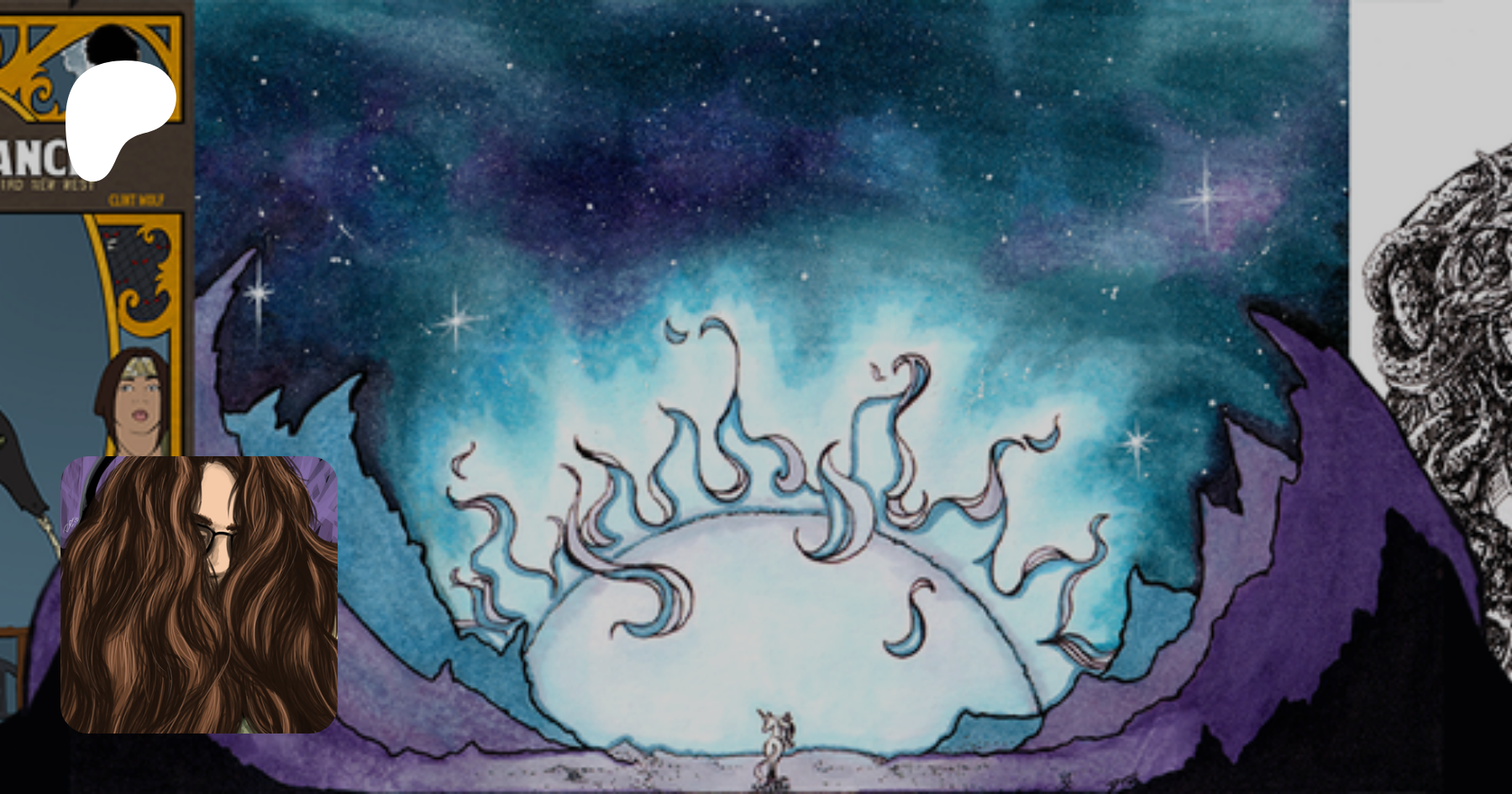
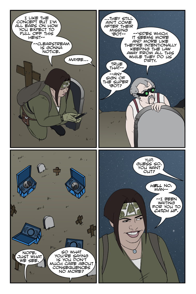
542 – Catching Up
Now you're getting the idea, Chuck!
Struggling with your letters
Calendar
BlueSky Latest Posts
Writer’s Blog Archives