Cart
Product categories
Support Us!
If you like what I do please support us on Ko-fi or Patreon.
Follow Us!
Join Our Newsletter!
Vote For Us!
Login
Polls
Events
-
Pasadena Comic Con
Dates: May 24
Location: Pasadena Convention Center, 300 E Green St, Pasadena, CA 91101, USA ( MAP)Details:We will be at the Pasadena Comic Con on January 26th. See some of you there for this one day event!
Purchase tickets online at here: https://www.tixr.com/groups/pcc/events/pasadenacomiccon-pasadena-comic-con-2025-115248
-
San Diego Comic Con: SP-N7
Dates: Jul 23 - 27
Location: San Diego Convention Center, 111 Harbor Dr, San Diego, CA 92101, USA ( MAP)Details:Clint & Dawn Wolf will be at San Diego Comic Con, as Lab Reject Studios. We will be at booth N7 in Small Press.


6 thoughts on “541 – Graverobbers”
Crazyman
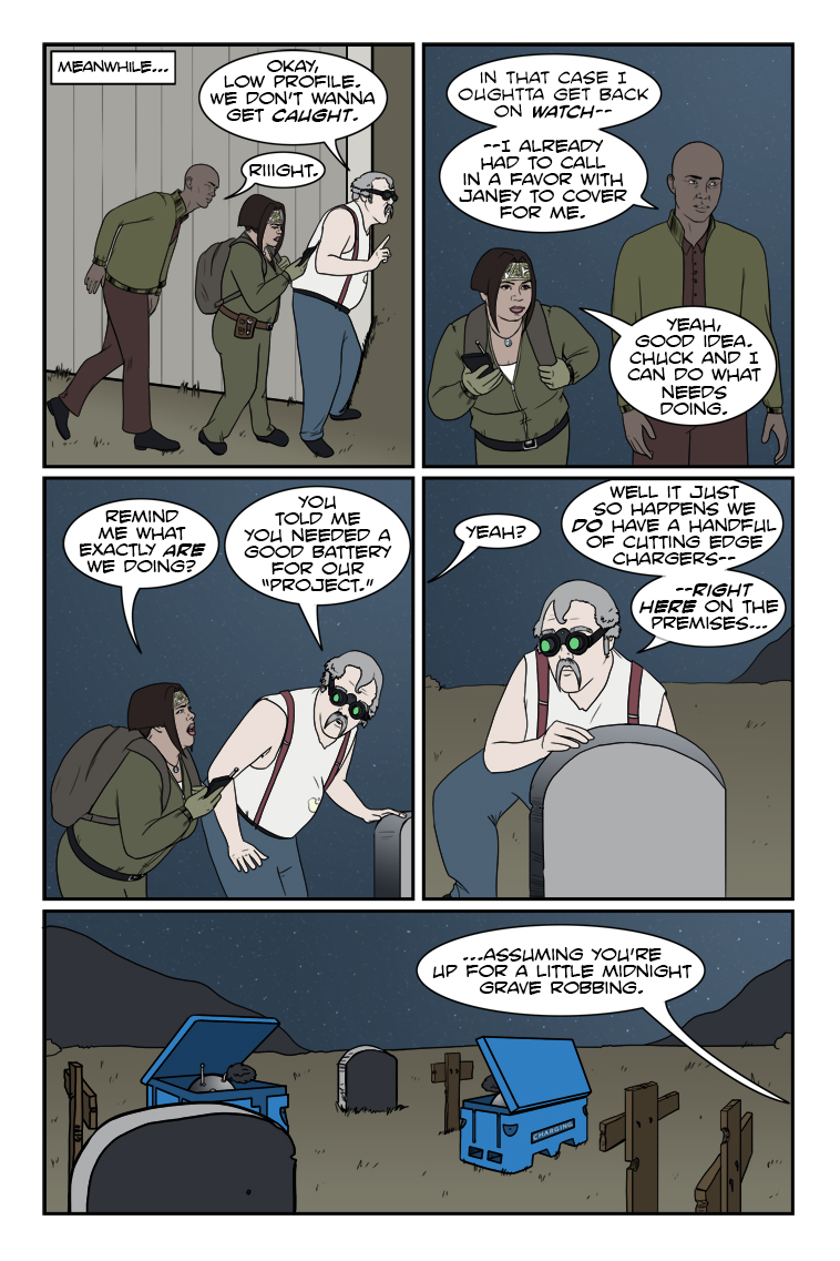
“Oh, *that* kind of grave robbing? Lead on, Chuck!” 😈
Dr. Norman (not a real doctor)
What? I say “What”?
Keith
Heh, this is going to be fun. Tradition says you need to drink at least one bottle of MD 20/20 before going to the graveyard.
Honzinator
At first I was thinking of something like a potato battery … nope!
Scarsdale
If you take a dead “D” cell battery, take out the carbon rod from the center, cut a strip of galvanized sheet metal about an inch (2.7 centimeters), take a small jar for canning, suspend the rod in the center and the strip on the side, pour in drain cleaner, you’ll get 1.2 to 1.4 volts DC. 10 of those connected to an inverter will give you 120 VAC at 0.5 amps. Do NOT keep them in the same area you live in however, the fumes will burn your lungs. Just something I learned in chem class in high school. You’d have to top-up the jars every few days, however. Any type of acid will work, even salt water. I think the teacher was a survivalist…
nbaldbiz
Scheffler, Hovland and Conners Share the Lead at P.G.A. Championship
Jordan Spieth, who needs a victory at Oak Hill to complete the career Grand Slam, and Justin Thomas, who won last year’s tournament, just made the cut at five over.
Give this article
Latest Comics
#564. 541 – Graverobbers
44 Mar 19, 2025
#563. 540 – Trick Hello
38 Feb 26, 2025
#562. EPISODE TWENTY-THREE
5 Feb 24, 2025
#561. 539 – A Knife In The Dark (END OF EPISODE 22)
24 Dec 25, 2024
#560. 538 – Astute Paranoia
47 Dec 11, 2024
#559. 537 – Kooky And Spooky
62 Nov 20, 2024
#558. 536 – Great State Of Tech Sass
61 Oct 30, 2024
#557. 535 – Suzie Schadenfreude
60 Oct 16, 2024
#556. 534 – Compliments To The Cook
66 Sep 18, 2024
#555. 533 – Just Asking Questions
160 Sep 04, 2024
#554. 532 – Food For Naught
37 Aug 21, 2024
#553. 531- Inquisitional Etiquette
54 Jul 10, 2024
#552. 530 – After Dinner Stints
53 Jun 26, 2024
#551. 529 – Kitchen Gossip
92 Jun 12, 2024
#550. 528 – Snitches Get Glitches
109 May 29, 2024
#549. 527 – Rosa Ex Nihilo
275 Apr 24, 2024
#548. 526 – The Union Of The Sneak
76 Apr 10, 2024
#547. 525 – Creeping Suspicions
56 Mar 27, 2024
#546. 524 – Stopped Watch
88 Mar 06, 2024
#545. 523 – Canned Responses
86 Feb 14, 2024
Latest Chapters
Episode 22
Episode 21
Episode 20
Episode 19
Episode 18
Episode 17
541 – Graverobbers
WonderCon 2025 is coming soon, so the next comic is planned for April 9th.
In the meantime, relevant previousness for this week's page:
https://www.zombieranchcomic.com/comic/223-surrounded-by-film-end-of-episode-9/
https://www.zombieranchcomic.com/comic/483-solar-systems/
The cat is both alive and dead…
Calendar
BlueSky Latest Posts
Writer’s Blog Archives