Cart
Product categories
Support Us!
If you like what I do please support us on Ko-fi or Patreon.
Follow Us!
Join Our Newsletter!
Vote For Us!
Login
Polls
Events
-
Pasadena Comic Con
Dates: Jan 26
Location: Pasadena Convention Center, 300 E Green St, Pasadena, CA 91101, USA ( MAP)Details:We will be at the Pasadena Comic Con on January 26th. See some of you there for this one day event!
Purchase tickets online at here: https://www.tixr.com/groups/pcc/events/pasadenacomiccon-pasadena-comic-con-2025-115248
-
San Diego Comic Con: SP-N7
Dates: Jul 23 - 27
Location: San Diego Convention Center, 111 Harbor Dr, San Diego, CA 92101, USA ( MAP)Details:Clint & Dawn Wolf will be at San Diego Comic Con, as Lab Reject Studios. We will be at booth N7 in Small Press.


14 thoughts on “539 – A Knife In The Dark (END OF EPISODE 22)”
Keith
Why am I not surprised.
Scarsdale
Typical, it’s always someone else’s fault. Revenge is not just best served cold, but by stupid too. “This is all your fault!” Which is wrong, but in his head, it’s right.
steelraven
It’s also been heavily hinted he has already been brain washed by the zombie worshiping cult.
Scarsdale
Which, no doubt, made easier because of that under-lying feeling. People are always looking for a scape-goat…
Clint
I don’t know if you got my callback by intent or not, but it’s great to see almost the same words echoed! https://www.zombieranchcomic.com/comic/203-breaking-worst/
RC
Honestly, probably the first time he’s ever taken control of and done ever in his life. There’s a reason why they kept him. Give a dog that’s been beat all its life a whiff of conference and control, you got a problem.
Crazyman
Imagine his surprise when he stabs a pillow. 😜
Zombatar
He isn’t in control, RC – he’s probably drugged to the very dilated eyeballs, probably with Datura. Back on p.443, Eustace is shown holding a Mojave Rattlesnake on a stick while the Brujefe milks it into a glass. Mojave venom A is a paralytic neurotoxin, like tetrodotoxin. Tetrodotoxin was thought to be part of the legendary Haitian “zombie powder”. The other part was Datura, which contains scopalamine, which messes with memory and concentration, and is supposed to render victims docile and suggestible.
The question is, where did he get his current dose, and did a little drone whisper in his ear?
TKG
Except Datura doesn’t do that. You’re thinking of the compound Scoplolmine (AKA the devil’s breath) which generally comes from a specific plant, Borrochero (Brugmansia arbora) that is native to Columbia that the gang in question probably would have had access to. It’s active compound obliterates free will, your conscious, you can function as normal but you are totally open to suggestion which is what happened to McCarty here. Datura just makes you trip mad balls and maybe die, but it does not make you a puppet.
Dr. Norman (not a real doctor)
Me lleva la chingada !
TKG
I’m betting money there’s no one in that bed and it’s a ruse to get him caught.
Scarsdale
I agree, the question is, will she just shoot him, will she have him added to the herd, or keep him alive to question him?
Dr. Norman (not a real doctor)
[Zombatar] and [TKG], please resend cocktail recipe. My efforts to date yield only a foul taste and a mild buzz.
TKG
Just a disclaimer before I answer that, I don’t recommend using datura or borrochero, the risks are a bit too high. I say this because the potency can vary from plant to plant within the same growing year and for some a real datura trip can be psychologically damaging. But anyway, the main way to use D. stramonium is to smoke it’s leaves and or seeds blended in with tobacco, I’d presume you can also do this with D. metel, which is the one commonly sold in garden centers as plants and seeds. The seeds are susually what folks focus on because as with many nightshades the active compound is centered there as a chemical defence against insects that would otherwise eat the seeds. The issue with D. metel is that it’s been hybridized for flowers and away from the normal Datura benefits so it might be all bitter and no bang so to speak. As for Borrochero or Brugmansia arborea, you really don’t want to go there. When I said it removes free weill and leaves you open to suggestion, it annihilates it for hours, and anyone can get you to do whatever so I really do not suggest it. Gangs and cartels use it to rob people blind already, you just don’t want that.
Latest Comics
#420. 403 – All The World’s A Soundstage
46 Jan 23, 2019
#419. 402 – Have Sword, Will Travelogue…
48 Jan 16, 2019
#418. 401 – Zoological Anxiety
44 Jan 09, 2019
#417. 400 – It’s Curtains For Ya!
43 Dec 19, 2018
#416. 399 – Cleather ™!
42 Dec 12, 2018
#415. 398 – Undead Or Alive
43 Dec 05, 2018
#414. 397 – Just Pronounce It “Win”
47 Nov 28, 2018
#413. 396 – Wild At Start
51 Nov 21, 2018
#412. EPISODE SEVENTEEN
58 Nov 19, 2018
#411. 395 – Pointing Fingers (END OF EPISODE 16)
43 Nov 07, 2018
#410. 394 – Hot Air
44 Oct 31, 2018
#409. 393 – Early Christmas
39 Oct 24, 2018
#408. 392 – Room And Hoard
37 Oct 17, 2018
#407. 391 – Myth Takes
34 Oct 10, 2018
#406. 390 – Cryptid Camera
33 Oct 03, 2018
#405. 389 – Stand By We
36 Sep 19, 2018
#404. 388 – One-Word Wonders
36 Sep 12, 2018
#403. 387 – Shaken, Unstirred
34 Sep 05, 2018
#402. 386 – Need To No
31 Aug 29, 2018
#401. 385 – A Frank Interrogation
31 Aug 22, 2018
Latest Chapters
Episode 22
Episode 21
Episode 20
Episode 19
Episode 18
Episode 17
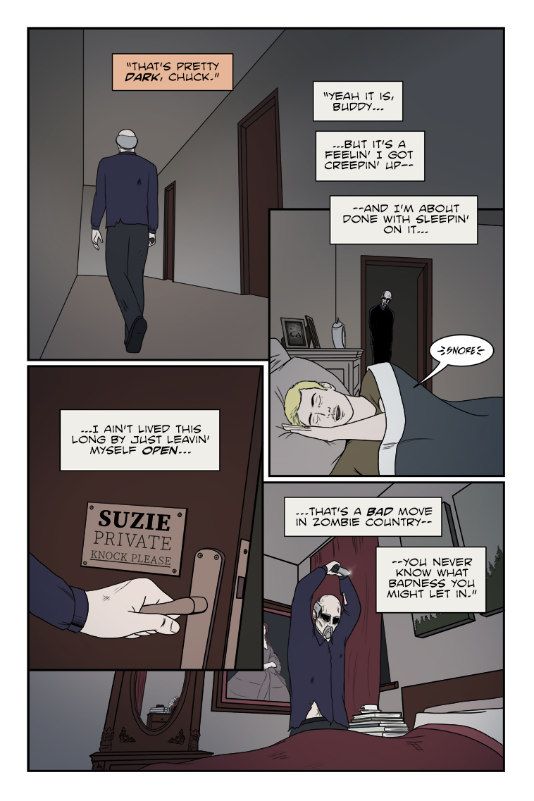
539 – A Knife In The Dark (END OF EPISODE 22)
Happy Holidays, all! That's a wrap (heh) for Episode 22 just in time for a Christmas cliffhanger! Hope we don't twist the knife too much...
See y'all in 2025 when Zombie Ranch continues!
Practice makes adequate: the writer sketch
Calendar
Writer’s Blog Archives