Cart
Product categories
Support Us!
If you like what I do please support us on Ko-fi or Patreon.
Follow Us!
Join Our Newsletter!
Vote For Us!
Login
Polls
Events
-
Pasadena Comic Con
Dates: May 24
Location: Pasadena Convention Center, 300 E Green St, Pasadena, CA 91101, USA ( MAP)Details:We will be at the Pasadena Comic Con on January 26th. See some of you there for this one day event!
Purchase tickets online at here: https://www.tixr.com/groups/pcc/events/pasadenacomiccon-pasadena-comic-con-2025-115248
-
San Diego Comic Con: SP-N7
Dates: Jul 23 - 27
Location: San Diego Convention Center, 111 Harbor Dr, San Diego, CA 92101, USA ( MAP)Details:Clint & Dawn Wolf will be at San Diego Comic Con, as Lab Reject Studios. We will be at booth N7 in Small Press.


5 thoughts on “Issue 22 Cover”
Dr. Norman (not a real doctor)
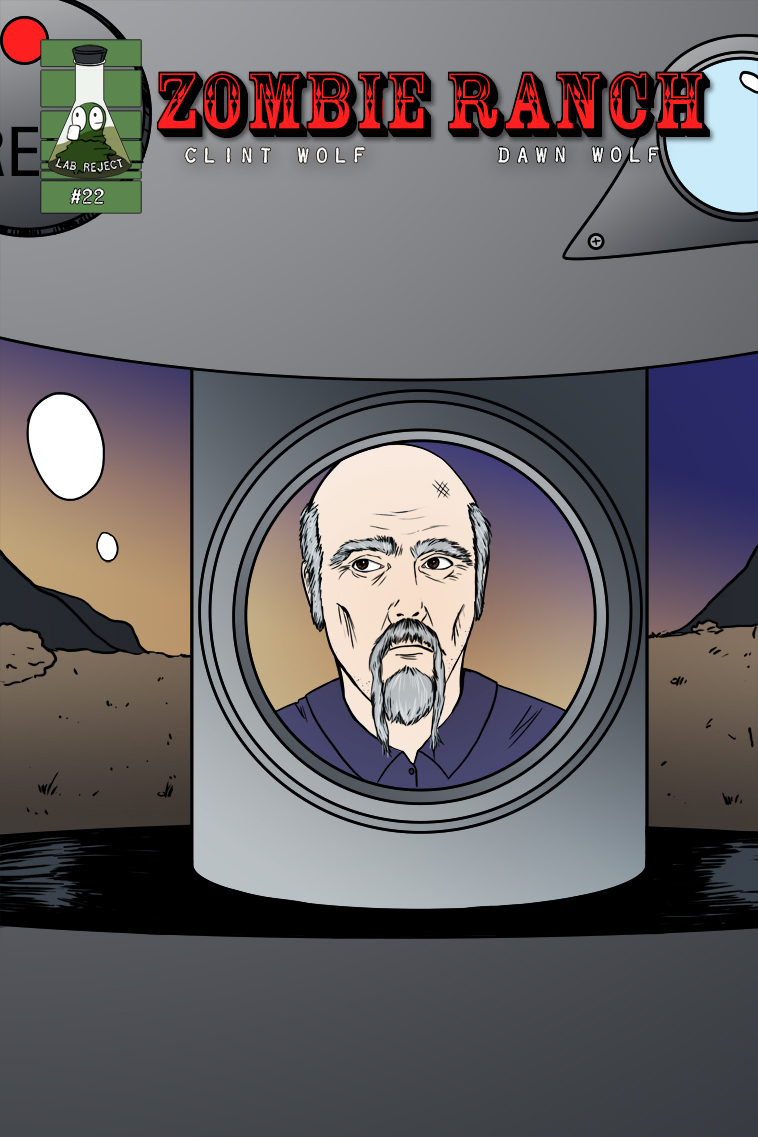
Ooohhh … He looks – desperate.
Zombatar
No hat. He lost his hat. Which had a lot of his personality. Alert! Alert! We have a Lost Hat emergency! This is Not a Drill! Alert! Alert!
Scarsdale
Hang in there, I’m a retired fireman, and those pictures/videos have me sweating… The closest thing to a forest fire I ever fought was when a stupid tried to burn raked leaves on a windy day. 4 houses! Mostly grass and bush fires but, yeah.
Clint
Good news, we are back at home and there was a home to return to. It’s been a crazy week and a serious near miss seeing as several other homes on our block burned. Terrible stuff but the Ranch persists.
Honzinator
Welcome back.
My mom’s whole town, Monrovia, seems to have survived so far, too, but it ain’t over yet.
Latest Comics
#381. 366 – Practical Tragic
17 Jan 31, 2018
#380. 365 – The Philosopher’s Tone
17 Jan 24, 2018
#379. 364 – In Memoriam
15 Jan 17, 2018
#378. 363 – Broken Records
17 Jan 10, 2018
#377. 362 – Civilian Investigation
17 Dec 13, 2017
#376. 361 – Zeke, Interrupted
15 Dec 06, 2017
#375. 360 – Baiting A Trap
20 Nov 29, 2017
#374. 359 – The Z-Roll
14 Nov 22, 2017
#373. 358 – Gut Feelings
13 Nov 15, 2017
#372. 357 – Monsters Watching Monsters
14 Nov 08, 2017
#371. 356 – A Screwed Up Shindig
21 Nov 01, 2017
#370. 355 – Smoker’s Remorse
16 Oct 25, 2017
#369. 354 – Deathbed Confessional
17 Oct 18, 2017
#368. 353 – Prompt Failure
17 Oct 11, 2017
#367. 352 – Ill Humor
14 Oct 04, 2017
#366. 351 – Dying On The Inside
14 Sep 20, 2017
#365. 350 – Threats And Whispers
14 Sep 13, 2017
#364. 349 – Liberties And Justice
18 Sep 06, 2017
#363. 348 – Don’t Mess
16 Aug 30, 2017
#362. 347 – Yesteryear’s Special
13 Aug 23, 2017
Latest Chapters
Episode 22
Episode 21
Episode 20
Episode 19
Episode 18
Episode 17
Issue 22 Cover
Traditional post-issue comic cover! Episode 23 is currently TBA but we're hoping to have the first page out on January 22nd so as to not leave y'all hanging from the proverbial cliff for too long.
[1/9/2025 NOTICE: Some of you may know we live in the Greater L.A. Area and if you've heard about the wildfires here: yep, we're currently evacuated from our home and still unsure as to its fate. We grabbed our computers and backup drives so whatever happens we still have our files, but definitely expect some delays and cross your fingers that the worst we're going to end up having to do is throw food out of the fridge due to power loss.]
[1/11/2025 UPDATE: Good news, we are back at home and there was a home to return to. It's been a crazy week and a serious near miss seeing as several other homes on our block burned. Terrible stuff but the Ranch persists.]
What’s in a million?
Calendar
Writer’s Blog Archives