UPDATING OCCASIONALLY (FOR NOW)

3 thoughts on “536 – Great State Of Tech Sass

  1. Amusing spam above … Things are about to get weird with Casa De Chuck!

    1. Ugh, I try to get to the SPAM quicker but we have a new kitty and I have been distracted. It is gone now. 😀

  2. New kitty tops spam any day … and I enjoy getting to see it in it’s brief lifespan.

Leave a Reply

Your email address will not be published. Required fields are marked *

*


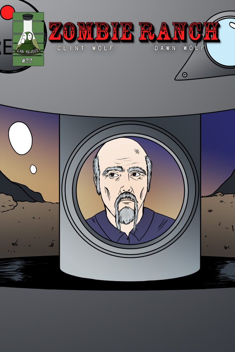
536 – Great State Of Tech Sass

Welcome to Team Paranoid, Oscar! Spoiler alert: they really are out to getcha!

Next comic page planned for Nov. 20th. In the meantime, please accept this documentary evidence of new kitten Morgoth as he discovers the enigma that is the empty soda box.

The art of comics storytelling

At APE I had an all-too-brief discussion with one of our neighbors about the balance of art versus storytelling in the comics medium. The premise of the conversation is already on shaky territory because ideally, any and all art in comics is storytelling, but I understood exactly what she meant when she brought it up. Is it possible for the art to get too wrapped up in itself, in just its own existence and cleverness, rather than telling an effective tale? Of course it is, just as its possible for a writer to fall in love with their words so much that it seems even they forgot what they were writing about. Just as it’s possible for a film director to get so enthusiastic about tricky camera techniques and effects that when you walk out of the theater you’re not sure what, if anything, actually happened. In comics this can be exacerbated by the common circumstance of a writer and artist being two different people, each struggling to find and promote their own identity, but it can also happen in solo authorship. The discussion then becomes a matter of determining where the borderline falls between experimentation and incomprehensibility, and that’s a line that I’ve found to be very subjective. For example, I found not only the movie but the original graphic novel of 30 Days of Night to be unsatisfying, and while I won’t go into my reasons on the movie here, I’ll say that the comic didn’t work for me mainly because of Ben Templesmith’s art. It was repeatedly making me stop to try to figure out what I was looking at, or worse, pulling me entirely out of the serious tone of the story by doing things like writing out the decidedly non-onomatopoeic word ‘Jump’ as a sound effect. I’m not saying Templesmith is a bad artist by any means, but in the more extreme cases I feel like I’m needing a machete and a mining helmet to hack through his imagery and get to the tale trying to be told. His imitators are even worse, where sometimes it looks like they took sketches straight from their storyboards and used them as the finished panels; including, in at least one example burned into my brain from a Comic-Con freebie, the liner notes. Generally speaking, I believe if you have to label the scalpel on the table with the word ‘scalpel’ and an arrow pointing to it, it looks less clever and meta and more like you just gave up trying to draw it coherently. Maybe in a parody setting it would work, but it always seems to end up in dark crime/horror comics. Nossir, I don’t like it. They might be going for a simulation of madness, but all I’m seeing is unnecessary clutter. Given that, you might think I’d be similarly down on the work of Bill Sienkiewicz, and yet he falls on the proper side of the borderline for me despite having very, very stylized imagery. If you ask me why, I’d just have to say I feel like it’s riding the edge, but I still get a sense first and foremost of the story being told. Even without a single word involved, I look at these examples, for instance, and I get a lot more sense of what’s happening and what’s being felt than in the Templesmith art. Your mileage may vary, but that’s how my dashboard reads. In a similar manner, my neighbor and I specifically discussed J.H. Williams III’s very stylized artwork on the Batwoman Detective Comics, and how much we enjoyed it. JHW III first came to bigtime attention drawing Promethea for no less than Alan Moore, where his dream and nightmare visions and non-standard paneling choices were a perfect fit to the story being woven. But compare the differences in Alan Moore’s prose style to Greg Rucka’s and you might have serious questions if the same lavish and experimental compositions would work in a gritty mainstream superhero setting. It does. It fits. Would it fit with Superman? That I don’t know about, but for Batwoman and especially Gotham, it works. Gotham City is a crazy, crazy place, almost more of a state of mind than a physical location. The good lunatics battle the evil lunatics for the town’s soul, but for me there’s exactly one sane man in that whole place, and his name is Gordon. Not Wayne. Not Kane. Gotham is a place of dreams and nightmares where everything is so much larger than life that a man (or woman) dressed as a bat is fearsomely serious and the most fearsome villain is literally a complete joke. The best Batman stories have always been psychodramas, so why not the best Batwoman stories? Promethea was closer than I originally thought. But what also helps Williams’ case is that he knows how and when to change things up. The scenes with Kate Kane are presented in a much more straightforward style than the wild exploits of her alter ego, drawing a deliberate contrast between the two. The stark, jagged borders of panels in one series of pages melt and flow together when our hero gets drugged, losing her sense of time and space (and remember in comics, time is space). That’s when I feel like there’s some real thought going on behind each stroke of the pencil, and that’s when I feel really, really impressed by an artist, even in the cases where a writer (like Moore) might be laying everything out for them. Whether that art happens to be fairly simple or gorgeously impressionistic doesn’t matter. Whether it’s a bog standard grid or some crazy moebius strip splash page doesn’t matter. What matters is how appropriately and seamlessly that choice of presentation melds with the story, and in the absolute best examples out there, enhances it. As I said in the beginning, the actual conversation was all-too-brief and didn’t even have the opportunity to get to most of what I’ve brought up here, and even this much is a poor surface scratch of the concept. I’ll just leave you with one last point to ponder on art supporting story, which Dawn touched on briefly several weeks ago when she brought up the deceptively simple layout of Watchmen. Every last page in Watchmen is made up of an identically sized grid of 9 panels. Occasionally this border or that border in the grid is removed, but that same size and shape remains constant throughout. Space as time, ticking away inexorably from beginning to end. Like clockwork.