Cart
Product categories
Support Us!
If you like what I do please support us on Ko-fi or Patreon.
Follow Us!
Join Our Newsletter!
Vote For Us!
Login
Polls
Events
-
Pasadena Comic Con
Dates: May 24
Location: Pasadena Convention Center, 300 E Green St, Pasadena, CA 91101, USA ( MAP)Details:We will be at the Pasadena Comic Con on January 26th. See some of you there for this one day event!
Purchase tickets online at here: https://www.tixr.com/groups/pcc/events/pasadenacomiccon-pasadena-comic-con-2025-115248
-
San Diego Comic Con: SP-N7
Dates: Jul 23 - 27
Location: San Diego Convention Center, 111 Harbor Dr, San Diego, CA 92101, USA ( MAP)Details:Clint & Dawn Wolf will be at San Diego Comic Con, as Lab Reject Studios. We will be at booth N7 in Small Press.


3 thoughts on “543 – Cradles And Graves”
Keith
Oh lordy, they really are a great couple…though, I suggest adopting.
Anonymous
Consequences be damned, because doing nothing might be worse.
Tommyguada
hi
Latest Comics
#325. 312 – Bad Noose Bearer
13 Oct 26, 2016
#324. 311 – Admission Statement
10 Oct 19, 2016
#323. 310 – Daddy Issues
18 Oct 12, 2016
#322. 309 – Sense And Sensitivity
13 Oct 05, 2016
#321. 308 – “Offally” Insistent
11 Sep 21, 2016
#320. 307 – The Unburied Fed
11 Sep 14, 2016
#319. 306 – Fault Lines
10 Sep 07, 2016
#318. 305 – Insufficiently Armed
10 Aug 31, 2016
#317. 304 – BMX-ceptions
11 Aug 10, 2016
#316. 303 – Lines In The Sand
12 Aug 03, 2016
#315. 302 – Hazy Optimism
12 Jul 13, 2016
#314. 301 – Conflicting Directions
29 Jul 06, 2016
#313. 300 – Errors Of Judgment
43 Jun 29, 2016
#312. 299 – Not Ready For Primetime
42 Jun 22, 2016
#311. 298 – Who Wakens The Watchmen?
42 Jun 08, 2016
#310. 297 – Going Under Cover
47 Jun 01, 2016
#309. 296 – Victims And Circumstances
44 May 25, 2016
#308. EPISODE THIRTEEN
48 May 23, 2016
#307. 295 – Reality Ensues (END OF EPISODE 12)
46 May 11, 2016
#306. 294 – Let It Go
46 May 04, 2016
Latest Chapters
Episode 22
Episode 21
Episode 20
Episode 19
Episode 18
Episode 17
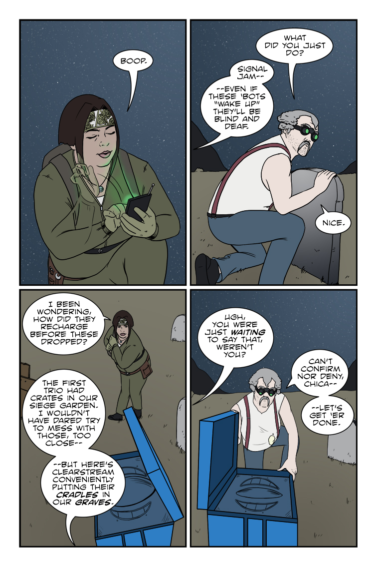
543 – Cradles And Graves
Chuck sez: "Never let a covert operation get in the way of a bad pun."
Flash and substance – dissecting a comics layout
- Finally, we have the choice of how to display the lone line of dialogue: in… between… moments. There is a real sense of velocity here because there’s no time to say anything lengthy. There’s not even time to say a short sentence in the space of a single panel, it takes three of them to utter what at most would be two seconds of words. This neatly follows the idea of a page where the protagonist descends from top to bottom at a rate of hundreds of feet per second, and is most likely also why the sound effect of the breaking window is isolated and unfinished–Flash hits the street before the glass has stopped tinkling.
By setting all this up, Manapul and Buccellato were able to split what could’ve been left as a lazy splash page (last panel sound effects notwithstanding) into 11 segments that tell the story far more effectively, even if five of the panels are there mainly for completeness and contrast. It’s a carefully crafted piece that draws your attentions exactly where they need to go and makes you feel exactly what you’re meant to feel, and does it so well we don’t need a lick of duo-specific narration from our hero explaining what’s happening or what he’s doing–and that’s important considering this is a situation happening so fast he should be running on instinct. That old silver age silliness of “Only a fraction of a second to react!” plays out exactly where it should for a piece needing that frame of immediacy–unspoken, unthought, except as a given to the actions occurring; a feature especially important to a superhero like The Flash where speed should be a major theme of the physicality. There were several impressive moments like this in the comic, and I highly recommend picking it up if you want to experience some enthusiastic pros at work with great visual instincts on how to guide a reader’s eye. I didn’t need to be a fan of The Flash to know that these guys are, and that they’re having some great fun with the opportunity they’ve been granted to not only reboot a classic hero, but show the storytelling core of that hero in a way only comics can do. In any case, I hope this article explained a bit more about my views on how all the aspects of a comic’s presentation can contribute to the tale being told. These are lofty heights we probably only rarely achieve with Zombie Ranch (if ever) but they’re something I feel important to keep in mind and strive for as a creator. When it’s done right, it’s the kind of work that really inspires, and makes the medium shine.Calendar
BlueSky Latest Posts
Writer’s Blog Archives