Cart
Product categories
Support Us!
If you like what I do please support us on Ko-fi or Patreon.
Follow Us!
Join Our Newsletter!
Vote For Us!
Login
Polls
Events
-
Pasadena Comic Con
Dates: May 24
Location: Pasadena Convention Center, 300 E Green St, Pasadena, CA 91101, USA ( MAP)Details:We will be at the Pasadena Comic Con on January 26th. See some of you there for this one day event!
Purchase tickets online at here: https://www.tixr.com/groups/pcc/events/pasadenacomiccon-pasadena-comic-con-2025-115248
-
San Diego Comic Con: SP-N7
Dates: Jul 23 - 27
Location: San Diego Convention Center, 111 Harbor Dr, San Diego, CA 92101, USA ( MAP)Details:Clint & Dawn Wolf will be at San Diego Comic Con, as Lab Reject Studios. We will be at booth N7 in Small Press.


9 thoughts on “542 – Catching Up”
Keith
Some friction, but yeah. IRL, I’d like these two…they should have kids. 😉
Dawn
I might have to draw out what their kid would look like. First thought is that their kid would look like Ongo Gablogian from “It’s Always Sunny In Philadelphia”
Scarsdale
He’s pushing 60, she’s maybe 30, more likely less. Chuck is most likely shooting blanks, and besides, he’s talking to her like a baby sister than a love interest.
Keith
Up in these hills, sometimes family is all y’gots. 😉
ConcordBob
It is really hard to have a favorite character, as there are so many good ones. But I think Rosa is my favorite. Chuck is a good accomplice in sneaking work, but not much for romance. Uugh.
Otaku
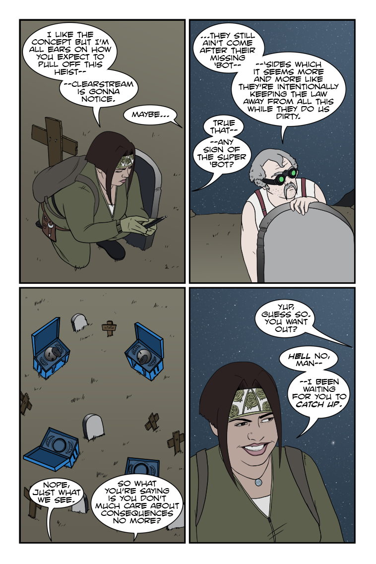
I mean, if they don’t have at least an inkling of what’s going down, I’m actually disappointed in Clearstream. If anything, I’m starting to wonder if they caught on and realized “Wait, we can use this.”
Because of course they can. 😉
Dr. Norman (not a real doctor)
I’m way ahead of you – I’ve been waiting for you to catch up. From November 2020:
I would hope for nothing less – her and Chuck have the potential for a great deal of positive mischief.
Speaking of which, I received the email notifying me that my order for the NSFW “Chuck and Rosa Finally Do It” (age verification required) limited edition hardcover is going to be delayed due to the pandemic. I think it’s really cool that you’ll be adding some additional stretch goal goodies when it ships – thanks for all your story and art.
As for the inscription, ” We owe it all to you ” will be sufficient.
Crazyman
Partners in crime! 😈
TKG
A crime so perfect she went full on wall-eye!
Latest Comics
#204. 196 – Suffering From A Code
12 Jan 22, 2014
#203. 195 – Oh, You Didn’t Know?
14 Jan 15, 2014
#202. 194 – Suzie Get Your Gun
16 Jan 08, 2014
#201. 193 – Got A Bit Of Red On You
17 Dec 25, 2013
#200. 192 – Bridging An Understanding
23 Dec 18, 2013
#199. 191 – No Waiting
21 Dec 11, 2013
#198. 190 – Exceptional Service
22 Dec 04, 2013
#197. 189 – Bad Mojo
20 Nov 27, 2013
#196. 188 – Calm After The Storm
18 Nov 20, 2013
#195. 187 – Drama Surgery
20 Nov 13, 2013
#194. 186 – Technicalities
19 Nov 06, 2013
#193. 185 – The Sixth Stage Of Grief
19 Oct 30, 2013
#192. 184 – La Siesta
19 Oct 23, 2013
#191. 183 – Communication Breakdown
24 Oct 09, 2013
#190. 182 – Isolated Incident
18 Oct 02, 2013
#189. 181 – What Happened Last Night
37 Sep 25, 2013
#188. 180 – Nothing Up His Sleeve
35 Sep 18, 2013
#187. 179 – The Most Dangerous Game
39 Sep 11, 2013
#186. 178 – Revision History
32 Sep 04, 2013
#185. 177 – An Uplifting Presentation
55 Aug 28, 2013
Latest Chapters
Episode 22
Episode 21
Episode 20
Episode 19
Episode 18
Episode 17
542 – Catching Up
Now you're getting the idea, Chuck!
Flash and substance – dissecting a comics layout
- Finally, we have the choice of how to display the lone line of dialogue: in… between… moments. There is a real sense of velocity here because there’s no time to say anything lengthy. There’s not even time to say a short sentence in the space of a single panel, it takes three of them to utter what at most would be two seconds of words. This neatly follows the idea of a page where the protagonist descends from top to bottom at a rate of hundreds of feet per second, and is most likely also why the sound effect of the breaking window is isolated and unfinished–Flash hits the street before the glass has stopped tinkling.
By setting all this up, Manapul and Buccellato were able to split what could’ve been left as a lazy splash page (last panel sound effects notwithstanding) into 11 segments that tell the story far more effectively, even if five of the panels are there mainly for completeness and contrast. It’s a carefully crafted piece that draws your attentions exactly where they need to go and makes you feel exactly what you’re meant to feel, and does it so well we don’t need a lick of duo-specific narration from our hero explaining what’s happening or what he’s doing–and that’s important considering this is a situation happening so fast he should be running on instinct. That old silver age silliness of “Only a fraction of a second to react!” plays out exactly where it should for a piece needing that frame of immediacy–unspoken, unthought, except as a given to the actions occurring; a feature especially important to a superhero like The Flash where speed should be a major theme of the physicality. There were several impressive moments like this in the comic, and I highly recommend picking it up if you want to experience some enthusiastic pros at work with great visual instincts on how to guide a reader’s eye. I didn’t need to be a fan of The Flash to know that these guys are, and that they’re having some great fun with the opportunity they’ve been granted to not only reboot a classic hero, but show the storytelling core of that hero in a way only comics can do. In any case, I hope this article explained a bit more about my views on how all the aspects of a comic’s presentation can contribute to the tale being told. These are lofty heights we probably only rarely achieve with Zombie Ranch (if ever) but they’re something I feel important to keep in mind and strive for as a creator. When it’s done right, it’s the kind of work that really inspires, and makes the medium shine.Calendar
BlueSky Latest Posts
Writer’s Blog Archives