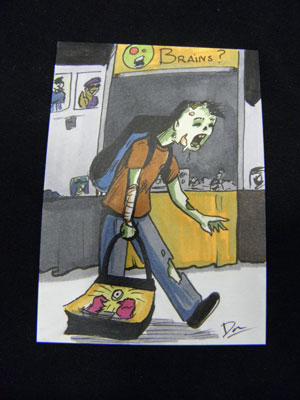
 So we’re back, and I can honestly say this was a very, very different Comic-Con than we’ve ever experienced in the past. I don’t know why that came as any sort of surprise, since I kept repeating that to myself and others prior to last week, but it’s akin to the difference between being told that the exhibit hall is big enough to land a small plane in, and actually getting in there and seeing just how overwhelmingly big it is. We had three SDCC “virgins” this year in our immediate circle and every one of them was still shocked despite my descriptions.
Two of those noobs happened to be my mom and dad, who were able to attend for the first time ever as part of our exhibitor staff quotient for Lab Reject Studios. Mom is an old-school Trekkie (seriously, one of the houses I grew up in had the street number 1701), and dad used to take me to hole-in-the-wall comic shows in places like the Shrine Auditorium when I was a tyke, where I bought my first ever comic in the form of an issue of Groo the Wanderer. Dad and I both ended up loving Groo, and when Groo celebrated its 25th anniversary in 2007 I bought us matching Groo hats. Unfortunately, he lost his somewhere along the line, but Comic-Con gave him an opportunity to not only buy another but meet Sergio Aragones, who personally signed it for him! It’s like one of those universe-come-full-circle moments.
But back to exhibiting for the first time… wow. You get to be in early to set up, so on Wednesday I thought about walking around and checking things out before the crowds roared in and clogged all the aisles. Here’s the thing, though — the aisles are already quite clogged. Crates and boxes everywhere, forklifts rolling through, cherry pickers overhead… when you get in after it’s ready you never even really think about everything that had to happen to get those gigantic displays ready to go. When you’re there during the process, you fear for your life and I wanted nothing more than to quickly return to the relative safety of the Small Press area.
Also, they don’t turn on the air conditioning until Preview Night actually begins, so we were very smart to be wearing black t-shirts for our load-in. Toil and sweat, but luckily (at least in our case) no blood or tears.
Preview Night went about as expected, i.e. not one sale (except to my dad), and almost no one even stopping by the table. I didn’t get depressed, because Preview Night is not a night for Small Press, it’s when everyone goes swag grubbing on the other side where the big exhibitors (and their big promos) are. In fact I swear I saw some Small Press tables that didn’t even bother to show up at all that night. I was afraid that would be a big no-no, but again, not much traffic on our side of the Con.
Thursday was a different story. First thing in the morning, we got our special delivery of a custom made Zeke plushie, who would remain our mascot for the rest of our convention (you can see the pics listed on our Facebook page HERE). Rick Marson, the man behind the ZOM outbreak, sewed him up special for us in exchange for the donation we’d made to his Kickstarter project. Rick even went so far as to figure out ways to simulate the scars on Zeke’s arm and neck, despite his ZOM template not really having much of either.
Webcomic types I knew from online correspondence came by to say hello, such as Jon Del Arroz of Flying Sparks, Brock Beauchamp of Variables, and Andrew Russo of Part Time. Apparently when we left mom and dad watching the booth as we went out to lunch on Thursday, other people stopped by looking for us, but unfortunately neither parental unit took very good notes on that. Promotionally speaking, we did manage to hook up with the guys of Humerus and the gal who runs the San Diego Zombie Walk. A lot of free temporary tattoos were dispensed but so far I haven’t had any sightings in the Zombie Walk pictures, and she never made it back by our table on Sunday so we don’t know how that all went yet.
It was a whirl of a time, quite exhausting, and almost before we knew it the closing announcements were being made on the last day. In past years I’ve always had at least one amazing “high point” I could identify that made being at SDCC worth every penny, but this time there was nothing so dramatic… except, I think, exhibiting. I suppose being there, selling, was really the high point, and it just seems less intense for being spread out over several days. Other than the arrival of ZOM Zeke, from a vendor perspective I remember two moments that really stuck into my brain:
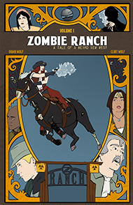
One, a lady came by and pulled out a piece of notebook paper with several entries. It was a list her friend, named Katie, had made for her of stuff to do at the convention, since Katie herself had been unable to attend. Our comics were on that list, and Katie had also gone to the trouble of baking up some homemade banana bread as a thank-you gift. Thank you for what? Well, for making Zombie Ranch, I suppose.
Two, a gentleman approached our booth, gave a quick glance over our stuff, and bought a Special Edition copy of Zombie Ranch #1. Yeah, the same one we have for offer in the store, the one that costs $20. Don’t get me wrong, we’ve sold these to people we didn’t know before, but usually only after they’ve listened to the concept, maybe checked out the samples, and decided we were cool to talk to. This guy was someone we’d never met, and furthermore who’d never heard of Zombie Ranch until he walked by the table, and he cracked open his wallet and presented us with Andrew Jackson’s blowdried mug. The marketing side of me was sorely tempted to quiz him on what prompted the sale, but in the end I figured I’d just better shut up and take the money before he regained his sanity. NO REFUNDS.
Seriously, though, I hope that he enjoys his purchase, or at least doesn’t regret it. We ended up selling more issues of the comic during SDCC than we have at any other comic convention, by a long shot. Part of that was having Issue #2 for in-person sales for the first time, part of it was a result of friends and family either adding to their collection or finally getting around to picking up print versions in support of our effort… but still, a lot of those comics went out to brand new people who seemed genuinely intrigued with our idea. And then of course there were the hundreds of postcard fliers we gave away to those who might not have had the money or inclination for a print issue but might come join the crew reading for free online. This time, unlike the disappointment of last year’s jaunt with the freebie table, I could be fairly sure the people picking up the cards had looked at what they were about.
I was also quite happy with our friendly neighbors on both sides, and the Small Press area’s prime location near both bathrooms and refreshments. Even if there were times Dawn and I lamented that we were missing out (this was the first Comic-Con where neither of us made it to ANY panels whatsoever), even if it was rough getting up every morning at the same damn time I usually get up to go to work, I’d have to say our previous attendee experience, some careful preparations and planning, and a good dose of improvisation carried us through the Big One with a good amount of smoothness for a first time. I’m really glad it wasn’t our first convention, but in any case, we’ve already turned in our paperwork and begun preparing for next year. Even though SDCC became a working vacation rather than just a pure party for us, we’re ready and more than willing to do it all over again.
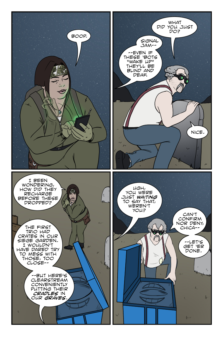
Chuck sez: "Never let a covert operation get in the way of a bad pun."







2 thoughts on “543 – Cradles And Graves”
Keith
Oh lordy, they really are a great couple…though, I suggest adopting.
Anonymous
Consequences be damned, because doing nothing might be worse.