Cart
Product categories
Support Us!
If you like what I do please support us on Ko-fi or Patreon.
Follow Us!
Join Our Newsletter!
Vote For Us!
Login
Polls
Events
-
Pasadena Comic Con
Dates: May 24
Location: Pasadena Convention Center, 300 E Green St, Pasadena, CA 91101, USA ( MAP)Details:We will be at the Pasadena Comic Con on January 26th. See some of you there for this one day event!
Purchase tickets online at here: https://www.tixr.com/groups/pcc/events/pasadenacomiccon-pasadena-comic-con-2025-115248
-
San Diego Comic Con: SP-N7
Dates: Jul 23 - 27
Location: San Diego Convention Center, 111 Harbor Dr, San Diego, CA 92101, USA ( MAP)Details:Clint & Dawn Wolf will be at San Diego Comic Con, as Lab Reject Studios. We will be at booth N7 in Small Press.


9 thoughts on “542 – Catching Up”
Keith
Some friction, but yeah. IRL, I’d like these two…they should have kids. 😉
Dawn
I might have to draw out what their kid would look like. First thought is that their kid would look like Ongo Gablogian from “It’s Always Sunny In Philadelphia”
Scarsdale
He’s pushing 60, she’s maybe 30, more likely less. Chuck is most likely shooting blanks, and besides, he’s talking to her like a baby sister than a love interest.
Keith
Up in these hills, sometimes family is all y’gots. 😉
ConcordBob
It is really hard to have a favorite character, as there are so many good ones. But I think Rosa is my favorite. Chuck is a good accomplice in sneaking work, but not much for romance. Uugh.
Otaku
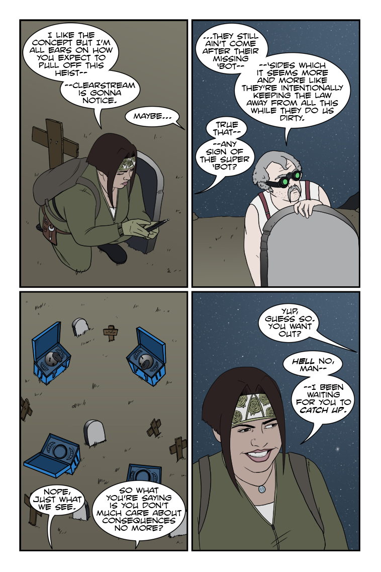
I mean, if they don’t have at least an inkling of what’s going down, I’m actually disappointed in Clearstream. If anything, I’m starting to wonder if they caught on and realized “Wait, we can use this.”
Because of course they can. 😉
Dr. Norman (not a real doctor)
I’m way ahead of you – I’ve been waiting for you to catch up. From November 2020:
I would hope for nothing less – her and Chuck have the potential for a great deal of positive mischief.
Speaking of which, I received the email notifying me that my order for the NSFW “Chuck and Rosa Finally Do It” (age verification required) limited edition hardcover is going to be delayed due to the pandemic. I think it’s really cool that you’ll be adding some additional stretch goal goodies when it ships – thanks for all your story and art.
As for the inscription, ” We owe it all to you ” will be sufficient.
Crazyman
Partners in crime! 😈
TKG
A crime so perfect she went full on wall-eye!
Latest Comics
#364. 349 – Liberties And Justice
19 Sep 06, 2017
#363. 348 – Don’t Mess
15 Aug 30, 2017
#362. 347 – Yesteryear’s Special
14 Aug 23, 2017
#361. 346 – Dramatic Irony
18 Aug 16, 2017
#360. 345 – Supervisory Advisory
47 Aug 09, 2017
#359. 344 – A View From The Top
46 Aug 02, 2017
#358. EPISODE FIFTEEN
52 Aug 01, 2017
#357. 343 – Howdy (END OF EPISODE 14)
46 Jul 12, 2017
#356. 342 – Loaded Memories
48 Jul 05, 2017
#355. 341 – Partial Recovery
14 Jun 28, 2017
#354. 340 – Parting Shots
8 Jun 21, 2017
#353. 339 – Not Just An Expletive…
10 Jun 07, 2017
#352. 338 – High-Risk Assurance
15 May 31, 2017
#351. 337 – Jumping At Shadows
12 May 24, 2017
#350. 336 – Motivational Viewing
20 May 17, 2017
#349. 335 – Pumping The Breaks
12 May 10, 2017
#348. 334 – Numbers Game
12 May 03, 2017
#347. 333 – Conflicts Of Interest
15 Apr 26, 2017
#346. 332 – Silent Running
14 Apr 19, 2017
#345. 331 – Whispered Opportunities
16 Apr 12, 2017
Latest Chapters
Episode 22
Episode 21
Episode 20
Episode 19
Episode 18
Episode 17
542 – Catching Up
Now you're getting the idea, Chuck!
Sex and the single artist
“Thank you for your overwhelming support of the Comic Creator Connection. We have now filled all the open spots for writers, but still have openings for artists. “
Emphasis theirs. I’m surprised I haven’t seen one of these where they offer free drink tickets to any artists that sign up. What if 50 writers show up and only 10 artists? Well, it might be awkward, but let’s just say I wouldn’t be surprised. Go through the submission guidelines for just about any comics publisher and they’ll be more than happy to hear from an artist looking for work, but writers usually need not apply. If you have a story pitch you’re shopping around to the independent outfits, the usual first question will be, “Do you have an artist for this?”. If not, you better be an established name or it’s almost unheard of that anyone will go through the trouble of hooking you up. So there’s a lot of writers seeking artists out there, because without one, it’s even worse than just going home alone… your comics story you want to tell is dead in the water. I’ve talked to several people at conventions where they’ve got a great idea, if they could just find someone willing to draw it. If they had the money, well, a lot of artists are ecstatic with the lot of getting paid to draw–suddenly you’re not just the random guy at the bar, you’re the random guy with the nice suit and the valeted Lexus–but a lot of writers are just as poor as the people they’re hoping to partner with. Collaborations without money involved can still happen, but you’ve got to have a fantastic personality to get past the dreaded line of “Well, when we make it big you’ll be part of that”. Artists hear that line a lot, and it’s about equivalent to “Of course I’ll respect you in the morning”. You better come off like a guy who’s willing and able to cook breakfast. One last thing I could bring up is the conventions. While I’ve had artists come by to show off portfolios for critique and occasionally a story tip or two, I’ve never had one ask me if I’m looking to take on any new writing projects. Contrast that with Dawn, who usually has at least one new business card from a hopeful writer any time I come back from a walkabout. That even happened once when I was present, but that was at Anaheim where we each had a full table so it looked like we might both be artists. If we’re together and I’m introduced as the writer then it’s probably equivalent to the lady at the bar saying “Oh hi, have you met my boyfriend?”. But hey, at least one guy took Dawn’s business card and then contacted her later. Several months later, and in a way that seemed like he was probably sending a similar (non-paying) pitch out to everyone he had a card from that could draw–but it’s nothing to take personally. He was perfectly polite and, as far as I know, took the rejection in stride. It’s not actually sex, after all, it’s just the needs of the business. Although really, if Alan Moore walked up to Dawn and said “Please draw my new comic”, all I would probably be able to think of to ask is, “Can I watch?”.Calendar
BlueSky Latest Posts
Writer’s Blog Archives