Cart
Product categories
Support Us!
If you like what I do please support us on Ko-fi or Patreon.
Follow Us!
Join Our Newsletter!
Vote For Us!
Login
Polls
Events
-
Pasadena Comic Con
Dates: Jan 26
Location: Pasadena Convention Center, 300 E Green St, Pasadena, CA 91101, USA ( MAP)Details:We will be at the Pasadena Comic Con on January 26th. See some of you there for this one day event!
Purchase tickets online at here: https://www.tixr.com/groups/pcc/events/pasadenacomiccon-pasadena-comic-con-2025-115248


7 thoughts on “539 – A Knife In The Dark (END OF EPISODE 22)”
Keith
Why am I not surprised.
Scarsdale
Typical, it’s always someone else’s fault. Revenge is not just best served cold, but by stupid too. “This is all your fault!” Which is wrong, but in his head, it’s right.
steelraven
It’s also been heavily hinted he has already been brain washed by the zombie worshiping cult.
Scarsdale
Which, no doubt, made easier because of that under-lying feeling. People are always looking for a scape-goat…
Clint
I don’t know if you got my callback by intent or not, but it’s great to see almost the same words echoed! https://www.zombieranchcomic.com/comic/203-breaking-worst/
RC
Honestly, probably the first time he’s ever taken control of and done ever in his life. There’s a reason why they kept him. Give a dog that’s been beat all its life a whiff of conference and control, you got a problem.
Crazyman
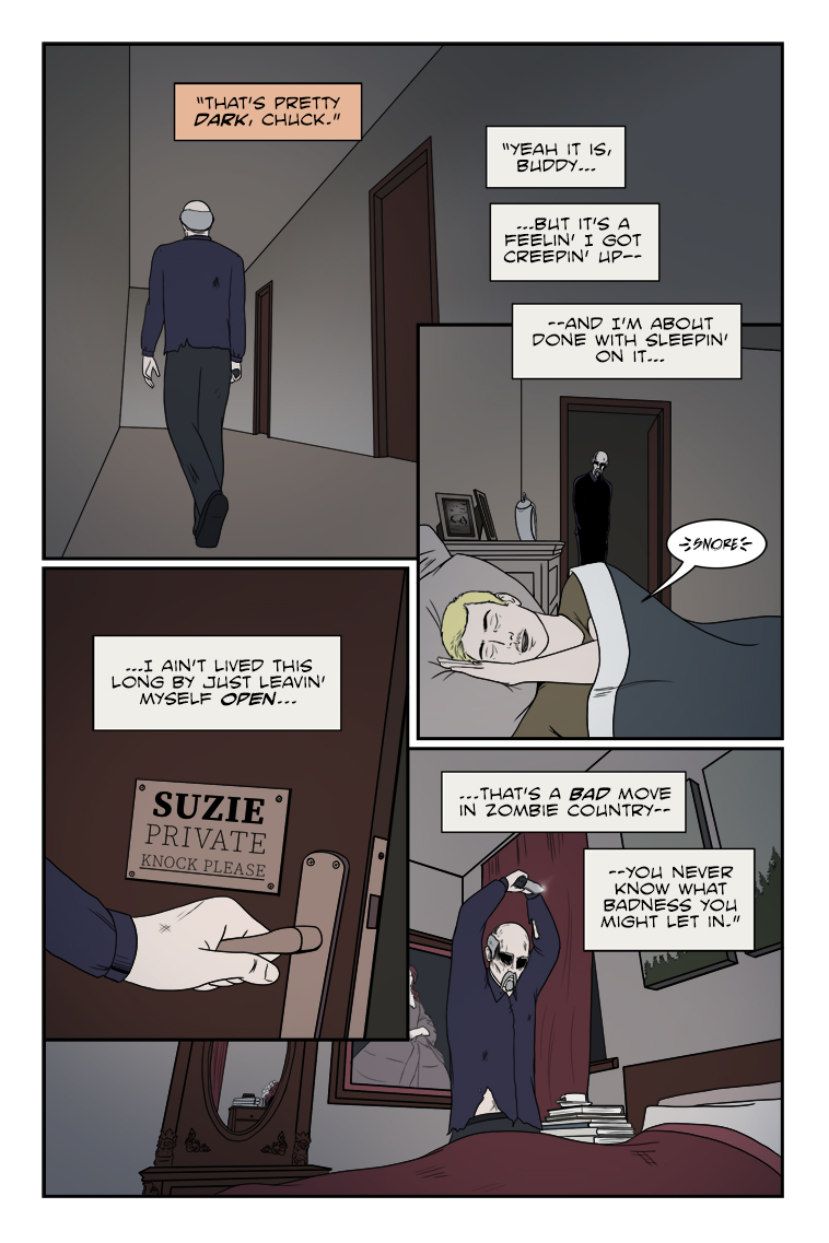
Imagine his surprise when he stabs a pillow. 😜
Latest Comics
#180. 173 – A Bang And A Whimper
14 Jun 26, 2013
#179. 172 – Rising Hatred
16 Jun 19, 2013
#178. 171 – Guilty As Charged
12 Jun 12, 2013
#177. 170 – The High Hand
10 Jun 05, 2013
#176. 169 – Frank Advice
12 May 22, 2013
#175. 168 – Poor Tactical Positioning
12 May 15, 2013
#174. 167 – The Punch Line
11 May 08, 2013
#173. 166 – Civilization Is The Last Resort
15 May 01, 2013
#172. 165 – Just Shoot Her
14 Apr 24, 2013
#171. 164 – Downed And Dirty
16 Apr 17, 2013
#170. 163 – We Got A Jumper
13 Apr 10, 2013
#169. 162 – No Time To Argue
12 Apr 03, 2013
#168. 161 – Just Following Orders
13 Mar 27, 2013
#167. 160 – Preaching On The Cross
15 Mar 20, 2013
#166. 159 – Spray And Pray
11 Mar 13, 2013
#165. 158 – Live Bait
12 Feb 27, 2013
#164. 157 – Don’t Get Cocky
12 Feb 20, 2013
#163. 156 – Out On A Limb
13 Feb 13, 2013
#162. 155 – Climb And Punishment
10 Feb 06, 2013
#161. 154 – Discretionary Valor
12 Jan 30, 2013
Latest Chapters
Episode 22
Episode 21
Episode 20
Episode 19
Episode 18
Episode 17
539 – A Knife In The Dark (END OF EPISODE 22)
Happy Holidays, all! That's a wrap (heh) for Episode 22 just in time for a Christmas cliffhanger! Hope we don't twist the knife too much...
See y'all in 2025 when Zombie Ranch continues!
The lettering of the law…
Calendar
Writer’s Blog Archives