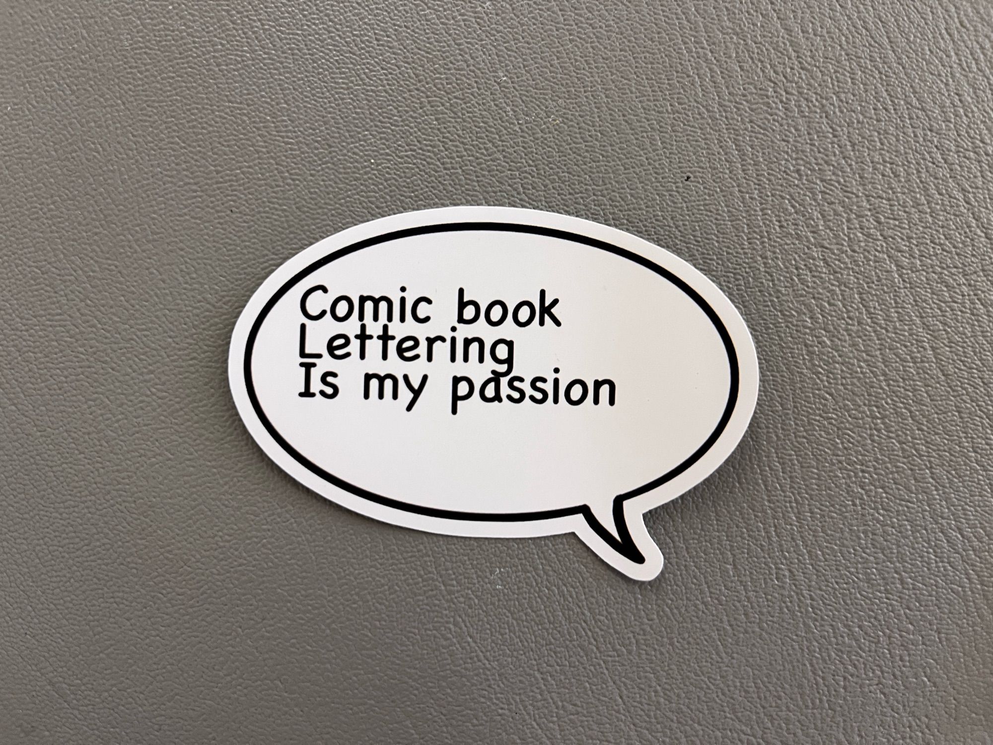
 As a layperson comics reader, would you see anything wrong with this? Maybe, maybe not. But it’s intentionally designed to trip the twitch switches of pro or semi-pro letterers. A sampling:
1) Left-justified text, meaning the paragraph is straight up and down on the left side but varies on the right. It’s standard in writing novels and such but tends to look very odd within the word balloons that are the standard method of delivery for comics dialogue. That’s why the convention is to center the text and ideally go for a “diamond” shape where possible to complement the balloon that contains it.
2) Speaking of which, the word balloon (while nice-looking on its own) is way too big for the text inside. It’s something I still wrassle with occasionally but you try to keep it from being too tight or too loose with regards to whitespace. This paragraph is not only left-justified but not even centered within the balloon itself.
3) Lack of all caps for your dialogue isn’t a big deal these days, but having three capital letters in the same sentence is… oof. As a bonus one of the caps is a crossbar capital “I” which editors would often consider a no-no to use in comics at all unless it’s on its own or part of an apostrophe situation.
4) Comic Sans is the font choice. This might be the least sinful overall to me, in fact when we first started the comic we were using it and you can still see it in the first issue or so. But there are a lot of people who really, really don’t like it and consider it a sign of ignorance and amateurism. What’s been explained to me is that it’s not very well set up as a font design, which might be why there’s also the problem of the “g” in “Lettering” brushing up against the “a” in the next line. That could also be a line spacing problem though, everything just looks cramped.
Anyhow, lack of these lettering stylings is hardly a criminal act, and most are honestly there for the purpose of making comics easier to read, so if your audience can read it then so be it (barring of course an editor you need to get things past). I’ve seen all sorts of webcomics do all sorts of things and the above at least is still legible, even if it makes my brain itch. But if you truly do have a passion for comic book lettering, it’s worth figuring out some of the basics even if you plan to break them later on.
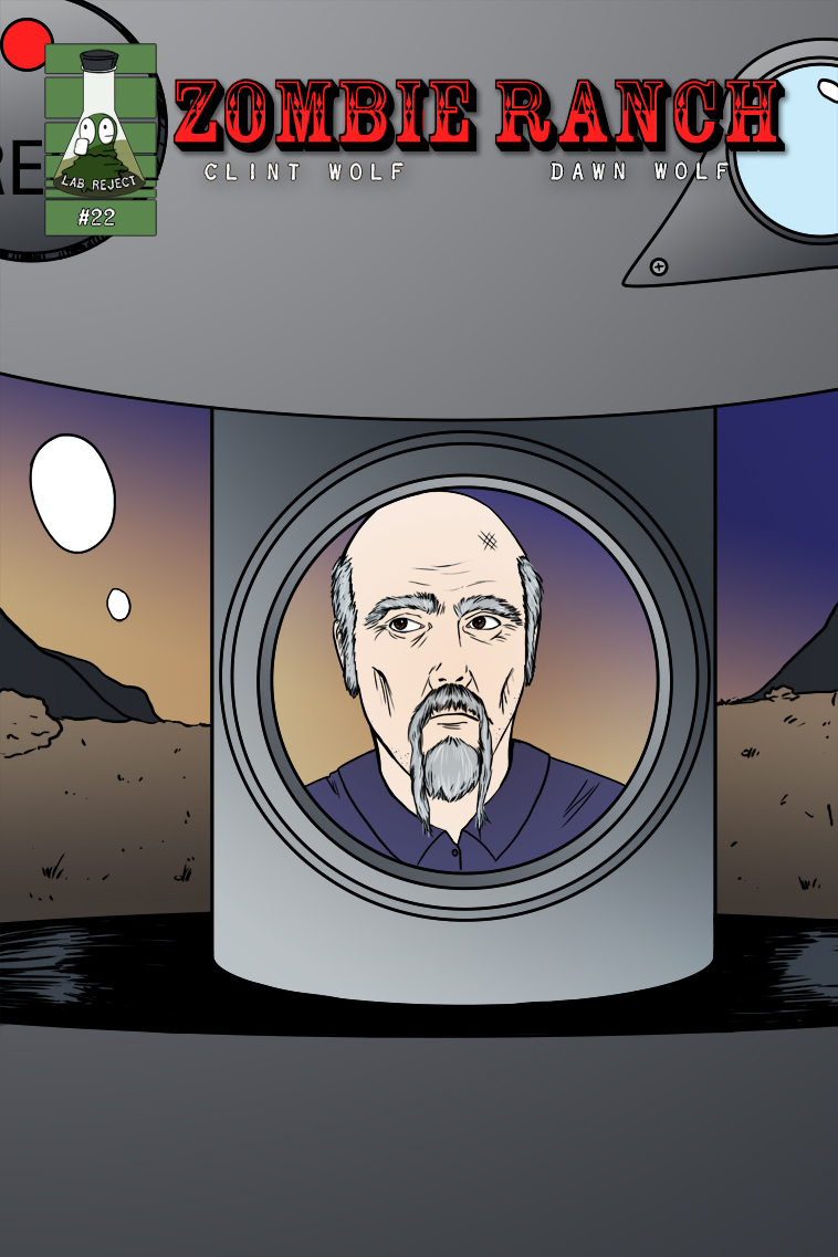
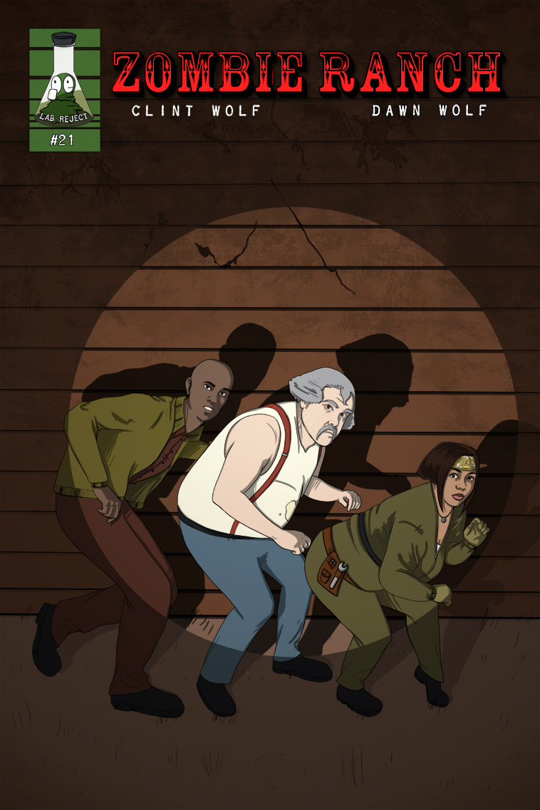
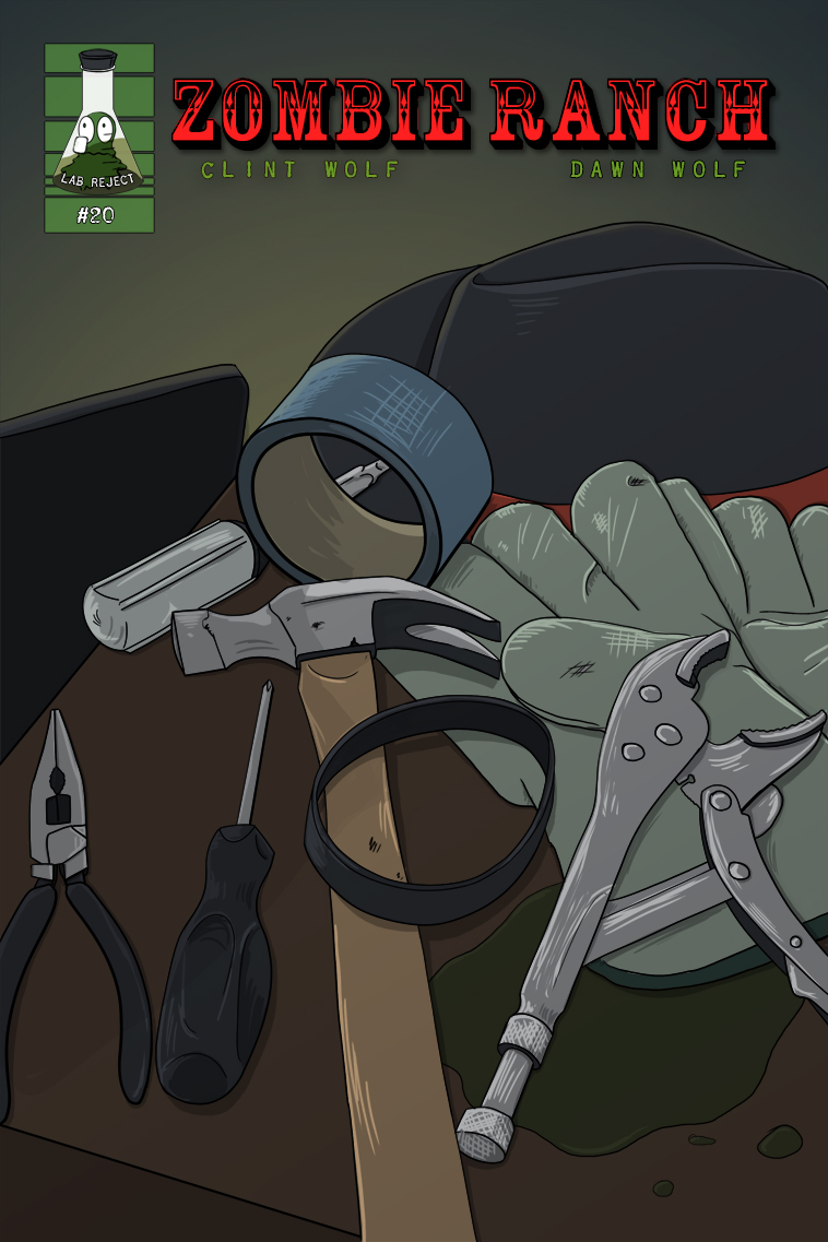
 Traditional post-issue comic cover! Episode 23 is currently TBA but we're hoping to have the first page out on January 22nd so as to not leave y'all hanging from the proverbial cliff for too long.
[1/9/2025 NOTICE: Some of you may know we live in the Greater L.A. Area and if you've heard about the wildfires here: yep, we're currently evacuated from our home and still unsure as to its fate. We grabbed our computers and backup drives so whatever happens we still have our files, but definitely expect some delays and cross your fingers that the worst we're going to end up having to do is throw food out of the fridge due to power loss.]




2 thoughts on “Issue 22 Cover”
Dr. Norman (not a real doctor)
Ooohhh … He looks – desperate.
Zombatar
No hat. He lost his hat. Which had a lot of his personality. Alert! Alert! We have a Lost Hat emergency! This is Not a Drill! Alert! Alert!