Biological needs

I remember the very first part of Max Brooks’ Zombie Survival Guide was a chapter devoted to establishing the physical rules of his version of the zombie. Here’s what the zombie virus (Solanum)  does. Here’s how long, on average, it takes to incubate. Here’s what the motor skills of the zombies are like. On and on, and you know what? It’s fine and fascinating stuff, and further than that is pretty crucial to establish early on before the rest of the book seeks to give advice on how to deal with them.

Zombie Ranch, by comparison, might frustrate someone who wants to know all the ins and outs of its version of the zombie as soon as possible. We got some of the more important bits (and bites) established in Episodes 1 & 2, but for all the media interludes and occasional narration by Suzie or Chuck, it occurs to me that I still have my share of “biology notes” left so far unshared with the audience.

But this is a different kind of story, with different kinds of primary characters than the researchers and doctors that could hold forth in other zombie tales. As Chuck demonstrates in this week’s comic, he himself doesn’t feel it necessary to know everything there is to know about zombies so long as he knows what’s important for his purposes. He also brings up the disquieting implication that such knowledge might not be encouraged outside of the processing labs and a few specialists, meanwhile blathering about how he’s convinced zombies need a certain amount of sunlight.

Is he crazy? Maybe. This is actually the part I love most about not having started off revealing every last detail of how zombies work in our Weird New West — the reader speculation that occurs as a result. The picking up on certain hints, like the scene with the goat in Episode 3 leading to people figuring out zombies were incapable of climbing, without us ever needing to explicitly say that. Meanwhile I’d like to think that the story has continued to successfully progress based on the information known. It probably helps that I really do have those notes, but at the moment it seems more fun for everyone and better for the narrative to keep them coming in small installments rather than a big dump.


Spring cleaning

A couple of years ago I made a blog post about the practice of creators going back and “renovating” their webcomic, basically fixing up their early work with a new coat of polish matching their later efforts, and the pros and cons of doing so. It remains a controversial subject, and man, sometimes it’s really tempting to revisit our earlier chapters, but our biggest worry is that dwelling on the past to that degree will impact our present and future.

Now that we’ve got our Kickstarter underway it’s even more tempting. If someone comes to look at our work, will they be turned off from pledging money towards the print volume because the first pages have a rougher look, particularly in the lettering? Possibly. People familiar with webcomics would probably understand, others might not. But trying to fix that is a bigger undertaking that it might seem.

So, insane man that I am, I announced my intention to at least rework some lettering for the print volume if we’re successfully funded. The art will still stay mostly the same because Dawn’s going to have all sorts of fulfillment to have to deal with, but now that everything will be collected together in one discrete package I want to give the reader a better sense of consistency.

Lettering can be an important part of comics storytelling, as I’ve also previously discussed, so this isn’t something to be done lightly,  but on those occasions where I’m looking to change more than just the font involved, I’m hoping to change things for the better. For instance, it was only comparatively recently that I learned how to do a nice looking curved stem for word balloons, and because of that there are a lot of panels where the stems are “elbowed” at sharp angles. I want to preserve those angles for any electronic dialogue like the cambots or walkie-talkies, but as I go through this touch-up process I’m trying to make it so people are always speaking with the more organic feel of the curved stems.

There are also cases where, because of need to meet deadlines or whatever, the flow of the dialogue isn’t as optimal as it could be, so I’m having a look at those pages as well. It’s a time consuming process, so in a fit of optimism since the project is over 80% funded now, I’ve actually already started. Ideally I want to be done by May 10th or shortly thereafter so there’s no extra time wasted in moving on to the printing/rewards stage.

It may seem masochistic, but honestly I’m finding it an oddly soothing and rewarding exercise. I think it’ll be a nice feature for the TPB. Will we replace the online pages with those new versions as well? That I’m not so sure about. They stand as one version of Zombie Ranch, our previous print issues another, and the trade volume will be a third. Can’t tell how far you’ve come if you lose sight of where you’ve been, right?

We’ll see if that still makes as much sense to me then as it does now.

The Kickstarter begins!

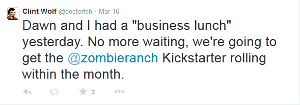
We launched our Kickstarter this last Friday, a smidge later than originally planned but at least still within the window of time I proclaimed when I made my vow on Twitter:

tweetIf you’re wondering why I put business lunch in quotes, well, basically because it was really just lunch. I mean, we’re married, we live together, and because of that we often eat together, but we aren’t always talking business at those times. In fact I’d say more often than not we avoid business discussions, but this time around our talk of how to plan out the next few weeks of Zombie Ranch with Episode 10 ending and WonderCon looming shifted into thoughts of a “work hiatus” where we could finally, finally get the Kickstarter we’d been planning underway.

Yeah, calling our launch a smidge late is mostly in reference to last week’s rambling blog where I was talking about getting things underway by last Wednesday. I believe our actual first mention of the idea of a Kickstarter to gather together a trade paperback volume was all the way back in June 2013, shortly before the climax of Episode 7.

Why did it take so long between then and now? Well, in part because of preparation, but to be perfectly honest I’d say the biggest issue was plain old fear. What if we weren’t really ready? What if we underestimated our funding needs? Or overestimated them so much the project would be doomed to failure? What could we realistically offer as rewards? How could we present ourselves so that not just friends and fans but potentially complete strangers might be interested in pitching in?

Worst of all: what if we threw a fundraiser and no one came?

I mean, to this day we honestly have no exact idea of what our reader base is, and even then we have little idea how many would actually be willing to toss some cash our way if asked. This project would be where we would find out, and if it ended up failing through lack of interest, well, it wouldn’t mean an end to our efforts but I can’t deny it would be something of a gut punch. Putting out a Kickstarter would be all but asking for the world’s referendum on our five years of work. It was, and still remains, a very scary thought.

But we finally committed to struggling past it, and make no mistake, there was a lot of work that got done between that March 16th tweet and now. Just setting the funding goal turned out to be a really big issue given all the horror stories we had heard from peers over the years. Then we had a momentary panic when some of the printing quotes we’d gotten last year turned out to be obsolete. An intended promotional channel I’d been saving for this occasion went belly up because the website it was operating through went down. Then there was the pitch text, the video, the reward tiers… even though many parts of a Kickstarter project can be edited after you go live, I mentioned last week that the idea of a mistake was near paralyzing to consider, since even a small typo might turn people away or give them the wrong message.

We perservered, though, and we launched, and now we just have to do our best to make it successful. You can, of course, help with that if you haven’t already (and you’re not reading this on May 11th or later). CLICK HERE, or on our neato keen graphic below, and consider pledging our way. If nothing else, your good vibes and spreading the word to anyone else who might be interested would be much appreciated!

banner_image_kslogo

Kicking and scheming

It is my hope that we have our Kickstarter launched by the time the early birds read this on Wednesday. As I write this blog, we are very, very close to being ready, and it would be great to be able to snag the attention of all the people who come by on update day. On the other hand, between recovering from WonderCon and trying to get this underway our heads are swimming, and I am fearful of somehow, some way making a project-killing mistake. Perhaps it will be better to let things percolate overnight and then launch on Wednesday evening, after a final review can be done where we make sure we didn’t offer a tier reward where we fly to your house for a naked table dance or something equally unfit for prime time.

Well, whatever we decide, I’d best get back to helping Dawn make it happen. It’s going to be interesting to see how many people out there are willing to toss some money our way in the next 30 days or so, and meanwhile we’ve also got to start up Issue 11 next week. Stay tuned!

April foolishness

I let the chains off the artist again. I know, I know, we should probably be doing nothing but promoting our upcoming Kickstarter, or our appearance at WonderCon this weekend, but it’s April Fool’s Day. I don’t think we’ve ever had the occasion where that was an update day for us before now. Hang on, let me check. Yep! Last April Fool’s Day that fell on a Wednesday was back in 2009, six months before we started Zombie Ranch.

Now if we were in the middle of an episode I would probably still be a big stick-in-the-mud about it, but we’re not, and Dawn’s been working extra hard between WonderCon and Kickstarter prep, so… yeah, as I’m writing this I’ve basically given her carte blanche to do whatever her weird little head can come up with. And trust me from experience, her head can get plenty weird.

I’ve been working pretty hard myself, so this blog entry won’t be quite as verbose as usual. I believe I’ll even stoop so low as to use some visual aids. Remember a few weeks ago when I spent several paragraphs writing about the importance of diversity and identity in popular culture, especially for the young ‘uns? Here’s a great example of that whole “a picture is worth a thousand words” adage.

Man, I could have saved myself a lot of typing.

Let me learn a lesson from that, at least for this week. The new trailer for Mad Max: Fury Road dropped today. I have to admit, I’ve been wishy washy about the idea of a new entry in the Mad Max mythos, considering numerous other failed attempts to reboot or resurrect hallowed franchises of my youth. I was particularly appalled to hear rumors that it was going to have a PG-13 rating. In of itself a PG-13 isn’t bad, but in this modern day it’s all about dollars, the ratings system just seems so random, and major action blockbusters can seem oddly toothless for all the violence they depict. I already gushed about the Hansel & Gretel movie bucking that trend. Don’t get me wrong, I don’t need to see heads exploding in Captain America, but I was happily, pettily relieved to find out that Mad Max is getting a good ol’ R rating after all for its May 15th release. And I’m excited. I might even be a little agape, despite decades of cynical living. Because… well, here’s the trailer. If a picture is worth a thousand words, this has got to be worth billions, at least.


A long, strange inbox trip…

“Bags, bags, bags…”

Dawn likes to watch various shows while drawing. As she was putting the finishing touches on the Issue 10 cover, she had chosen to binge watch Broad City. It is a funny show. But I’m not writing about the show, except for the fact that I looked over and saw that two characters had gone to Chinatown and were being muttered at by a Chinese woman selling handbags, apparently illegally obtained discount handbags. Bags, bags, bags…

This was a rather coincidental occurrence considering something I’d recently posted on my Twitter account:

Going through old spam, I’m becoming convinced the greatest black market on the planet is for illicit handbags.

Seriously. Our filters catch most spam before it pollutes our comments section, but we still get the messages and in the last few days I must have cleaned out over a hundred instances offering Louis Vuitton purses, each containing many, many lines of repeated keywords. Bags, bags, bags… after hours spent on inbox purging, hearing that repeated on our television was downright surreal.

Actually the whole experience was a bit on the surreal side, as I combed back through all the email I’d ever received for Zombie Ranch over the years looking for contacts to hit up when the Kickstarter launches. More than one interview exchange would end with the interviewer asking us to please keep them updated with any news. Rightly or wrongly I hadn’t really considered us doing anything particularly newsworthy since, but finally getting the Kickstarter going? That seemed downright newsworthy.

So I’m making a list, checking it twice… and, alas, finding a lot of those sites and projects are either no longer active or are outright gone. That’s a weird feeling, to still be around. I won’t go so far as to call it survivor’s guilt, because the web is the web and sites and comics that stay active for more than a few years are more the exception than the rule, but still, going sequentially through messages like I did sometimes gave the sense of a site flaring up and then flaring out in a time-lapsed fashion, from initial exuberance to abandonment, or even the black hole of a 404 Not Found. One site domain had reverted to a page full of Chinese characters and product images. I think handbags might have been among them.

But yeah, I guess it’s kind of like looking at old photographs or a high school yearbook. Where are they now? What are they up to? Some folks I’ve kept up on through Facebook or still chime in on here from time to time so I know they’re still about even if their webcomic or news blog isn’t. Others, well, I had some great conversations back in the day, but I wonder if the email address I have still works. I guess I’ll find out soon enough when I try to spread the word of the Kickstarter, although madman that I am I’m also planning to try to personalize each of those emails so that it doesn’t seem like I’m only getting in touch again for commercial purposes. I mean, technically, I guess I am, but I’ve been saving up a lot of shamelessness since 2009. Soon I’ll cash it in, assuming I don’t go insane first from sorting out the wheat from many moons of accumulated chaff.

Bags, bags, bags…

Sacrificial alters

As I write this blog it’s March 17th here in these United States of America, otherwise known as St. Patrick’s Day, which is a day when we traditionally bust out a lot of Irish stereotypes (or what we mistakenly think are stereotypes) and, most importantly, drink a lot. Despite the “drink a lot” aspect, no one in our storied country’s history has seen fit to make it any sort of official holiday, which I still find to be an egregious oversight. Of course, technically the wisest course of action would be making the day after a holiday. I imagine there will be many people calling in sick tomorrow. Many will honor March 18th as a day of worship, with their altar in the form of a porcelain bowl.

Dawn and I will not be counting ourselves among that number. It’s a work night for us, which doesn’t just mean we have to go out to our day jobs tomorrow morning (we do), it means we’re literally going to be working tonight, putting our final page of Episode 10 together for the consumption of the masses, at least those masses not too hungover to get their weekly webcomic fix. We do have underage and International readers, after all, and I’m honestly not sure how many cultures around the world use St. Patty’s Day as a binge drinking excuse. We might even have readers who don’t drink, or have some measure of willpower and moderation when faced with the looming spectre of responsibility.

Speaking of moderation, it’s no secret that we keep an update schedule for Zombie Ranch that more or less dovetails with what we feel we can handle without a burnout. It usually means a cumulative few days a week that we’re working on the comic, whether that’s directly part of the creative process or the various maintenance and paperwork and promotion surrounding it. This has been doable. Sometimes in the later hours of a Tuesday evening, it still gets quite stressful, but we can usually look forwards to some unwind time (day jobs aside) before the cycle begins again. We can go hang out with friends, watch movies, play video games, all those things which keep us refreshed and let us keep coming back to the Z Ranch with a sense of enjoyment rather than trepidation.

From all this it sounds like we don’t sacrifice much, but tell that to Dawn, whose face fell visibly when she realized she had to spend one of her favorite days of the year chained to her drawing tablet and atrociously sober, rather than chugging down Bailey’s and Guinness and blasting music more than likely involving brogues, banjos and washboards. She’s half-Irish, half-Mexican. Do I have the heart to remind her Cinco De Mayo is also going to be a Tuesday this year?

Not too many parties and events are scheduled for Tuesdays, but when they are we have to beg off. One of our moms forgets and wants to call up and chat on a Tuesday night, we have to awkwardly remind them it’s worky-work time. We could potentially avoid this if we had a buffer, but buffers don’t magically appear, you have to make time to work on them, and if you stop working on them for whatever reason then you eventually will be back to not having a buffer.

Rough life, right? Well, the purpose of this post isn’t some misguided attempt to generate sympathy, it’s just to point out that even with a moderate schedule on your comic, you’re going to be making some sacrifices. You’re going to be balancing your personal life (and oftentimes your professional or educational life) with producing an ongoing creative effort for an audience, likely also eventually needing to deal with some back-end activities for that effort as well. And as the weeks, months, and perhaps even years pass, I think it’s only wise to occasionally re-evaluate that balance, altering aspects if necessary.

Case in point, this past Sunday Dawn and I were sitting down to lunch at one of our usual neighborhood food haunts, and I brought up that this week’s comic would mark the end of Episode 10. Our traditional “cover week” would be next, but then WonderCon would be creeping up on us just as we would normally be starting Episode 11, and from experience we knew WonderCon is usually intense enough for us to warrant a “sketch week”. That stop-start-stop stutter would be a bit weird to deal with, but on the other hand we’d need a three week pause in the story action as the alternative. Was that too long?

About this time it also came up that we still hadn’t gotten our act together on the Kickstarter for a collected trade we’d been intending to do ever since we finished Episode 7, which… whew… that was Summer of 2013? And we kept telling fans and ourselves that we had stopped printing individual issues for Episode 8+ in order to focus on that, but here it was 2015 and we still hadn’t pulled the trigger, so to speak. We knew at least one friend who had been waiting nearly since we started for a trade volume to purchase. Why not use this in-between as a means to move forwards and get that done?

So just like that, lunch became a business lunch, as we hashed out what we would need to do in order to have a Kickstarter launched in time to proclaim so at WonderCon, and decided if was fully achievable, especially if we put the ongoing story creation on hold for a bit while bending all our energies towards that purpose, like Scotty re-routing the power of the Enterprise. No more procrastination, no more cold feet and worries of failure. It would be done.

These next few weeks may paradoxically see Dawn and I working even more on the comic than usual, just in a different way. There are no doubt people out there that could launch their first Kickstarter, do their day job, and continue pumping out their comic all at once, and (possibly) maintain sanity. For the rest of us, it’s valuable to find our limits and work with them, occasionally pushing beyond when the need calls. To say that neither Dawn nor myself are naturals at promotion is a gross understatement, so it’s going to be an exhausting task just getting the word out about this. Even if you can’t help out with the Kickstarter itself, we definitely continue to appreciate your patience, understanding and support.

By the way, this was mentioned already on the comic blog, but on the off chance you only read this blog, if you’d like to be added to our email list for the Kickstarter announcement please do contact us and let us know (and leave an email for us to use, naturally).

“From invisible to inevitable.”

Last week I gushed about the improvements of the 2015 Long Beach Comic Expo over previous shows bearing the name, but I want to bring up one aspect in particular again: the first ever presentation ceremony for the Dwayne McDuffie Award, for promoting diversity in the field of comics. The first recipient was Nilah Magruder, in honor of her creator-owned webcomic M.F.K., and on the back of the award was printed a properly poetic quote from McDuffie: “From invisible to inevitable.”

McDuffie’s contributions to the field of comics and superheroes are many and respected, but what I always respected most about him was that he never presented himself as someone that was out to destroy the past. He looked to the future. He wrote the (very white) Fantastic Four and Ben 10 with just as much verve and wit as his Milestone Comics creations. He always wanted to write characters first and foremost, but wasn’t afraid to acknowledge that there’s a selfish part of us that likes to see larger-than-life reflections we recognize in the media we consume. It’s like what I posted way back when discussing the seminar on Superblack (also featuring a section on McDuffie), where Dr. Adilifu Nama admitted his child self was fascinated by all the superhero action figures, but most of all by the Falcon, a black man who could fly.

It’s not to say we can’t identify with icons outside of our own skin color or gender or sexual identity, because a well-written character and story should have universal aspects that transcend such things. But as a white dude I recognize that growing up I had a lot more choices amongst media icons that resembled me, and there was something ineffable to that. I think one of the best explanations of why diversity in media matters comes from a speech by Pulitzer-winning author Junot Diaz:

“You guys know about vampires?” Diaz asked. “You know, vampires have no reflections in a mirror? There’s this idea that monsters don’t have reflections in a mirror. And what I’ve always thought isn’t that monsters don’t have reflections in a mirror. It’s that if you want to make a human being into a monster, deny them, at the cultural level, any reflection of themselves.

And growing up, I felt like a monster in some ways. I didn’t see myself reflected at all. I was like, “Yo, is something wrong with me? That the whole society seems to think that people like me don’t exist?

And part of what inspired me, was this deep desire that before I died, I would make a couple of mirrors. That I would make some mirrors so that kids like me might seem themselves reflected back and might not feel so monstrous for it.”

The invisibility. The feeling that you just somehow aren’t there and aren’t worth acknowledging. McDuffie’s quote comes from the feeling he got when his 11-year-old self picked up an issue of Marvel’s Black Panther in the 1970’s, a similar epiphany to Nama’s: “In the space of 15 pages, Black people moved from invisible to inevitable.”

And so it is. The face of the comics audience is changing, becoming far more diverse than when I was a kid, and while the appetite for good stories is still a unifying desire, the success of comics like the new Ms. Marvel is finally starting to chip away at the assumptions that only a certain subset of people want the product, and thus only a certain subset of people need to be acknowledged. I’m inspired to say that today because in my previous blog that I linked above I held up DC’s New 52 as an example of backwards blindness catering to the old and stale audience even though it was paradoxically supposed to attract the fresh and new. But today:

http://www.comicbookresources.com/article/lee-didio-call-june-launches-first-of-many-steps-in-building-the-new-dc-comics

Listen, I’m not saying DC’s decisions in this regard are a sign of progressive attitudes winning the day. It could be, but it could also be the same reason Las Vegas has become such a staunch supporter of gay marriage—gay men and marriages both bring a lot of money into Las Vegas. Similarly, women and people of color (and women of color!) are becoming a bigger and bigger part of the pop culture and comics scene, and bringing money with them that they’re using to make their choices of what appeals to them. Maybe cold hard cash is not the most pure of motives for change, but it’s a powerful one that can eventually make itself heard in even the most tone-deaf of skyscraper boardrooms.

The diversity has been growing, and with it, the demand for those mirrors Diaz mentioned. That sense of inclusion in the clubhouse. Once, that was invisible. But now that it is not, it is inevitable.


Conventional evolution

I haven’t done a convention review in awhile, but I think it’s time again. See, this past weekend was the Long Beach Comic Expo. The Long Beach Expo began as a smaller, early year adjunct to the Long Beach Comic Con, which, if you’ve been paying attention around these parts, was our first convention we exhibited at back in 2009. We started Zombie Ranch quite literally as LBCC started.

Now the first Expo happened in February 2010, and was a very modest affair. In hindsight it was so modest it might be barely worth mentioning, but for the talent roster that was present in that small room. Subsequent years would see it expand out beyond, filling the lobby outside in an increasingly awkward fashion, until the 2014 Expo finally moved elsewhere in the convention center. I unfortunately could not call that move good, since Artist’s Alley ended up somehow even more cramped in its layout. I was glad our neighbors happened to be good friends of ours, seeing as we ended up crammed up so close together our chairs were touching. Couple that with a lack of a public address system and other issues and it seemed a case of one step forwards, two steps back, and even though the Expo expanded to two days that year the crowds and sales just didn’t seem to grow with it. Friends and peers had been bleeding away and I suppose I couldn’t blame them.

I worried, I’ll admit it. Dawn and I had made an economic decision to scale back to local shows, and Long Beach represented two of those slots on our schedule. We liked the show, we knew and liked the management, we’d “grown up” with the convention, but… the company that ran the con was based out of New York. What if they just gave up, what with all the continual growing pains that seemed to be happening? Could I blame them, either?

Well, thankfully that’s a question I hopefully won’t have to answer anytime soon. Instead of backing off, this year’s Expo doubled down, and as far as I can tell only good things came of it. Another move within the Convention Center put the show in a “Goldilocks” room — you know, not too big, not too small, just right? The entry area was posh, as was the area for panels, and the crowd was solid for both days. That was probably also because they massively stepped up their game with advertising, getting the word out early on major geek websites and even indulging in some radio and TV ads. Rather than bringing in something noisy and disruptive like a wrestling ring, the show reached out to the Girl Scouts of America and let them sell cookies on the floor as well as get out and experience the comics scene. I would not have expected that to be a good pairing until I realized how much I ended up craving the cookies. We bought two boxes. Meanwhile three girl scouts bought things from our table in turn. I think they came out ahead financially, but it felt nicely symbiotic, especially after seeing a couple of them dressed up in “Attack on Titan” gear. I don’t know if they earned their “take down giant naked cannibal” merit badges, though.

The show also featured a touching moment of silence on Saturday in honor of Leonard Nimoy’s passing, and hosted a first ever presentation of the Dwayne McDuffie Award for diversity in comics. And for the first time I can remember in a long while, there was an after party worth checking out on Saturday night which was still going strong by the time we left for home around 10pm (hey, give us a break, we’re old).

Anyhow, long story short, it’s the first time I felt honestly excited for the evolution of a local show since WonderCon, and for that to happen at the Expo was doubly surprising. They put a lot of effort into improvements and I think it really paid off. Hopefully it will continue to do so. They say that the fifth or sixth year is when exhibitors really start hitting their sweet spot. Maybe that applies to conventions as well?

Time will tell

So the Academy Awards happened. I haven’t watched the ceremony in years because it just no longer seemed relevant to me, often more of an exercise in money, politics, and prejudices than actual quality. Then again, my own prejudices swing towards genre, “escapist” fare, and the Academy by and large does not acknowledge such efforts except perhaps to toss them a visual effects or sound award. Call it an agreement to disagree.

Nonetheless, I’ve read some thinkpieces and summaries on the show and a recurring theme appeared to be a backlash against superhero movies, which is a shame as I feel like 2014 saw the release of two of the best films ever to come out of Marvel Studios. I have both Captain America: The Winter Soldier and Guardians of the Galaxy on blu-ray now. Guardians in particular I have now seen four times over and have thoroughly enjoyed each viewing. I have an instinct that neither will be wearing out their welcome with me anytime soon.

Now, I could spend this blog reiterating some counterpoints to things like Dan Gilroy’s praise of independent and serious filmmakers standing against the “tsunami of superhero movies”, but others have already quite elegantly stepped up in their defense, or defense of “lighter” film fare in general.

Instead, I want to bring up this thought. Thirty years ago, 1985 saw the release of several movies that impacted my generation to such an extent we still remember them and share our experiences of them and quote them to this day: Back to the Future, Better Off Dead, The Breakfast Club, Goonies; heck for purposes of this blog, let’s throw in Return of the Living Dead, the movie that first introduced the cry of “brains!” to the zombie genre. You know what movie I rarely, if ever, see referenced? Serious, important (albeit not indie) Best Picture winner Out of Africa.

Now am I claiming Goonies was a better film? Well, Out of Africa does seem to make a lot of “overrated” lists, especially since it beat out the still much more memorable The Color Purple, but yeah, that’s the thing. Being remembered probably should count for something. I sometimes feel like the Oscars might be more relevant as a celebration of filmmaking excellence if, instead of choosing between the movies of the previous year, they chose their Best Picture nominees from films that released five or even ten years before. After all, we should be looking past the trendy shine of the moment, right? That’s why all these pop culture box office megahits are just dust in the wind, not worthy of consideration next to real, meaningful cinema.

And yet, Ghostbusters is still a worldwide phenomenon to this day, while you would have been hard pressed to find any 30th anniversary fan-fests of Terms of Endearment or even Amadeus. Can you truly continue to write something off as nothing but popular, lowest common denominator tripe when it retains that power to make people laugh, cry, and/or scream over the decades? When it inspires entirely new generations, the way so many current industry professionals can point to a film like Jaws or Star Wars and state, “When I first saw that, that’s when I knew I wanted to make movies.”

In relation to superhero movies, the comparison can be made to the era of Westerns in cinema that dominated studio output for many years because audiences had a hunger for cowboy stories. Out of those hundreds of films we have a handful of all-time classics, some true stinkers, and a great majority that were just forgettably mediocre. And despite their box office success or critical acclaim or lack thereof, only the passage of time truly sorted out the wheat from the chaff.

Now do remembrance, inspiration, and cult followings really equate to quality? All right, if I say “yes” someone’s going to remind me that Troll 2 or The Room have become phenomena over time since their debuts. And… I’m actually comfortable with that. Look, I’m not saying they’re on the level of Casablanca, but I do believe the truly awful can be as inspiring and memorable as the truly great.

If you’d like to hear more from me and some of my colleagues on how that could be, and you’re in the L.A. area, I invite you to come down to the Long Beach Comic Expo this Sunday, March 1st, where at 3:30pm I will be part of a panel entitled “The Satellite Show Presents: Yakmala!”. It’s our bad movie watching club. If you can’t make it, well, here’s a blog I did expressing some of our core principles for movie selection. Yes, we’re actually picky about our terribleness. Plan 9 From Outer Space may not be a good movie, but Ed Wood wanted it to be, and that sort of misguided passion can shine down through the ages just as much as it does for the passionate films that work.


No script survives contact with the production

There exists a military strategy maxim that is attributed to Prussian Field Marshal Helmuth von Moltke the Elder. In its original verbose form, it is translated as “No plan of operations extends with certainty beyond the first encounter with the enemy’s main strength.”

You may be more familiar with its condensed form: “No plan survives contact with the enemy.” It’s the idea that the battlefield is an ultimately chaotic place, where even the most meticulous plans can go horribly awry due to factors beyond control. In fact the meticulous plans are the most vulnerable to failure, depending on how unwilling those in charge are to abandon them when they don’t work. Moltke’s other, less famous quote states, “Strategy is a system of expedients”, which is more or less saying that it alters based on the conditions, opportunities, and limitations of the moment.

Creative writing is not the same thing as mass warfare, but it really does seem similar in the respect that it is a rare thing for a script to survive contact with the actual process of production and have the final product emerge unchanged. A great example of this is Jaws, which I now own on blu-ray and have long been familiar with just how much the original creative vision Spielberg sat down and storyboarded had to change because of matters beyond his control, like the mechanical shark breaking down on a constant basis. They had to get creative and use various means to imply its presence instead, and even though it all seemed like a day-to-day disaster and failure at the time, the end result was cinematic history. Had Spielberg been inflexible the movie probably couldn’t have happened at all, much less been an all-time classic.

Even in my personal experience, working with just one other person, the amount of behind-the-scenes compromise that occurs in producing the comic might surprise you. Sometimes we can’t find the reference we need for the angle I envisioned. Sometimes things get accidentally left out, or other things are inserted I didn’t intend to be present. There are occasions when this happens that I’ve insisted on correction, but just as often I’ve taken the long view and looked over my strategy, seeing if it can be adjusted based on the new circumstance, and more than once I’ve actually ended up excited at the opportunities. I would love to say everything happens just as planned because that makes me seem really cool and collected and mastermind-y, but then again I’m pretty sure those kinds of masterminds only really exist in fiction. Mind you I’m not claiming to be a strategic genius, but I’d say the historical guys we hold up as such certainly had their plans, but their real talent was in being able to to take apparent setbacks and turn them into an advantage, finding solutions rather than devolving into paralyzed panic.

Will they be good solutions? Maybe, maybe not, but it seems like the only true defeat is when you just flat out give up and sink into the despair that your story just can’t be accomplished. Many an army commander lived by the idea that so long as their force remained intact, they could lose any number of battles and still maneuver for an eventual victory.

So if you feel like you painted yourself into a corner with your writing despite your planning, well, maybe it’s time to knock out a wall just so you can keep going. Who knows? Maybe your house of ideas will actually turn out better for having that cross-ventilation. Or, true, you could just end up with a jagged, silly-looking hole, but hey, could be worth a try if the alternative is just ditching all the work you’ve done altogether.


Poking at foundations

So in the last month or so, Dawn and I started binge-watching Marvel’s Agents of S.H.I.E.L.D. We held off for awhile, even after the first season became available on Netflix, due to all the bad buzz I kept hearing about the early episodes. I was assured by those of my friends who had kept watching that “it gets better”, but I still had to ask the question: if there were only six or so episodes of Season 1 in the “gets better” category, should I just watch those and skip the rest?

Surprisingly, the consensus seemed then to be that, while much of Season 1 had its issues, it was worth watching. It laid all the foundations for what was to come after, and the payoff would be that much sweeter even if the first episodes themselves weren’t particularly compelling.

So we took the plunge and started from episode 1. While I won’t argue the idea that the series certainly does get better, we didn’t find it as much of a chore as we were led to believe. Maybe we were approaching it from hindsight, and that helped? I’ve also heard that watching big chunks at once allows the threads of the story to hang together far better than for those who were watching week to week (or sometimes not even week to week, since I’ve heard there were some breaks and hiatuses along the way).

Have we as a society gotten too demanding of our TV shows, like they have to knock our socks off out of the starting gate (or within a few episodes thereof) or we give up on them? I think of Babylon 5 which was one of my favorite shows ever, but how to this day I never watched what I was assured was a comparatively mediocre first season. Star Trek: The Next Generation was another show so (in)famous for having a rocky start that it named an entire TV Trope, “Growing the Beard“, since fans mostly agree it started getting good around the same time Commander William Riker decided to sprout facial hair. For quite awhile following its debut, Parks and Recreation was derided as a limp, pointless clone of The Office. There have been quite a few other examples over the years of series that took some time and development before they hit their stride.

Mind you, again, it’s probably much easier to deal with an uneven first impression in hindsight, with assurance that the time you’re dedicating will be rewarded. Going back to check out a TV show, particularly one with multiple seasons, can be a daunting prospect. Hitting an episode, or worse, several episodes where it felt like you could have skipped them and been none the worse for your experience, can be downright demoralizing.

But maybe I’m a bit more sympathetic these days, especially in terms of the early going. After all, I still remember the criticism of this very webcomic about our first “episode” being a span of pages where nothing interesting happened. I still contend with that assertion, but it’s not quite on the level of some of the nailbiters we put forth by the end of episode 7. Foundation building is a necessary but potentially boring aspect of fiction, as you get your first introductions to the characters and the setting. I figure that’s why in a lot of action movies these days you’ll get those introductions in the midst of an already occurring action scene, except I feel more often than not you’ll get out the other side of said action scene and still have only the barest sketch of who the people involved are and why you should care about them.

Did the early parts of a series like Agents of S.H.I.E.L.D compare to its post-beardy existence? Nah. But they were enjoyable enough, and at least some part of every episode seemed to be working to lay the groundwork for the future. From the beginning the showrunners were supposedly promising “Everything is connected”, but after disappointments like Lost (at least in terms of answering questions) I can see how it would be rough to keep faith based on that alone. I had the benefit of being, basically, a man from the future, so I could look at it all and enjoy from that standpoint.

And once I do look back like that, in addition to my enjoyment of the entertainment, my writer side gets to wondering just how much of everything was actually planned from the beginning. But that’s a topic for another time.


Have your cake, eat it, too, and don’t pay the baker.

Well, so, there’s an old proverb most commonly expressed as “You can’t have your cake and eat it, too”, basically meaning you can’t have something both ways, especially when both those ways are favorable to you. One of the concrete examples of that would be commissioning a design job: if you tell the designer you want it done ultra-fast, low-cost, and high quality, they will, depending on their level of professionalism, respond with varying degrees of laughing in your face. At least one leg of that triangle is going to have to give.

I realize that’s three things, so let’s do another example. You want to sell your car to a buyer and get the money for it, but still retain all ownership of your car. Doesn’t seem very logical, especially to the buyer who would be getting nothing out of the deal. It’s like deciding to stop paying your power bill, but still wanting your electricity.

Well, that’s us. Apparently a recent court decision has the potential to declare major movie studios can do just that.

http://www.tessgerritsen.com/gravity-lawsuit-affects-every-writer-sells-hollywood/

Now I’ve written before on the pitfalls artists can encounter when entering into deals involving their creative work, but Tess Gerritsen’s case seems like a whole new level of weird. If you didn’t read her post at the above link, the upshot is that in 1999 she published a novel entitled Gravity, and ended up optioning the rights to make a movie out of that book to New Line Cinema, of course with name recognition and compensation to her should it happen. She even did some script work on a screenplay, and the movie got far enough along she heard a director had been attached… but then the project was shelved.

Now if you’re keeping track, you’ll realize a quite successful Warner Bros produced movie came out recently with the name Gravity. There were similarities to Gerritsen’s book, even moreso given the screenplay rewrites she did, but… eh, parallel evolution can happen. It wasn’t until her agent uncovered that the man who co-wrote the “original screenplay” for the 2013 movie was the same man who’d been attached as director on the earlier attempt, Alfonso Cuaron. Still, Warner had merged with New Line in 2008, gaining access to all its properties, so they had legal rights to use Gerritsen’s work. Sure.

But that’s where it gets weird. Somewhere in 2008-2009 Cuaron writes his screenplay, the movie is developed and released, and not only does Gerritsen not see a dime of payment, she isn’t even credited.

Outrageous? Unethical? Probably. Also not uncommon in Hollywood. Hell, my friend produced and showed off a short film at San Diego Comic-Con, and two years later Divergent was made and bore some really shady similarities to his work. Hard to prove these sorts of things, though. If it weren’t for Cuaron’s earlier involvement with the proto-Gravity, it probably wouldn’t have merited much more than an annoyed shrug from Gerritsen.

The part that gets weird is that in the court case that was filed, Warner apparently didn’t argue that the eventual film wasn’t based on Gerritsen’s work, they just argued that because Gerritsen’s contract was with New Line, they didn’t have to honor it.

That’s the eat the cake and still keep the cake part. Warner merged with New Line, meaning they got access to all of New Line’s properties and dealings, but Warner is arguing that they have the rights to make a movie involving a writer’s intellectual property, rights acquired as part of New Line’s contract with Gerritsen, but they don’t have to honor the part of the contract where they would be paying her and giving her credit.

And apparently, the judge agreed with that reasoning.

Some writers are worried this will set a nasty precedent, given how often mergers and buyouts occur these days. Are they correct? Maybe. We only really have Gerritsen’s side of the story, but if true, the line of reasoning doesn’t seem very logical at all.

Certainly it’s a very, very good argument for making sure any optioning agreements a writer makes with any movie studio come with an expiration date. Hopefully the courts would at least consider that part of a contract to be something to be honored.

“Low” and the flow

Here’s another in my series of posts about the flow of visual comic page navigation, so if you’ve been bored by the ones so far, then— well, truth be told I don’t think I’m stopping anytime soon, so I’ve got no consolation for you there. It’s just too rich and valuable a concept, in my opinion.

Last week I took a self-critical walk down memory lane with some of our own past pages of Zombie Ranch. This week I turn my eyes outwards again, specifically to this article by Dale Jacobs of the University of Windsor’s Comics Theory Class Blog. It’s a discussion of the concept of “Guided View” and how it can change the comics reading experience.

If you’re not familiar with Guided View, it’s a process used by Comixology and other digital readers whereby a page is broken down into discrete elements (often panel-by-panel) and presented to the reader in prepackaged sequential parts, mostly for the sake of reading on small screens like you’d get on a mobile device. The theory is that this is exactly what your eyes are doing anyhow when reading a comic, focusing on parts one after another, so why not just show things that way?

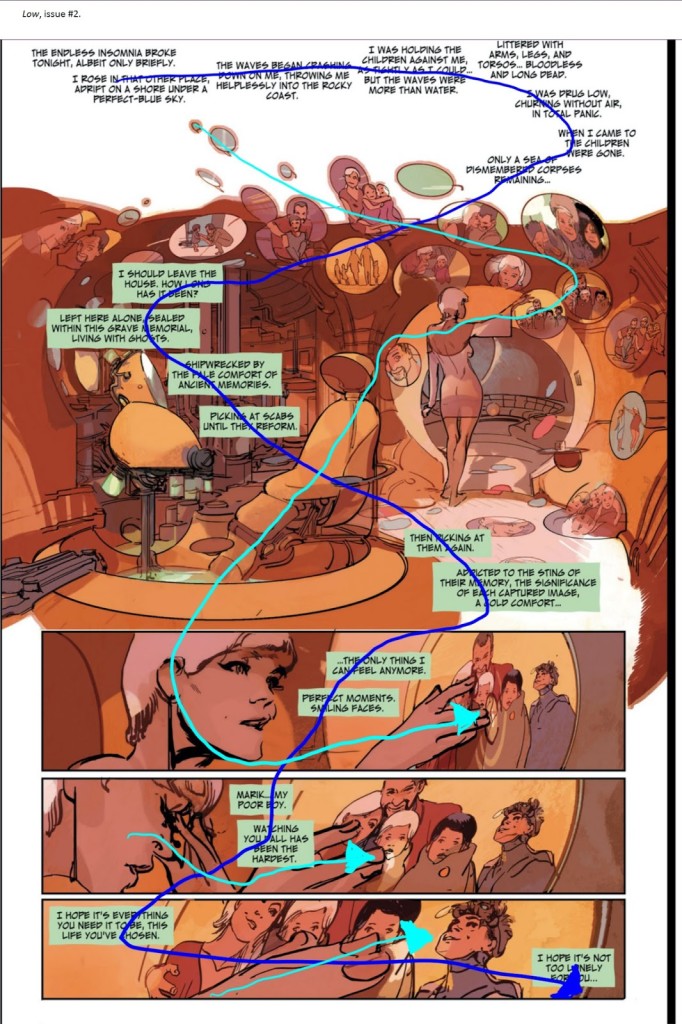
Well, I highly encourage you to click on the article and read it if you haven’t already, or at least look at the example of how the full page differs from the Guided View experience. I’ll imbed the full page example here, along with the added overlays by Jacobs denoting the paths described by art and text. From the Image comic Low by Rick Remender and Greg Tocchini:


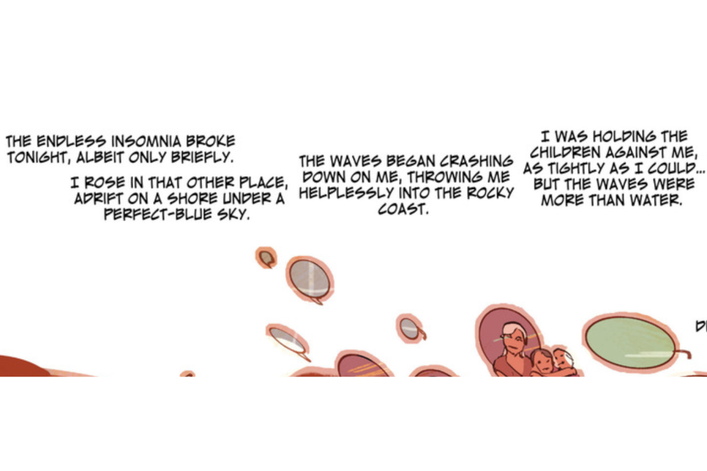
Low Arrows


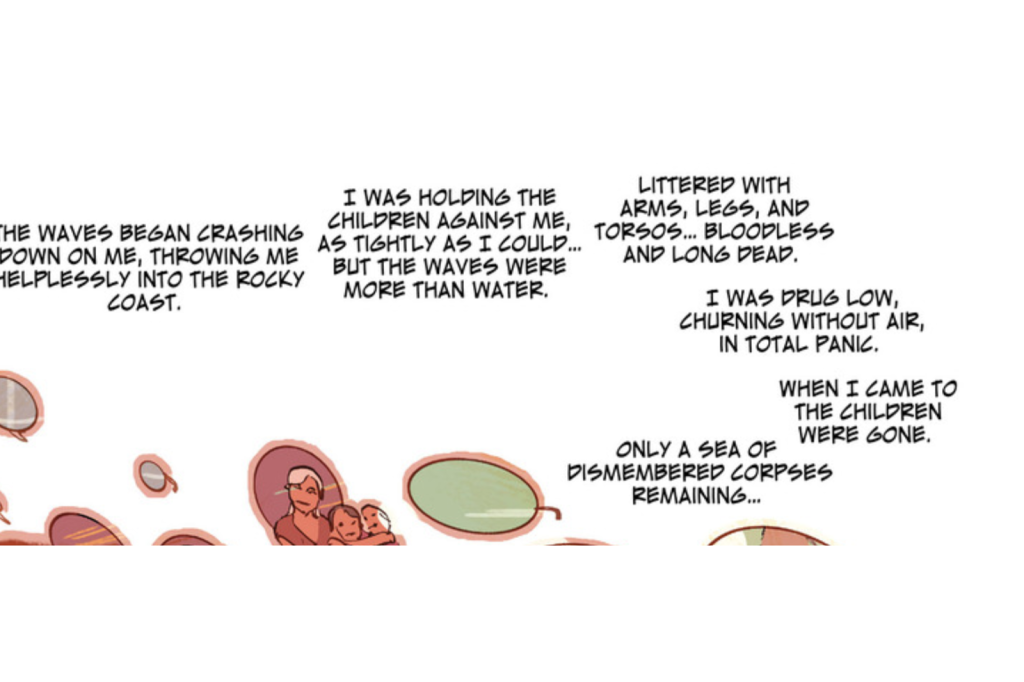
In previous weeks I talked about using word balloons or captions to establish a pattern for the reader’s eye to follow, one that if done strongly enough can break the ingrained left-to-right-top-to-bottom defaults of most Western World readers. This is a really fine example of that, as denoted by the dark blue line marking out the sinuous serpent of captions (both bordered and borderless) winding its way downwards, and it’s doubly impressive to me for maintaining its shape and momentum while covering up a minimum of art. Meanwhile the art starts its own complementary path, as shown by the light blue line, even though it gets a bit more broken up towards the end. The overall effect has a dreamlike visual poetry to it which reinforces the surreal recollections of the character’s thoughts. I dig it. And Guided View utterly fails to replicate it. All the same parts are there, but without any sense of the whole. I’m not going to show all of it here since Jacobs already did a fine job of it on his own page (seriously, go look), but as a taste here’s how “Panel 1” appears in a reader:


lowguidedview1

Keep in mind that when you move forwards in the reader, you will no longer see this, but instead will be able to see nothing except Guided View’s decision on what constitutes “Panel 2”:


lowguidedview2

The overlap is somewhat aggravating in of itself, but beyond that it becomes much harder to discern the pattern that was originally there. Guided View does its best by eventually providing a full view of the top half of the page once it presents all the broken up text and images composing it, but compared to just having the full page available we are definitely, as Jacobs diplomatically puts it, having “completely different experiences.”

Now, true, you can say Guided View only breaks down when comics creators are gettin’ all fancy with their layouts, but… if you’re not doing a “newspaper style” comic where the panels are nothing to you or the reader but boxes where things happen, then I feel like if you’re not at least occasionally “gettin’ fancy”, you’re losing some unique opportunities for storytelling.

I get asked occasionally if we’re going to put Zombie Ranch on Comixology and I have to admit to people that I haven’t pursued it, even with their Comixology Submit program geared towards independent creators. Assuming we were accepted, their in-house team would be breaking up our pages for Guided View, and while some of our pages would do just fine, others would not survive the transition very well. I don’t honestly know what would be worse, letting complete strangers hack our baby to bits, or (like some other reader sites have occasionally offered) having them give us the tools to do the hacking ourselves. Probably the latter, since that’s a ton of work for 200+ pages in addition to the rough decisions and compromises we’d have to be making as we went along.

It doesn’t seem like Comixology or Guided View are going away anytime soon, though. They may even truly be the way of the future, and the art of comics will have to adjust to them accordingly. But for now, the “flow” of a well-arranged comics page is one of my favorite things to enjoy, both as a creator and a reader. So for now, I go with the flow.


Some money where my mouth is

Last time I linked to three of our past pages and asked you folks what you thought of them in terms of fulfilling my ideas of word balloons being able to “lead the eye”. Response was pretty positive, but we still haven’t heard from the nastiest, fussiest critic of all: me. And since I’ve shown time and time again to be not at all afraid of offending myself, let’s put on our big boy/big girl pants, take a calming breath, and see what me has to say about these efforts.

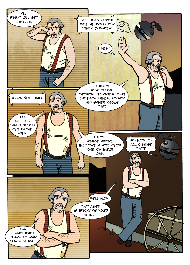
EXHIBIT A: Page 16, “A La Cart”

This page takes us all the way back to Episode One, and it shows in certain things like the font not being as crisp, the rampant “crossbar I” usage in inappropriate places, etc. I have yet to hear anyone complain that rendered things unreadable, but I admit at cringing a bit when I look at it now.

On the other hand, I do still very much like the pattern we established with the word bubbles themselves. Using them to cross the borders between panels provides a connective tissue that forms a “U” shape with enough momentum to it that I feel we get away with the weird sin of having “That’s not true?” being ordered sequentially after the balloon to its right. The balloons continue to loop back and forth through and across the panels until the final one, which again in defiance of convention is occupying the extreme lower left spot rather than lower right.

That last balloon is one that in retrospective I have a problem with. Chuck has a meandering style of speaking that fits in with the visual loops, but since he’s obviously intending to keep talking at the end I feel like there should be more of a sense of traditional left-to-right momentum and we might have been better served placing the final balloon to his right. Not only did we go left but we broke the panel border, which sends the reader’s eye off into the great white ether and is especially egregious in the print issue where this page ends up on the left side as book is open. I feel like a reader has to “hit the brakes” and turn their attention around in order to properly continue to the top of the next page over. It’s not fatal, but given the opportunity I might change the course of that particular flow.

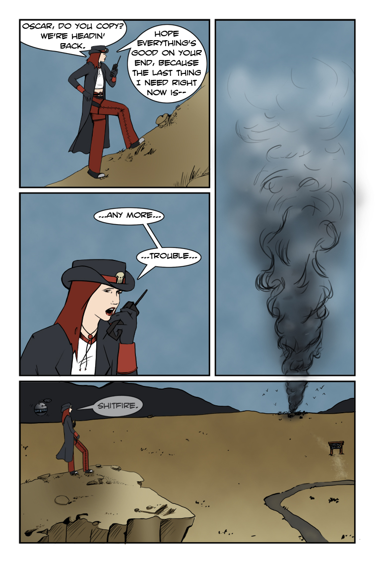
EXHIBIT B: Page 99, “Event Horizon”

Reader Ashley zeroed in on this one in last week’s comments and gave a great breakdown:

“The first panel with Suzie talking to Oscar, the reader sees the third panel out of the corner of their eye. Looking at it, they think ‘Cloud?’ Then they get to the second panel with “any more trouble” and realize it’s not a loud [sic] but smoke, and it builds tension. Where’s this smoke coming from? What’s on fire? Then the third panel segues directly into the fourth panel; that’s when they realize that the smoke is coming from the distant ranch. This only brings up more questions and ends the chapter on a cliff-hanger.”

Since this is pretty much exactly the effect we wanted, Critical Clint lets this pass with an approving nod. The only quibble to make is that the page is arguably that much more powerful when viewed online, assuming the bottom of the page is hidden until the reader scrolls down. Even if viewed all at once, I believe the cloud shape remains vague enough not to drag the reader’s eye down until it’s time for the reveal. Sometimes a page doesn’t work out as well for us in execution as it does in conception, but this is one of those times I think the intent came through quite admirably.

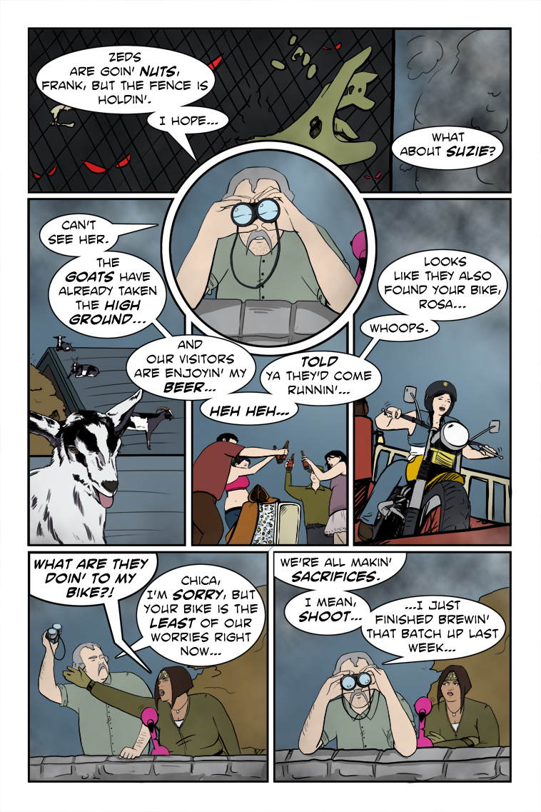
EXHIBIT C: Page 118, “Brewing And Stewing”

This is one of the more questionable pages in our archive in terms of navigation, so I’m pleased no one really called it out even when prompted. Critic Clint, on the other hand, ponders the wisdom of a top panel meant to be read left to right, featuring an unanchored word balloon on the right that gives no clue where to go next. Could be better, that, especially with the circular panel of Chuck breaking up the normal flow. Arguably the flow isn’t broken enough that the eye doesn’t return to the left and seek out the proper sequence starting with “Can’t see her.”, but following the counter-clockwise pattern of balloons around as far as they go ends up with “Whoops” being positioned conspicuously below the final statement, not to mention the danger of the reader’s eye being flung out into space.

I think what saves things at that point is the artwork of the joyriding Darlene on the motorcycle, since it pulls the eye down, but if someone were to term the layout “clunky” I doubt I’d be inclined to argue, especially since I can’t remember any real artistic reason for it other than a simple desire to fit the text. If it weren’t for the rounded pattern and continual connection across panels this might really have gotten out of order due to the lettering sin of having previous balloons appearing lower down than subsequent ones. For some readers it probably still does.

Speaking of sins, there’s the crossing of the balloon stems in the lower left panel. It’s a no-no, traditionally speaking, but here I actually like how it shows the conflict of words between Rosa and Chuck, and echoes the visual of Rosa reaching across Chuck in an attempt to snag the binoculars. I’m guessing a professional editor would probably send it back with a “DO BETTER”, but for once I relish the freedom of the comparative amateur. If we ended up doing it all the time it would suck and show nothing more than us being careless, but in this case I actually find it kind of cool.

So there we have it, a guided tour through some of our past successes and/or imperfections in guiding the eye. Some practice of my preaching. Some money where my mouth has been. And next week, mercifully enough, I think I’ll get back to critiquing the efforts of others again.

Dialogue as navigation

Last week I talked about the idea that the placement of word balloons and captions in comics can actually be a very important storytelling element. Let’s take that even further. Have you ever noticed how they have the potential to guide the reader’s eye?

Most of us are familiar with the basics of how we tend to read in the so-called Western World, a habit that’s been ingrained into us since childhood: left-to-right, top-to-bottom. That’s our default, and it’s not even something you have to think about when you write in prose.

Comics can be another matter entirely. Art and paneling layouts are suddenly part of the composition, and you may have to engage in some fancy gymnastics to get all those words and sound effects you wanted to fit comfortably. Now of course, the first pass is to make sure you absolutely need all those words and sound effects, but if you honestly believe they’re needed, you want to try to make the progression of the reader through the story is as natural as possible. I’ve had several times as a reader over the years where I had to stop and get back on track after reading the wrong dialogue balloon first or even the wrong panel out of intended sequence, neither of which is a good thing.

The most primitive and direct solution for this is the ol’ arrow method where you’ll see a creator literally place a graphical arrow in the gutters between panels to show which ones you should be reading next. You’ll rarely see this in works from experienced pros, and I shy away from calling out any direct examples because of that, but you probably know what I mean. It’s a last resort, in my opinion, something to be avoided at all costs. And there are definitely creative ways to avoid it, one of which happens to be your lettering.

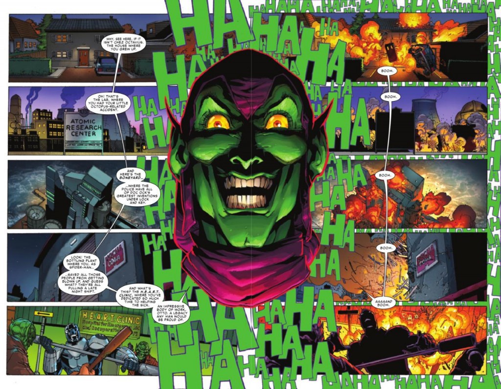
I think I’m going to just dive right in the deep end here with an extreme example from the pages of Superior Spider-Man. The script calls for the Green Goblin to taunt his foe by naming off several locations, and then one after another he detonates bombs planted in all of them, laughing maniacally all the while. The paneling layout, however, is very non-standard. (click the image to enlarge)


ssmballoonsample3

Now admittedly this has the dimensions of a splash page, so we’re actually looking at two separate pages of the comic, but as a single design I think it still works swimmingly at guiding you down the left side first and then the right, with the Goblin and the visual representation of his laughter serving as the border. I even like the happy accident (or maybe design?) of the word balloon stem in the lower left panel. It points to the Goblin’s mouth as it should, but if you look past him it also points to the the upper right panel where the quite literal cascade of “boom” begins. The laughter serving as a background to the right side panels also serves to divide the two spaces.

You could technically still read this left to right and have it work, but I don’t believe that’s the intent, and that’s why those thin little stems are there crossing the gutters to provide the vertical (but not horizontal) connection. They could have all had individual stems pointing to the Goblin or no stems at all and still serve their minimal purpose, but it would have been a less clear choice.

Now that we’ve seen a cool bigtime pro page, I’d like to provide these three pages from our own past work that also hopefully illustrate what I’m getting at, and hear your thoughts on how well they might (or might not) have worked for you.

https://www.zombieranchcomic.com/episode/a-la-cart/

https://www.zombieranchcomic.com/episode/99-event-horizon/

https://www.zombieranchcomic.com/episode/118-brewing-and-stewing/

If you’ve got no opinions to give, I’ll just do my retrospective on them next week to say what we were going for and how well I think we achieved what we intended in terms of guiding the reader. But since you folks are the actual readers, it could make an interesting addition to the discussion.


A little back-and-forth discussion

I have it in my head, whether true or not, that every writer feels certain aspects of the craft come more easily to them than others. For some it’s effortlessly weaving intricate plotlines. Others have wonderful and memorable sensory descriptions spring readily to their fingers.

Me? I’ve always thought I had a good sense of dialogue. When characters are talking to each other, or even to themselves, I’m in my element. So when I saw this article linked on one of my webcomic creator groups, I felt compelled to go give it a look.

http://webcomicry.com/dialogue/

The gentleman responsible, C. S. Jones, creates a webcomic that couldn’t really be termed “dialogue heavy” so far, but that doesn’t mean he didn’t have some interesting things to say on the subject. I don’t agree with everything he put forth in his piece (for example he’s not a fan of boldface, and I expressed a quite recent conflict of opinion there), but if nothing else it got me thinking and examining how near or how far I was from some of the conventions he brings up. For instance, this little bit which is technically a quote of a quote, since it originally comes from Tyler James on Comic Related:

“Steven Forbes turned me on to the following rule of thumb that was supposedly given to Alan Moore by his editors at DC comics. (If it’s good enough for Alan Moore, it’s good enough for you.)

– No more than 35 words per panel.

– No more than 25 words per word balloon or caption.

– No more than 120 words on a page.”

Now anyone who has read From Hell knows Alan Moore eventually wiped his Northampton-born arse with those dictates, a good example of which is the page shown here. But I understand why the dictates are there. Writers—even experienced writers—get too wordy and suddenly there’s no room for the art, or you’re unnecessarily repeating the visuals in textual form. If you’re self-editing, it’s worthwhile to keep things like this in mind. They may seem arbitrary (and they are), but they will keep you honest about whether or not you really need to wax loquacious at a given time.

Then there was this:

“One word balloon contains one concept.

1. Something’s been scaring the cats lately. Miffles hid under the bed all morning.

2. Plus, I keep hearing these weird rumblings at night.

Punctuation goes a long way towards capturing the nuance of speech.  Consider the difference between “Get in here” and “Get.  In.  Here.”

Both of these are great points, especially the first if you happen to be someone who is regularly struggling with where your word balloons should begin and end. But have you ever considered how word balloons and captions are themselves are a form of punctuation in comics?

Think about the definition of a paragraph: “…a group of sentences with one topic.” That sounds an awful lot like “One word balloon contains one concept”, doesn’t it? I would go so far as to declare a good rule of thumb would be that if you would start a new paragraph in prose, you should be starting a new word balloon in a comic.

Mind you, the reverse notion doesn’t hold as true for me. There are times where I feel that a prose version of “Yes. I am.” would be better served in a comic by separate word bubbles, depending on just how much I want those words to have weight to the reader, and trying to fit some of Charles Dickens characters’ speeches into a single word bubble seems like an exercise in eye-squinting insanity. Comics can and should be able to break apart (and reduce) textual paragraphs in the service of a greater visual understanding.

I’m not done talking about all this by a long shot, but for now I leave you with an example of just how much the choice of how word balloons are placed and structured can affect a comic, from the pages of Grant Morrison and Frank Quitely’s We3. We3 was something of a take on those old Disney “lost animal” movies like The Incredible Journey, where a group of somehow abandoned pets have to survive danger on a long trek to safety— but in this case, the “pets” are escaped secret military experiments given limited sentience and wired into powered armor suits. The dog, known simply amongst the group as “1”, has been leading them “home”, and at this point in the narrative the skeptical cat, “2”, finally presses him to define what exactly “home” is supposed to be, since the dog doesn’t seem to have any actual destination in mind. 1’s (quite beautiful) response?

“Home? Home is run no more.”

Or that’s at least how it might appear in prose. In the original comics, here’s how it’s presented (click to enlarge):

we3_old

This is very compact, stylized dialogue, and yet even then the word balloons are heavily broken up, both to emphasize the halting nature of the animals’ speech and the weights of concepts. Of particular note is the third panel where the question mark gets its own balloon after the previous balloon is a one-word statement. It’s a fantastic way of showing the “gears turning” in 1’s head as he wrestles to express an abstract concept. Where, precisely, are they running to? And then in the last, amazing row of panels, he slowly but surely provides his answer. Home is no more and no less than the place where you are safe. HOME IS… RUN. NO. MORE. Even the choice to space that out over two panels feels deliberate and correct as the animals progress through space, time, and understanding, and bring the reader along with them.

Thus, it’s pretty baffling what ended up happening in subsequent reprints (again, click to enlarge).
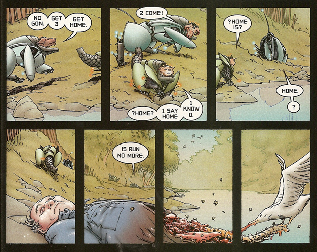
we3_new

“Butchered” might be too strong a term here, but this inexplicable alteration on the bottom row is not a good one, in my opinion. Maybe Morrison and Quitely did change their minds? Or (more likely) it was just some editor deciding they knew best? But I feel like squashing the words together is a comparatively terrible choice that robs the moment of the power it had in its previous version, not to mention endangering the multiple-placement illusion of progressing the same characters across panels through a contiguous background. Lest you consider me alone in this, I’m only aware of it due to a post highlight on Brian Cronin’s Comics Should Be Good column for CBR where the comments thread mentioned the change, and much similar gnashing of teeth ensued.

In any case, maybe you don’t agree, or don’t care, but I think the above at least illustrates how important something as simple as the word balloon decisions can be as a storytelling element.

What does this have to do with writing good dialogue? Nothing. And also everything. With comics we are dealing in a medium that’s one step up from prose, in that there is a visual element to go with the textual, but we still lack a lot of the subtleties that go into face-to-face communication. So it behooves us to use whatever cheats we can to convey a certain tone and meaning, a “body language” accompanying what is demonstrably a bodiless form. The art is one tool, the words another, but never forget the potential intersections between the two.
 

Rounding out the year…

I’m going to keep this installment of the blog somewhat short since we’re on our Holiday break, but I wanted to be sure to clue you guys in to a great article for your reading pleasure. Last week I discussed at length the idea of using boldface type as a storytelling element, but that’s merely scratching the surface of the kinds of things you can choose to do or not do with comics lettering, and Balloon Tales is home to a fantastic roundtable discussion on the subject featuring some of the most respected names in the business.

The discussion is supposed to be about obsolete and/or abandoned techniques, but these are folks who know their stuff enough to not just be content with blanket bans and omissions, expressing their frustration with editors over the years who have enforced such things regardless of whether it might actually be appropriate. This discussion, incidentally, is where I got my insight that the misuse of boldface might have been due to printing errors more than any errors on the part of writers or letterers, and yet because it could be done badly in the past, there were those with veto power who had barred it from consideration— a rather irritating situation for dudes like Kurt Busiek who damn well were putting a lot of thought and care into their decisions, only to be overridden because others had been careless before.

Which is sort of like outlawing science fiction films because bad science fiction films have been made, isn’t it? Speaking of which, the roundtable begins right off with the worry that comics these days are being expected to be too much like movies, to the point where a lot of comics-specific techniques have been nixed by editors as being, ludicrously enough, “too comic-booky”. Sound effects, for example, and boy howdy did I have my own say on that.

But I, for all my opinions, am still but a small fish. Without further ado, I bid you read the words of some of the true movers and shakers: LETTERING ROUNDTABLE

Oh, and Happy New Year!

The brave and the BOLD

So, for the last several months I’ve mostly taken over the lettering duties for Zombie Ranch, except on those rare occasions where I beg Dawn to help me with a certain visual effect I don’t feel confident of pulling off with my shaky non-artist hands. Even before I started doing the actual balloons and captions, though, I had begun the practice of formatting the text itself in certain ways, the most common of which was deciding to present certain words in boldface, for emphasis.

Not every comic does this. In fact it fell out of favor for a long time because careless hand lettering and/or print errors would make the sentence seem like it was being said by an insane person if you tried to read it out loud. Traditional comics lettering being all capitals, you would read “GREAT SCOTT!! THE MISSILE IS ONLY SECONDS FROM IMPACT WITH THE CITY!!”, and if you care to think about that, Superman now sounds like a malfunctioning voice synthesizer. “GREAT scott!! THE missile is ONLY seconds from impact WITH THE city!!”. Linkara occasionally loves to call this phenomenon out as part of his Atop the Fourth Wall reviews, although it’s perhaps unfair to do so for anything published before the advent of digital lettering.

Mind you, if digital lettering is used, then there’s really no excuse for using boldface badly. You can continue not to use it at all, and that’s a perfectly valid choice, but I personally have really fallen in love with it as a part of my comics writing toolbox. I feel it helps me in my simulation of the rhythms of how people would talk, and as such becomes an important storytelling element.

Examples, you say? All right, take a look at this page from Episode 7 (the link should open a new window/tab for you). Note how Frank starts off with no boldface in his speech, which suggests an even keel, even when he declares Eustace’s kin as good as dead. The one exception is the boldface on his exclamation regarding Muriel, where I let his simmering frustration with the situation briefly spike through.

Eustace meanwhile is making all sorts of desperate pleas. What about this? Or this? Finally Frank cuts him off with my favorite bit of the page, one of our “whisper balloons” we’ve already established that blends with the background and is in a smaller font, but is still boldface so that I, at least, can almost hear Frank hissing the command. Frank continues with a non-whisper and some emphasized words to drive his point home, but the font remains slightly smaller than the rest of the page. Even if a reader doesn’t consciously register that, I hope subconsciously there’s still a sense of restraint that comes through.

Panel 4 is back at regular size font, but not one word is bolded, suggesting an almost monotone speech that reinforces what’s being said. Slow and steady. Keep your cool. Don’t draw attention. In Panel 5 Eustace is, of course, too panicky a sort to follow that advice to the letter (heh), so his fear still bubbles up when he asks about the stampede, but Frank’s response is very simple and neutrally delivered, capping off the page.

So there’s a prime example of my using boldface (or lack thereof) to help show character, establish rhythms, and reinforce the story. Another thing you may notice (or at least may notice on another read-through) is that almost any time speech is coming from the camera drones or walkie-talkies, there is no boldface involved, which is my choice to show the detached and/or more “lo-fi” nature of such communications. On the other hand, the overproduced media interludes run rampant with emphasis to make sure the viewer is as excited as possible!

Now all this would be obnoxious in a pure prose story, but if we accept the idea of lettering being a visual element in comics as much as anything else on the page, then shouldn’t we be considering how to present it visually? As long as some care and thought is involved in the usage, I see no reason that you can’t boldly go forwards with some boldface type.

Imperfection and passion

I think it’s fair to say that no artist has ever perfectly realized their vision. You might argue such a statement is pessimistic or perhaps a case of sour grapes, but everyone I’ve ever personally known in the creative arts can point out the flaws in their own work and is never truly 100 percent satisfied with the final product, be it prose, poetry, sculpture, dance, or any other medium of expression. I can certainly picture Michaelangelo looking at his statue of David and thinking, “Well crap, I botched that bit. Hopefully no one notices.” Meanwhile a significant chunk of humanity is in awe to this day of what he accomplished.

And there’s a significant chunk of humanity that don’t care (ignorant or not), and I’m sure even a chunk of humanity who consider that sculpture to be an overrated piece of junk. The other side of the equation is the audience, where even if an artist theoretically considered his work to be perfection (like, I suppose, Kanye West might?), the viewer or reader can still be entirely unmoved, or moved in a way the creator didn’t intend. Paul McCartney might have conceived the song “Helter Skelter” because he “liked noise“, but I’m sure he was as horrified as anyone else when Charles Manson was inspired to do some very nasty things while listening to it.

Does that lack of connection or unintended reaction make the art in question a failure? Good question. Does Fifty Shades of Grey selling millions of copies make it a success? What about works that go unrecognized or even reviled at the time they’re first published or put on display, only to later be inducted into the ranks of the all-time classics every schoolchild gets subjected to?

There’s no easy answer to this, which is why I feel that from a creator standpoint it’s a trap to create things that you think will appeal to the masses rather than something you personally are passionate about. On the one hand, it’s easier to handle the idea of flawed work or unmet expectations if you don’t really care about what you’re doing. On the other, it seems like a pretty hollow exercise. That’s probably why a lot of Hollywood or Triple A gaming output leaves me cold, since they’re usually conceived first and foremost as something focus groups or statistics say will work and make money. When you encounter the rare exception where the people involved were excited about what they were doing and believed in it enough to take risks, you can just about feel that joy and effort shining through— and then it becomes a success and everyone rushes to copy it and try to cash in, meanwhile making excuses on why they passed it up and making more excuses when their soulless retreads fail.

In most cases, the more money and overhead and people involved, the less risks will be tolerated. And that’s why the wild world of webcomics continues to be an exciting thing, because with few exceptions, they’re all passion projects of their creators that don’t need a big bankroll for production and distribution. That’s far from saying we present uncompromised visions, mind you. Certainly I don’t consider Zombie Ranch to be a flawless product, and there have been many times where our reach has exceeded our grasp, or at least where my grandiose intentions have exceeded my artist’s time and patience. But we continue to try. To do otherwise wouldn’t be very passionate at all, and if we didn’t care, there’s no excuse for expecting you to.