What’s in a million?

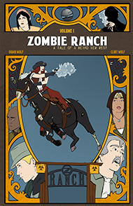
This past weekend, at least according to the WordPress site stats counter, Zombie Ranch experienced its one millionth pageview. It’s a mark I saw approaching and figured would be hit by the end of the year, but I think this is better since it means by the time December 31st rolls around we should have enough extra views to maybe account for all the refreshing we’ve done ourselves during various edits. And the possibilities of inaccurate counting. Maybe.

Don’t get me wrong, this is still a nice feather in the cap after two years of operation, but oy vay for the varying totals you can get from different tracking sites. Sometimes the numbers are off by dozens, if not hundreds or even thousands, and it’s extremely difficult to tell what your actual audience level is. We don’t have one million loyal readers by any stretch, nor have we had one million unique visitors since we started. I do believe, guestimating between the various trackers, that we have had unique visitors in the hundreds of thousands by now, but again, how many of those made a run of the archive? How many got hooked and are going to actually come back week after week? There are sites like comicrank.com that purport to calculate the last total, but it seems like there’s always going to be a certain amount of fuzziness involved in the math.

To be a starting webcomic creator is to exist largely in the dark in terms of audience, not really ever knowing how “well” you might be doing. You’ll try, and it’s certainly not entirely worthless to go over your metrics, but at some point you’ll realize no tracker or ranking site is really going to give you the picture on its own. Too much variance. Too much “who?” and “why?” to try to factor together. And yet there are ad networks out there that won’t let you be a part of their roster unless you get X amount of visitors in a day. Hopefully whatever tracker they’re using to determine that errs on the generous side.

I feel like reaching this milestone of a million views does count for something, but what counts for more might be the number of people actually responding to that news. It’s those little personal lights in the dark, the connections, even if it’s as simple as “Congrats! Good on yer!”. The anonymous gentleman who came by our table at Long Beach Comic Con this past weekend to declare he read Zombie Ranch every week, religiously, and couldn’t wait to find out what happens next — that’s the sort of thing I really feel like celebrating. So thanks to all of you for that, everyone who has ever tossed a sincere thumbs up in our direction as we chugged along. Thanks a million. 😀

Flash and substance – dissecting a comics layout

Two weeks ago I wrote about the ideal of having artwork that meshes perfectly into the storytelling of comics, and how I felt the right choice and arrangement of panels was an inescapable part of that. At that time I included some scans of J.H. Williams III’s artwork to illustrate the possibilities, but this time around I want to take one single page and get really (over?)analytical about the choices that were made.

It may seem strange but I find this to be one of the joys that progressed out of working on a comic of my own. When you’re figuring out how to tell your own story, you really start to become aware of the techniques others are using to tell theirs, and it provides a new level of appreciation for both the comics you re-read and the ones you discover for the first time. One of these recent discoveries for me was The Flash #1, one of the slew of titles in the New 52 line-up of the DC reboot.

By and large, I was uninterested in or even just outright bleah about DC comics trying to reinvent and relaunch their signature heroes, although having grown up a Marvel brat I didn’t have quite the visceral investment of those that were really familiar with the characters. Superhero comics in general were something that had blended into a generic state, especially visually,  that I found to be uncompelling, and the reboot didn’t look prepared to change that much. Then, in one of my occasional browsings of comics news sites, I ran across a review of The Flash, and a scanned page from the issue that unexpectedly seized my attention in a big way.

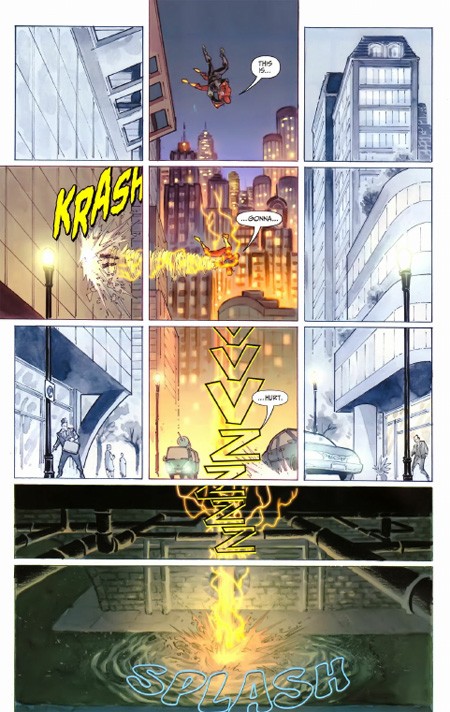
Without further ado, let me share that page with you now:

I went out and bought the comic almost solely based on this page alone (plus a quick skim at the comic book store to confirm it wasn’t a fluke). The Flash #1 is an issue I felt was well worth its $2.99 pricetag because of visual storytelling like this. It’s a great example of how the work in a superhero comic doesn’t have to be stale and generic. Francis Manapul and Brian Buccellato went above and beyond with this layout. Let’s break it down (you can click on the image to open it in a new tab/window while you’re reading this).

  •  Note that this page is composed of a single, contiguous environment. A city street, its surrounding buildings, and the sewer beneath. The action and dialogue here is actually quite simple, script-wise. The Flash has just fallen out of a helicopter along with one of the armored thugs he was chasing. As he falls, he throws the thug through the glass window of a building, then plummets to a crash landing. Aside from some sound effects, the only dialogue is: “This is gonna hurt.”
  • Given all that, there was a choice here where the scene could have been rendered without any panel dividers, or very few. But panels = time. The more panels on a page, the more compressed time becomes, increasing the urgency of each action depicted. Urgency was a key storytelling component of this page. But most of the action takes place along a very narrow section of the actual image, so if you’re going to display a big, single background, aren’t some of those panels going to end up showing unnecessary filler? Yes they are, and so…
  • The “non-action” parts of the grid are not only reduced in size, but bled of color. Not completely, so you know it’s not a mistake of printing, but it does serve to mask the presence of the contiguous background image at a casual glance. Your eyes go first right where they’re supposed to, the top middle. But wait, there’s more…
  • Although it may not be obvious from the scan, there are three panels that extend all the way through the bleed area to the edge of the comic page. This occurs at the middle top, the middle left, and the entirety of the bottom. Notice this also corresponds to the presence of full color, and of action. Flash’s entry point from above (falling) is clearly defined, and the “exit point” of the thug is given weight by having the panel shifted outward by the impact. These are given a tighter focus than the bottom, where the final ‘SPLASH’ impact is spread out to overflow downwards in a less sharpened form, letting the kinetic energy of the sequence fade away.
  • Similarly, splitting the sewer area into two panels of equal horizontal space, but unequal vertical space, is another deliberate choice. What you get with this is a sense of the pancaking ‘hit’ of the initial contact with the street, followed by the subsequent descent into the water having a more anticlimactic feel that’s backed up by the splash being much less ragged and violent than might otherwise be expected.
  • Finally, we have the choice of how to display the lone line of dialogue: in… between… moments. There is a real sense of velocity here because there’s no time to say anything lengthy. There’s not even time to say a short sentence in the space of a single panel, it takes three of them to utter what at most would be two seconds of words. This neatly follows the idea of a page where the protagonist descends from top to bottom at a rate of hundreds of feet per second, and is most likely also why the sound effect of the breaking window is isolated and unfinished–Flash hits the street before the glass has stopped tinkling.

By setting all this up, Manapul and Buccellato were able to split what could’ve been left as a lazy splash page (last panel sound effects notwithstanding) into 11 segments that tell the story far more effectively, even if five of the panels are there mainly for completeness and contrast. It’s a carefully crafted piece that draws your attentions exactly where they need to go and makes you feel exactly what you’re meant to feel, and does it so well we don’t need a lick of duo-specific narration from our hero explaining what’s happening or what he’s doing–and that’s important considering this is a situation happening so fast he should be running on instinct. That old silver age silliness of “Only a fraction of a second to react!” plays out exactly where it should for a piece needing that frame of immediacy–unspoken, unthought, except as a given to the actions occurring; a feature especially important to a superhero like The Flash where speed should be a major theme of the physicality.

There were several impressive moments like this in the comic, and I highly recommend picking it up if you want to experience some enthusiastic pros at work with great visual instincts on how to guide a reader’s eye. I didn’t need to be a fan of The Flash to know that these guys are, and that they’re having some great fun with the opportunity they’ve been granted to not only reboot a classic hero, but show the storytelling core of that hero in a way only comics can do.

In any case, I hope this article explained a bit more about my views on how all the aspects of a comic’s presentation can contribute to the tale being told. These are lofty heights we probably only rarely achieve with Zombie Ranch (if ever) but they’re something I feel important to keep in mind and strive for as a creator. When it’s done right, it’s the kind of work that really inspires, and makes the medium shine.

It’s not about forum moderation…

Netflix has been having its issues of late—price increases, bizarre business model alterations—thankfully the whole Qwikster idiocy has now been abandoned, but with all the rough patches it was nice to fire something up this last weekend that reminded me why I fell in love in the first place.

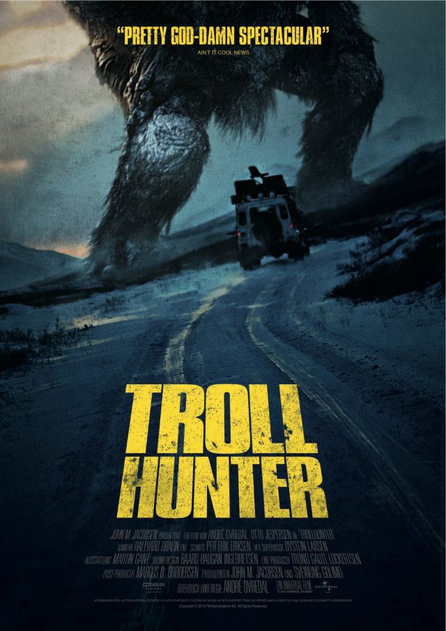
Troll Hunter (original title: Trolljegeren) is a Norwegian film shot in the “mockudrama” style first brought into modern popularity by The Blair Witch Project and since used in many subsequent films such as Paranormal Activity, Cloverfield, and (as reviewed earlier on this very site) Diary of the Dead.

In that Diary of the Dead article I briefly mentioned how this whole cinéma vérité trend was getting a little annoying and, ironically, false in its presentation. Cloverfield did little for me except make me feel seasick. The final frames of Paranormal Activity were so silly and predictable to me that I started laughing, which I doubt is the emotion the filmmakers were going for. Therefore, when Troll Hunter opened with a black screen printed with yellow text declaring that what you are about to see is representative of 283 hours of film anonymously delivered (so far unable to be declared a prank by the experts that have examined it!), I groaned, and groaned further when the movie started and it became clear this “found footage” was shot by three students—two guys, one gal—for their college project.

Still, I’d seen a decent looking online trailer and heard some good word of mouth about the film, so hell, even if it’s a Norwegian remake of Blair Witch, maybe it would at least be as entertaining as Dead Snow, which was pretty much a Norwegian remake of Evil Dead. Besides, I wanted to know what exactly was on top of those giant legs in the poster. I kept watching, and I’m glad I did, because this movie has something that Blair Witch very much lacked: a hunter.

And not a hunter in the sense of Beowulf, but a hunter more like John Wayne in Hatari!  A guy who treats what we would consider spectacular as just his job. There is an ingenious conceit at the heart of Troll Hunter that rescues it from mockudrama hell, and it is subtly foreshadowed right from the start as sanctioned bear hunters are being interviewed and speaking of how they are carefully licensed and reviewed by the government in their job of controlling the bear population.

Some brilliant soul took that idea and cross-pollinated it with Norwegian folklore, and Troll Hunter is the result as these college kids end up following and documenting the activities of an unsung, lonely man whose job it is to track and occasionally cull, well… you get the idea.

It’s a fun movie, full of the sorts of inventive explanations we’ve gotten used to in telling us how other creatures of myth and legend might exist in our modern world, but treading fresher territory than vampires, witches and werewolves. Not to mention it’s full of the fascination and attention to detail you usually only give to the particular monsters of your own backyard. Troll in America is a rather generic term, and these days maybe something people think of first and foremost in its Internet context. The trolls of Norway are a varied lot who seem to be quite at home in the landscape no matter how outlandish they get in their appearance. There’s a lot of beautiful landscape shots which might seem like time-wasters, but honestly to me served to ground the legends in the land. How did those huge rocks move overnight? Trolls moved them! Are the government’s explanations any less ridiculous?

I love the ideas in this film, and the visuals, and the tone. I even love the fact that on the one hand it tries to scientifically explain why trolls turn to stone in sunlight, but completely handwaves the demonstrable fact they can smell the blood of “a Christian man”. I love the world-weary hunter who goes stalking a 600 foot behemoth because it’s his job, and if he doesn’t do it, who will? The bureacrats filing the “Slayed Troll” forms for the TSS (Troll Security Service)? Pshht. Don’t make him laugh.

Of course, an American remake is already in the works, but at the risk of sounding irredeemably hipster, I urge you to check out the original. If you’ve got Netflix, it’s just an Instant View away right now. The thing is, again, this movie just seems so dependent on its locale, and that locale’s specific mythology, in a way that others of its ilk might not be, and Hollywood can’t seem to touch any of these without ripping them out of their original setting in order to appeal to a “broader audience”. I don’t think a remake will justify the shakycam it’s shot with, but this original was a pleasant surprise that surpassed the cliches of its presentation.


The art of comics storytelling

At APE I had an all-too-brief discussion with one of our neighbors about the balance of art versus storytelling in the comics medium. The premise of the conversation is already on shaky territory because ideally, any and all art in comics is storytelling, but I understood exactly what she meant when she brought it up. Is it possible for the art to get too wrapped up in itself, in just its own existence and cleverness, rather than telling an effective tale?

Of course it is, just as its possible for a writer to fall in love with their words so much that it seems even they forgot what they were writing about. Just as it’s possible for a film director to get so enthusiastic about tricky camera techniques and effects that when you walk out of the theater you’re not sure what, if anything, actually happened.

In comics this can be exacerbated by the common circumstance of a writer and artist being two different people, each struggling to find and promote their own identity, but it can also happen in solo authorship. The discussion then becomes a matter of determining where the borderline falls between experimentation and incomprehensibility, and that’s a line that I’ve found to be very subjective.

For example, I found not only the movie but the original graphic novel of 30 Days of Night to be unsatisfying, and while I won’t go into my reasons on the movie here, I’ll say that the comic didn’t work for me mainly because of Ben Templesmith’s art. It was repeatedly making me stop to try to figure out what I was looking at, or worse, pulling me entirely out of the serious tone of the story by doing things like writing out the decidedly non-onomatopoeic word ‘Jump’ as a sound effect. I’m not saying Templesmith is a bad artist by any means, but in the more extreme cases I feel like I’m needing a machete and a mining helmet to hack through his imagery and get to the tale trying to be told.

His imitators are even worse, where sometimes it looks like they took sketches straight from their storyboards and used them as the finished panels; including, in at least one example burned into my brain from a Comic-Con freebie, the liner notes. Generally speaking, I believe if you have to label the scalpel on the table with the word ‘scalpel’ and an arrow pointing to it, it looks less clever and meta and more like you just gave up trying to draw it coherently. Maybe in a parody setting it would work, but it always seems to end up in dark crime/horror comics. Nossir, I don’t like it. They might be going for a simulation of madness, but all I’m seeing is unnecessary clutter.

Given that, you might think I’d be similarly down on the work of Bill Sienkiewicz, and yet he falls on the proper side of the borderline for me despite having very, very stylized imagery. If you ask me why, I’d just have to say I feel like it’s riding the edge, but I still get a sense first and foremost of the story being told. Even without a single word involved, I look at these examples, for instance, and I get a lot more sense of what’s happening and what’s being felt than in the Templesmith art. Your mileage may vary, but that’s how my dashboard reads.

In a similar manner, my neighbor and I specifically discussed J.H. Williams III’s very stylized artwork on the Batwoman Detective Comics, and how much we enjoyed it. JHW III first came to bigtime attention drawing Promethea for no less than Alan Moore, where his dream and nightmare visions and non-standard paneling choices were a perfect fit to the story being woven. But compare the differences in Alan Moore’s prose style to Greg Rucka’s and you might have serious questions if the same lavish and experimental compositions would work in a gritty mainstream superhero setting.

It does. It fits. Would it fit with Superman? That I don’t know about, but for Batwoman and especially Gotham, it works. Gotham City is a crazy, crazy place, almost more of a state of mind than a physical location. The good lunatics battle the evil lunatics for the town’s soul, but for me there’s exactly one sane man in that whole place, and his name is Gordon. Not Wayne. Not Kane. Gotham is a place of dreams and nightmares where everything is so much larger than life that a man (or woman) dressed as a bat is fearsomely serious and the most fearsome villain is literally a complete joke. The best Batman stories have always been psychodramas, so why not the best Batwoman stories? Promethea was closer than I originally thought. But what also helps Williams’ case is that he knows how and when to change things up. The scenes with Kate Kane are presented in a much more straightforward style than the wild exploits of her alter ego, drawing a deliberate contrast between the two. The stark, jagged borders of panels in one series of pages melt and flow together when our hero gets drugged, losing her sense of time and space (and remember in comics, time is space).

That’s when I feel like there’s some real thought going on behind each stroke of the pencil, and that’s when I feel really, really impressed by an artist, even in the cases where a writer (like Moore) might be laying everything out for them. Whether that art happens to be fairly simple or gorgeously impressionistic doesn’t matter. Whether it’s a bog standard grid or some crazy moebius strip splash page doesn’t matter. What matters is how appropriately and seamlessly that choice of presentation melds with the story, and in the absolute best examples out there, enhances it.

As I said in the beginning, the actual conversation was all-too-brief and didn’t even have the opportunity to get to most of what I’ve brought up here, and even this much is a poor surface scratch of the concept. I’ll just leave you with one last point to ponder on art supporting story, which Dawn touched on briefly several weeks ago when she brought up the deceptively simple layout of Watchmen. Every last page in Watchmen is made up of an identically sized grid of 9 panels. Occasionally this border or that border in the grid is removed, but that same size and shape remains constant throughout. Space as time, ticking away inexorably from beginning to end.

Like clockwork.


It’s never quite conventional…

Not all nerd shows are created equal. Dawn and I have only been exhibiting for two years now, exclusively in California (and mostly Southern California, for that matter), but it’s a truth we’ve come to realize. You understand this phenomenon somewhat as an attendee as well… some conventions seem more cosplay-friendly than others, some have a more “all ages” atmosphere, some are just overall more crowded… but as an exhibitor I think you really start to pick up on certain differences, especially as the item that was such a hot seller last time gets barely a glance from the crowds at the next show.

Case in point, at Wizard World Anaheim we sold so many of Dawn’s Bits of Nothing collections that we came within a couple copies of completely running our stock dry. Zombie Ranch and her personalized sketch cards got a bit of attention, but nothing to crow over. Fast forward to San Diego Comic-Con and Bits of Nothing goes largely ignored while Zombie Ranch is seeing lots of love and Dawn can barely keep up with the sketch card demand (in one case, a lady just bought every single one currently on the table). Then there was APE, which was a very friendly and well attended show, but the crowds there just by and large didn’t seem interested in anything we had to offer. It’s possible we just looked too mainstream? That would be highly ironic considering the content of Zombie Ranch, but of course you have to get past first appearances to really know that.

We haven’t ever exhibited at an Anime themed convention since I don’t think that’s our audience, either, but when I attended Anime Expo this year I thought it was interesting how even though both it and more “standard” comic conventions have Artist’s Alleys, the set-up differs considerably. In the conventions I was used to, the table contained some of the artist’s work, but then behind them are the display banners, samples, etc. At Anime Expo, the display was usually a latticework of piping latched right to the front of the table and covered in art, with a small ‘window’ in the middle the artist(s) lurked in.

Psychologically, it seemed to me like the effect there was to present the art first and foremost, with the artist as an almost hidden afterthought. In some of the more extreme cases it seemed like people were handing their money and speaking their wishes into a mysterious cave from which signed prints would then mystically emerge. On the other hand, it perhaps makes you consider how much of the non-Anime-con Artist’s Alleys are cults of personality, where it’s the artist’s name and presence that brings the boys (and girls) to the yard, not necessarily whatever they’re producing at the moment. ‘JIM LEE’ says the banner. ‘TODD NAUCK’, says the next one over. That could be a simple function of more mainstream Artist’s Alleys having a lot of big names with big distributions, but in any case everyone tends to be front and center, easily able to lean over, shake your hand, and hear what you’d like sketched.

Speaking of which, one oddity we noted at APE was that not a single person asked Dawn for a sketch, and at every convention we’ve ever been at, someone’s always wanted something, even if it was just a quick free scrawl for their collection book. Then again the set-up is much like if a convention was entirely composed of Artist’s Alley, and I heard at least a couple people talk of how there was just too much for them to try to see in what little time they had available. It’s not a big convention geographically speaking, I could walk from one end to the other in a couple of minutes (try doing that at San Diego)… but there’s a lot packed in there.

No one asked me for a sketch, either. What? I did a few free ones at San Diego. At the requester’s own risk, of course. I’m the best there is at what I do… what I do isn’t pretty…

… no really, it isn’t pretty. I think my art skills haven’t improved much beyond what they were when I was six. It’s still fun to play around with, though… if you’re coming to Long Beach or Comikaze in a few weeks and you feel like a laugh, go right ahead and hit me up for one. It keeps me from getting into trouble. Mostly.

Anyhow, where was I? Oh yes, so basically, even when you’re not dealing with Anime/Manga versus more “Western” conventions (and since I haven’t been to one in Europe that may be a misnomer), there’s a lot of variance in terms of crowds, show management, and heck, even the nature of the surrounding area. Anaheim has a very pretty, very spacious convention site, but because of the proximity of Disneyland the hotel prices and even the food prices are through the roof. Everyone knows that getting eats inside the Convention hall is a great way to go broke, but Anaheim is a place where you go down the street to the IHOP and find the burger there will *also* cost you twelve dollars. Rough stuff, and every dollar spent on passes, lodgings, and tickets cuts into your budget for buying things at the convention itself. APE was wonderfully cheap at the door, but had the interesting phenomenon of having your parking for the event be pricier than the ticket to get in.

Sometimes it may also a matter of being able to stand out. We did well at one show because we were one of the only tables there with a comic to sell, but the other part of that equation is having people there who came looking to buy a comic. There was only one booth at APE selling discounted trade paperbacks, when most conventions usually have several. I don’t know how well they did when all was said and done, but they managed to fulfill my goal of getting a bunch of Love and Rockets books at a discount price, and without hassle. If you’ve ever tried to scout for trades at San Diego Comic-Con in the last few years, you’ll know just how important “without hassle” is. Before Dawn and I gave up on it completely we would be there on Sunday trying desperately not to die in the crush as we scavenged through 50% off and $5 “end of Con” specials. Now we know that it is much better to wait for a different convention where the booths don’t quite resemble a bad rugby pile-up. The deals are still there, and the selection usually is as well. Maybe even moreso.

It’s expensive to attend different conventions, even if they’re all local to you… that’s probably why we didn’t really start noticing all the different “vibes” and circumstances until we had wares of our own to hock and so a really good reason to do the legwork. There are subcultures that develop based on location, main subject matter, and even the traditions of the convention itself. Just like the problems with the concept of “Conventional Wisdom”, pop culture conventions are rarely something you can apply a blanket approach to.


The Zeitgeist of Apocalypse

dangerous

Let’s face it: we’re obsessed.

Humans, that is. We’re obsessed with our own mortality, and have been likely since the first person ever had the conscious realization, watching their tribemates pass away, that one day they, too, would “move along”.

It was only natural, sooner or later, that people would start applying this notion to their whole tribe. Their whole village. Nation. The entire human race. As perception of the breadth of humanity grew, the notion that we were all sooner or later doomed grew right along with it. Our imaginations ran wild, especially fueled when out-of-the-ordinary events happened like solar eclipses, or comets, or especially nasty volcanic eruptions. Every time it happened seemed like a pretty good indication that The End Was Nigh to the people living at the time.

For all our advances, or perhaps because of them, apocalypse still weighs heavily on our minds. I think a subconscious part of us always has an idea of The End, but it changes with the spirit of the times (the zeitgeist), and I believe whatever form seems to resonate the most in pop culture can tell you a lot about the culture of people in a particular time and  particular place.

If it comes in the form of a 100-foot Marshmallow Man, you can probably guess that’s someone having a laugh. Or is it? Yeah, I’m going to overthink here, but consider Ray’s babbling in “Ghostbusters” about the nostalgia of his youth roasting Stay-Pufts around the fire… and now it’s come to kill us. Back in the 1950s and 1960s when Dan Akroyd and Harold Ramis’s generation was growing up, children still ate marshmallows with carefree glee. Not like growing up in the 1980s, where every Saturday morning I was bombarded with PSAs warning me of all the dangers of unhealthy junk food. Sure it might seem like a good idea at the time, but that stuff would ROT YOUR TEETH and MAKE YOU FAT and possibly even SEND YOU TO AN EARLY GRAVE. There’s a sense of lost innocence, of something you once thought to be harmless and fun turning against you or being somehow secretly horrible, that I figure a lot of adults of that era had knifed into their subconscious.

Back in those same 1950s and 60s, radiation and invasions from outer space seemed to be the go-to pair for apocalypse scenarios. Bonus points if you could somehow combine the two. I think I’ve mentioned before about the modern zombie apocalypse scenario, how back in “Night of the Living Dead” when it began, it was heavily implied to have been caused not only by radiation, but radiation from a crashed space probe (nowadays it’s usually represented as a disease, because we are freaking terrified of plague). Anyhow, “Day of the Triffids”, “The Day The Earth Stood Still”, “Invasion of the Body Snatchers”, and “The Blob” were just a smattering of the unfriendly visitors the Earth was receiving back then. Oh, and in the U.S. and U.K at least, there was also a heavy element of fear of Communism to make the moviegoing public clutch their loved ones closer (but are they REALLY your loved ones anymore?!). The original novel of Day of the Triffids was actually much more explicit about it, outright stating the Triffids were a result of bio-warfare experiments from the Soviet Union. Then you have them getting loose, spreading and inflicting themselves on a world that is quite literally blind to their menace…

Across the pond in the other direction, Japan had some still recent national tragedies to deal with, and it was no accident that Godzilla was conceived as an unstoppable monster born in atomic fire, with a penchant for destroying cities. Japanese fiction to this day seems to often have apocalyptic moments, particularly in the form of very large blasts indiscriminately destroying cities or even entire planets. Meanwhile in the U.S., we were experimenting with irradiating food and otherwise tinkering with things through science, and the jitters from that (or should I say THEM!)  have resounded down the decades to this day, with radiation giving way to genetic engineering as that became the preferred zeitgeist of chicks and dudes in lab coats playing God.

On the other hand, the specter of nuclear annihilation just doesn’t seem to have quite the gut-punching impact it did in popular fiction from the 1950s to the 1980s. It’s been sort of folded into the general fear of terrorism and just doesn’t seem as “big” anymore, perhaps because we’re thinking more in terms of suitcase nukes than a stratosphere full of criss-crossing ICBMs. Its relevance to the zeitgeist ended, along with the fear of Communist invasion, when the Soviet Union collapsed… which makes me really boggle at the fact that they’re remaking “Red Dawn”. It doesn’t matter that they’ve changed to current bogeyman North Korea, I don’t think the requisite fear is there. Your average American does not subconsciously fear Kim Jong-Il interrupting their barbeque. Bin Laden, yes (though his death may put a damper on that), but North Korea is not the current face of our fears.

In fact, even though the original Red Dawn’s premise was laughable, it tapped into the zeitgeist enough to get a pass. Fear is not logical. But now downgrade the USSR of the 1980s, The Evil Empire, the Dark Superpower, to North Korea, which at last count still doesn’t even have missiles capable of reaching U.S. soil. Now consider the fact that the original script bloody well knew this and had China as the invader, but the filmmakers had to change that because of the concerns of their distributors.

Think about that for a moment. I’m on the fence about whether a film about a Chinese military invasion of the U.S. would tap the zeitgeist, because in America we’re not really allowed to speak badly of China, on account of owing them way too much money and having most of our products made there. Fear of China is not hammered into our subconscious, even though it really is the emerging new Superpower of the 21st Century world, the one probably slated to supplant America (if it hasn’t already). That should make us terrified, but our terror doesn’t extend into either our politics or our pop culture, where instead, we’re terrified of portraying anything Chinese in a bad light. I don’t know about the rest of you nations out there, but in the U.S., even for the most jingoistic of Tea Party candidates, China is not an Acceptable Target.

Hauling things back from politics, let’s consider how many “crimepocalypse” and “robotpocalypse” movies were also popular in the 1980s. Where are they now? Well, the crime waves of the 1980s dried up in the 90s, rather than leading to the complete societal breakdown people feared. The urban decay often remained and gangs were (and are) still killing each other, but with most of the middle and upper class having left for the suburbs, it just wasn’t so immediate anymore. Even in movies made today you never see post-apocalyptic kids dressed in grunge fashion… it’s always punk, because that’s the callback to the era of “Escape From New York”, “Mad Max”, etc. … the time when the crimepocalypse was still possible in our fears. “Hobo With A Shotgun” realized this so well it just flat out was made top to bottom as a 1980s movie, and while I personally found it brilliant because of that, it was a critical and commercial flop.

The 1980s also was, I believe, the last time the robotpocalypse movies struck a real chord. By the 1990s Terminator 2 had a “good robot” fighting the “bad robot”, while in the 1984 original technology was pure, soulless, implacable evil. You could argue we had a resurgence in “The Matrix”, but I’d argue there were some very mixed messages going on there, especially in the latter two movies. Even the first one didn’t really tap into fear so much as tapping into our love for good ass-kicking action movies. Why? Because frankly, people afraid of technology are a dying breed in a land where your 50-year-old aunt is playing Angry Birds on her iPhone. It’s become an integrated, almost unconscious part of our lives, to the point where the police have to fine people because they can’t stop texting while driving a speeding car. Yes, in a way this is horrifying, but it seems like it’s Asian pop culture that was, at least for awhile, the place where Technology Will Doom You. Not in the form of robots, but ghosts. Ghosts in the machine. There’s all sorts of essays and notions on this, although personally I like the theory of the culture clash starting in the 20th Century between ancient spiritualism and the ultra-modern… the idea that on some level the evil forces of Ringu and Ju-On are an antibody reaction to the loss of their relevance, striking out through an antithesis that on the one hand displaced them, but on the other hand makes them very, very relevant again.

Over here in America? The movies were remade with varying degrees of success, and while I will say The Ring was one of the most personally disturbing movies I’ve ever seen, it didn’t make me want to throw away my VCR. Technology may be something we don’t really understand or control, but it’s just so fun for us.

Maybe like the marshmallows.


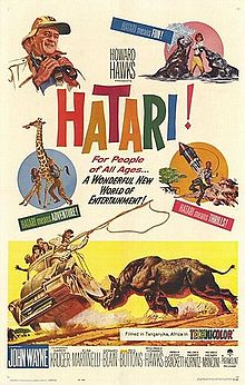
Hatari!

I have a confession to make, and it’s that, despite my rambling on in recent weeks about the unique power and pacing of certain classic movies, I might never have seen this one were it not for my good friend (and Zombie Ranch enthusiast) Anthony. Even then it was almost accidental — Anthony just had a free evening where he wanted to hang out, and brought a random bag full of zombie and/or western films he thought we might enjoy. Several of his choices, I was pleased to note, I’d already viewed, but I quizzically noted that in the midst of the pile was the movie “Hatari“. Sure, it was directed by Howard Hawks. Sure, it starred John Wayne. But this was about an African safari in the 1960s, right? One of these things is not like the others.

I can be dense like that sometimes, so Anthony started explaining that it’s about a ragtag crew of Americans and Europeans who for one reason or another have ended up in Tanzania with a rather exotic and dangerous occupation: catching wild animals alive for delivery to the world’s zoos. Animals that include such terrifying four-legged juggernauts as the Rhinoceros and Cape Buffalo, and we’re not talking sticking tranquilizer darts in them from a safe distance, we’re talking chasing them down in a truck and putting a noose around the dang things, bringing them to ground with more ropes and shoving them into a transport crate.

A story of people going out every day to do a job that most of us would consider insanely dangerous and life-threatening? That clicked, so I set all the other choices aside and loaded the DVD. Anthony warned us, almost apologetically, that it was a long movie, and if we got bored at any time we could stop.

He shouldn’t have worried. “Hatari” has so much of a Zombie Ranch vibe to it I would almost accuse myself of plagiarism had I not known for a fact that last week was my first time watching. Perhaps that’s going to far since I’d be comparing our efforts to those of people like Howard Hawks, but there are similarities to the tone we try to achieve, such the elements of the exotic treated as mundane (the crew keeps a pet cheetah in the house), or the terrifying treated as “just part of the job”. The scenes at the headquarters they all share (dare I call it a ranch?) are often quiet character moments, and even the most pulse-pounding action sequence has a very natural, underproduced feel to it.

Of course, in this last element, “Hatari!” gleefully cheats, because every last lick of footage of the captures is shot on location, with the real actors, driving real vehicles, chasing down real wild animals. This is a movie you just could not make today, not just because of the “no animals were harmed” prohibitions but because studio execs would blow every blood vessel in their heads at the sight of John Wayne (or their equivalent cash cow star) standing three feet from an ill-secured, thrashing Rhinoceros… which, by the way, got loose the first time and had to be chased down *again*. Hawks kept the footage of all that because it just seemed like such a natural moment… probably because it WAS a natural moment. About the only thing they edited was dubbing over all of the Duke’s non-stop swearing.

So yes, I’d say the chase sequences in “Hatari!” are pretty damned close to our concept of reality television. It will also bring home to you just how lacking in immediacy even the best CGI sequences of modern cinema are, when you witness a Cape Buffalo repeatedly ramming the side of a speeding jeep, throwing actors covered in dust and sweat around in their seats, and are acutely aware that this moment is all very, very real. I don’t fault the Duke for swearing. I was swearing just watching it happen on my television, despite it being something filmed 50 years ago and ten thousand miles away.

In fact, I could almost go so far as to say this is my whole “bits of nothing” premise from last week applied to action sequences. That’s a weird thing to say, perhaps, but again it’s all through the lens of it being moments we unconsciously recognize… maybe not in the sense that we’ve ever chased down giraffes, but I’d wager a lot of us have been in or at least witnessed car accidents, and because of that know the sudden randomness and shock, and even meaninglessness, that real violence entails.

I overthink things, I know. But this stuff had me on the edge of my couch, I guess because I knew, and felt, that the stakes were high.

Again, in a way it’s certainly cheating. “Hatari!” is a film where they got all these chases on camera first, then wrangled a script together and made a movie out of it, filming a story to connect the dots. They hired the ever amazing Henry Mancini to provide the score (this is the movie where the famous “Baby Elephant Walk” first debuted), and got John Wayne, Red Buttons, and a nicely rounded international cast of supporting characters together to spin an unhurried tale of a unique time, place, and especially occupation. A near three hour runtime passes by with deceptive ease, and even if the ending is a bit contrived, it’s the journey that makes it well worth watching.


Bits of Nothing

Some of you may be aware of the on-again, off-again comic project Dawn has called Bits of Nothing. It’s basically a repository for any and all strange ideas she gets into her head that she feels a compulsive need to draw, like a slightly more structured sketchbook (in fact we do gather them together in little mini-comics to sell at conventions). There’s no real narrative to Bits of Nothing, or any kind of regular schedule. If you ask how she came up with the title, the answer is that basically this is everything that she’d be giggling to herself about, the kind of stuff that a co-worker would ask “What are you laughing about?” and she’d have to respond, “Nothing!”.

Why do I bring this up? Well, aside from a bit of shameless shilling, nothingness has been on my mind. Not in the cosmic sense, mind you, more in the sense of the claim that the “Seinfeld” sitcom was “a show about nothing”.

“…many episodes of Seinfeld focused on minutiae, such as waiting in line at the movies, going out for dinner, buying a suit and dealing with the petty injustices of life. The view presented in Seinfeld is arguably consistent with the philosophy of nihilism, the idea that life is meaningless.” — from the Wikipedia entry

While I personally find it a bit heady to be drawing parallels between Seinfeld and Nietzsche, there is an idea here that I touched on briefly last week when I was discussing how some of the old westerns (or other films) seemed to have a more relaxed pace to them modern films have largely lost. In the comments I brought up the trope of Chekhov’s Gun: the idea, based in the writing philosophy of conservation of detail, that no element of dialogue, scenery, or action should be present unless it is directly relevant to the plot, either now or by the end of the story.

Actually that’s the extremist view… it’s probably more accurate to state that no storytelling element should be focused upon unless directly relevant. But I think even that can be a trap, depending on the type of story you’re trying to tell. In day to day life, don’t we suddenly fixate on things, or talk about things, that aren’t at all “relevant”? Yes we do. We do it all the time, and of course the argument there is that real life is not fiction, nor should it be, because the minutiae of real life are boring. Conservation of detail asks a writer to please omit showing someone flossing their teeth before bed unless that happens to be a plot point. Please don’t show her having a conversation with a random person on the train unless that conversation sparks some sort of epiphany.

And yet, I think the closer you adhere to conservation of detail and Chekhov’s gun, the more your narrative, no matter what the subject, will grow stylized and detatched from a certain sense of reality. It doesn’t matter if it’s a bunch of bug-eyed aliens invading our colony on Antares-5, or a bunch of rural 19th century Russians sitting around discussing their personal relationships, I believe we as human beings have an unconscious connection to the idea that our actual lives are often full of random observation and even more random conversation. No one would mistake a movie like “Reservoir Dogs” as being realistic, but the fact the stone-cold criminals at the beginning talk about Madonna and argue on whether or not you should tip your waitress gives a certain grounding to them, and a sense that their lives don’t revolve 24-7 around being bank robbers.

Going back to Seinfeld, TV Tropes has the entry of the Seinfeldian Conversation, which you can probably guess by now the definition of. Tarantino’s films are singled out as prime examples, and yet Roger Ebert contests this by saying that the conversations are not pointless to the story, but actually “load-bearing”, informing on key character points and occasionally foreshadowing future events. Chekhov’s gun still exists, but it’s a concealed weapon. In a similar vein, Seinfeld’s conversations and situations may have dwelt on minutiae, but the show was also known for adhering to a sense of continuity many more standard format sitcoms ignored. Life may have been meaningless, but it also marched onwards even as it remembered the past.

In good writing, even the bits of nothing arguably have a purpose, and I believe that purpose is to connect the audience to a sense of reality in the midst of the fantastic, by presenting a reasonable facsimile of the hundreds of inconsequential interactions we go through each day. Showing a hero flossing their teeth humanizes them. Showing their reaction to a stranger on a train trying to start conversation speaks volumes about the type of person they themselves are, or at least the type of day they’re having. It’s not appropriate for every story, but if your primary goal as a writer is to have your audience say “I am that person” or at  least “I know that person”, as opposed to “I’d like to be/be with that person”, it’s something to think about.


Takin’ your sweet time.

Earlier this year my friends and I stumbled across a song from the Australian band Tripod called “King Kong“, featuring the insistent chorus, “Get to the F—ing Monkey” (so NSFW, unless perhaps you work in construction). On TV Tropes the sentiment they express falls under the Just Here For Godzilla heading: the idea that if, for example, you’re at a movie to see stuff being smashed, you don’t want to waste your time with anything besides that.

It’s something for a creator to keep in mind. On the other hand, it could be argued that we either take the idea too far these days, or not far enough, ending up with uneven, uncontrolled pacing that pleases neither fans of people interacting or giant apes (or *ahem* robots) wrecking things. We have to have a love interest, no matter how superfluous. We have to have action beats every X page of script. We have to have this, and that, and…

I mentioned before how the popularity of the Western genre and the era of the Summer Blockbuster missed each other by a few years, and as such I don’t think we’ve ever really seen what a Western Blockbuster would look like. I guess films like “Tombstone” might have been a stab at it, but they’re still a far cry from a noisy special effects spectacle like “Transformers: Revenge of the Fallen”.

Case in point, I watched “Rio Bravo” the other day and clearly noted the contrast in pacing between that movie and (for lack of a better term) more modern Hollywood action films. It’s a film that’s noisy only in parts, and even then the violence is over pretty quickly. Most of it’s a lot of people talking and trying to maneuver their way through a sort of “cold war” standoff that’s hanging over a town due to a rich rancher’s brother being held in jail for murder. There’s some explosions at the end, but the core of everything is people in a more-or-less realistic depiction of conflict in a land where a Sheriff’s badge won’t stop a bullet, but the Sheriff knows that and is fully willing to have his prisoner executed if a forced rescue attempt is made.

Like “Shane”, and to be quite honest, like “Unforgiven”, Rio Bravo is a movie unafraid to take its time in telling the story it wants to tell. Does that mean it fails the test of getting to the f-ing monkey, especially for people who just wanted to see John Wayne shoot some bad guys? Well, I can’t speak for the audiences back in 1959, but given what I see of classic Westerns, I’d say it’s entirely possible that people didn’t go to these films just to see people get shot or barns catching fire. “High Noon” has, if I recall, only a single fistfight to its name prior to the climax, but it certainly has no problem holding my interest and cranking the tension. Rio Bravo has a similar (if much subtler) smoldering undercurrent to a town still trying to conduct business as usual in the face of impending calamity.

There’s a driving force to these films that I think helps carry them through the lack of people jumping from stagecoaches or fighting off bandits every other minute. I mean, it’s inaccurate of me to say no Western was ever made that’s more action-packed fluff than anything else (“Django” being a good example), but a lot of times they’re much… well, quieter films than the modern stereotype would view them as, and I think that trips people up when they try to make a Western fitting the modern action movie mold. The classic Westerns aren’t so much about the storm breaking on your head and homestead so much as the smell of ozone on the wind, and the observance of the dark, flashing clouds on the horizon. The storm will come, inevitably, but it will come in its own sweet time, and you’ll feel that tension up until the thundercrack heralds its arrival.

It’s just a theory of mine, but I believe “Unforgiven”, which was Clint Eastwood’s love letter to the genre that made him a star, understood this so well that it brings a quite literal storm into effect for William Munny’s final visit to Big Whiskey. Or there’s “Yojimbo”, Akira Kurosawa’s transplanted tale of the Old West which has a protagonist who, like William Munny, is laid up sick and injured for the middle portion of the movie before he returns to end things amid a tornado of dust and leaves.

For all these movies, taking time out for some lengthy conversation, or in some cases maybe even a little singing, was not only not crazy, but actually felt natural to the story. It just feels so different to watch them and see even the characters clearly meant as comic relief allowed to have a certain purpose and depth. To see a relationship between a man and woman that’s not forced to develop mostly as they fall off cliffs or run from explosions. And all fitting almost casually into a couple hours of runtime, letting the audience breathe and think, while still providing a satisfying climax in the end.

The Coen Brothers are the only ones I can think of off the top of my head that still make a recurring habit of providing films along these lines, although they’re not perfect for me (I still think No Country for Old Men went on longer than necessary). But what they do is now considered “quirky” and “offbeat”, when once it seems like it was more the norm. So much the norm that the classics of the most earthy and American of genres embraced the standard with an unhurried and powerful grace.

Maybe we’ve gotten too frantic to appreciate that manner of storytelling anymore, in the same way a lot of directors these days can’t seem to keep the camera still, or keep their hands off the slo-mo effect. But on the other hand, isn’t “Jaws” considered the first of the Blockbusters? Did we take all the wrong lessons away from that, forgetting the immense amount of patience involved in the tale which provided strong characters and logical progression and emotional impact beyond just the shock and awe?

Considering the rash of cheap “nature gone mad” imitators that followed in Jaws’ wake, I guess that’s a rhetorical question. Nowadays Summer movies are written off almost before they’re made as “popcorn flicks”, where you pay your money and turn off your brain. Is it a bad thing? Eh. I love “Star Wars”. I love “Raiders of the Lost Ark”. Trying to artificially inject self-reflection and depth into such offerings is exactly the sort of thing Tripod was bitching about. It’s what makes runtimes unnecessarily padded beyond the point of boring. I even made a whole rant about it recently.

But it certainly feels like once upon a time in the West, they took their sweet time about things… and it was good.

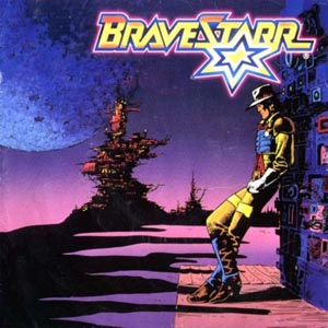
A look back at BraveStarr

Readers of this here blog know I’ve had the Weird West on my mind for the past few weeks. Well, arguably I’ve had the Weird West on my mind since I first started writing Zombie Ranch, but I’ve been thinking on it lately even more than usual. One particular bit that kept hazily surfacing was the remembrance of a drawling narrator declaring the following couplet over a background of “Magnificent Seven”-style music:

“Then one day, a lawman appeared…

… with powers of hawk, wolf, puma, and bear…”

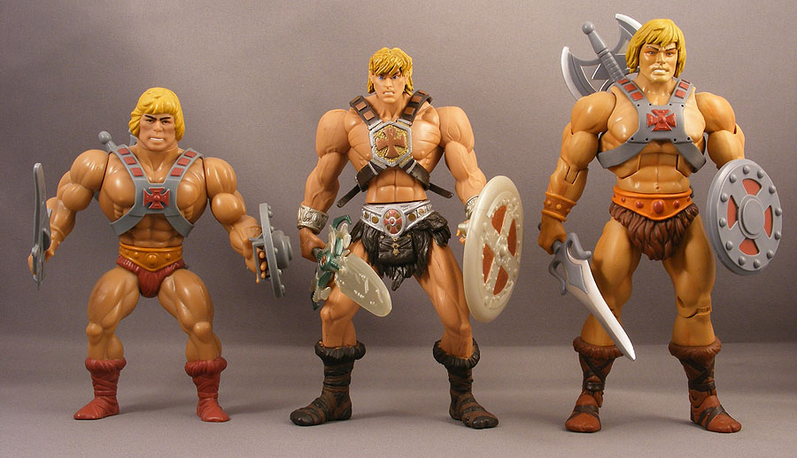
This week I’ll be starting my 38th year on the Earth, which means I grew up solidly as a child of the 1980s and all of the cartoon offerings that are now being mined up as feature films (“Transformers”, “G. I. Joe”), attempts at animated reboots (“Thundercats“), or just continuing toy lines that don’t even need a cartoon tie-in anymore to coast on the nostalgia factor — it seems like every year at San Diego Comic-Con they’re still lining up for the latest He-Man figures.

He keeps going, and going, and going...

In the 80s it was often the case that any engaging storylines and characters that might have happened in the cartoons tended to be a result of happy accidents or writers somehow slipping stuff through the maze of “we have to show fighting without anyone getting hurt” and anvilicious Aesops. Seemed like most every cartoon back then had to form itself around a moral message, and it wasn’t enough to just present that as part of the story, we had to have an out-of-continuity PSA at the end where the musclebound fantasy barbarian or special forces operative lectured us on the power of friendship. Heck, the ones from the G.I. Joe cartoon were so infamous that an entire series of parody videos using the old footage made their way onto the Internet. It was cheesy stuff that I remember rolling my eyes at even when I was ten. Yes, man with big gun and no shirt, I know how to look both ways before I cross the street.

I won’t lie… despite the nostalgia factor, going back and trying to watch these shows nowadays is often a real chore, even if you’re trying to do it with some sense of ironic detatchment. But there was certainly a potential in the settings and worlds dreamed up, an imagination to them that may not have shown through in the trite dialogue, formulaic plots and stock footage animation of most episodes, but functioned as something beyond just a framework to sell toys with.

BraveStarr is a classic example of this. It was made, like all the other Filmation cartoons of the day (and most cartoons besides that), to sell toys. There are analyses out there of why it failed to grab the audience He-Man and She-Ra did, including once again the spectre of the Western just not resonating anymore with youngsters of the post-1960s, no matter what other cool elements you stuck onto it. And from my opinion? The concept here is actually pretty damn cool. Call it a “Bat Durston” if you must, but then check out the opening:

Badass.

But, as I mentioned before, the show itself is dragged down by all those “requirements” of 80s cartoons, where it seems like the writers either give up trying  or go completely insane: for example, we can’t have people actually injuring each other with their guns, so the “lasers” encase people in blocks of ice, or in one memorable case, conjure flying lamprey things out of thin air that then go attack our heroes. What seemed like it was going to be a high-noon shootout between BraveStarr and the evil Tex Hex proceeded with Tex Hex conjuring a weird snake dinosaur he poofs onto the back of and uses to menace the Marshal.

Then there’s the natives of New Texas, the “Prairie People”, who have voices so annoying that they’ll not only be having you pine for the dulcet tones of Orko and Snarf, they’re almost entirely unintelligible to the audience. Although I do like the fact that the outlaw one, Skuzz, is a chain-smoker… something you probably wouldn’t see on a cartoon nowadays, even in villains, except perhaps with a Very Special Episode.

No, it’s all very 80s and often rough for an adult to sit through in any state of sobriety. Nor does the setting necessarily make any kind of logical sense… but man, that intro still is cool. I know it’s cool because Dawn had never heard of the series and when I fired it up she spun around to watch it with wide, sparkling nerd eyes, wondering what it was. Unfortunately, the episode that followed lost her interest almost as quickly as the opening grabbed it. It doesn’t help that Netflix appears to have the episodes completely out of order and several as DVD-only, so that if there is any kind of narrative arc to be had, it’s jumbled beyond  recognition.

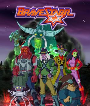
On the other hand, there’s just so much of the crazy that’s wonderful. BraveStarr’s pard, the cyber-horse Thirty-Thirty (nice shout out to the Winchester rifle, there), is both his best friend and his mount, and transforms between quadraped and humanoid… in the latter case toting a gigantic gun he calls Sarah Jane. His appearance is also based on contemporary rock star David Lee Roth. Uber-villain Stampede appears as a skeletal head looming out of dark clouds, drawing comparisons to the hell-cattle of “Ghost Riders in the Sky” (or perhaps Nicodemus from “The Secret of Nimh”, but hey, Nic woulda made one creepy villain). Tex Hex, as one reviewer pointed out, looks like Skeletor if Skeletor were played by Lee Van Cleef… and much like Skeletor, he might be presented in the cartoon as a buffoon with a funny voice, but his appearance could easily be the stuff of nightmares.

The BraveStarr "Rogues' Gallery"

I would love to see at least an attempt at rebooting the concepts involved with the show in a more modern, adult-oriented offering. Sometimes (okay, a lot of times) remakes are uncalled for, or fall short of whatever magic the original possessed (sometimes it ain’t just nostalgia), but I can’t think of any reason not to give it a go with “BraveStarr”, aside from economically. Maybe people might get up in arms about Native American stereotypes, but you’ve already got this weird slippery logical slope where we’re talking being one with the land somewhere that’s parsecs away from America.

Seriously, this happened with G.I. Joe already and was awesome. I’m not talking about the movie, I’m talking about “G.I. Joe Resolute“, which I believe you can still find for free online and is well worth the watching. A similar treatment applied to BraveStarr could be incredible.

I don’t know that it would ever happen… even in its debut BraveStarr was never a popular cartoon, so there’s not that huge reservoir of nostalgia fuel that powers other properties of the era. Plus I just got done talking recently about how Hollywood has gone gunshy of Weird West properties after “Cowboys & Aliens” failed.

But I watch that intro, with its moody, almost Heavy Metal style imagery, and promise of frontier adventure “in a distant time, and far away place”…

And I dream.


Horror: a matter of intent

The poll we have up for the site right now asks for readers to pick from a list of genres the one choice that most represents Zombie Ranch to them. The split so far seems to be fairly even between “Science Fiction” and “Western”, although the frontrunner is the non-answer “Sorry, my head exploded”. Which is fine, because even as the guy writing the story I’d be hard pressed to pigeonhole it into any one theme. I felt your pain whenever I placed the comic on a listing site with a drop-down menu where I had to pick *something*. Usually I went with Science Fiction, but sometimes I did other picks, including Horror.

Ah, horror, possibly one of the most nebulous, “I knows it when I sees it” genres out there. Like humor, horror as an experience is something very subjective, and what haunts one person may just be shrugged right off by another. An occasional complaint, or at least note I receive about Zombie Ranch is that it’s just not very scary, and the poll so far is bearing that out, along with this recent review by Back From The Depths.

Now my occasional pen-pal buddy James from The Other Grey Meat brought up the natural follow-on to that, which is that Zombie Ranch (at least in his view) isn’t really a “horror comic”. Back From The Depths focuses on horror comics, so it’s only logical they’d come at Zombie Ranch from that angle, not to mention that, hey, it is listed out there in certain places as horror and our title banner is pretty ominous looking. False advertising? Hopefully not that bad, but I admit it has made me shy about promoting on “mainstream” zombie and horror sites, at least since the early days.

But what actually makes something a horror comic, aside from some marketing person slapping that label on it? For that matter, what makes anything horror? Some of the old episodes of The Twilight Zone and The Outer Limits  are quite scary, but had no gore or even monsters involved. So horror doesn’t seem to be tied into the subject matter or even the presence of the supernatural. In the early 1800’s writers were already debating the fine points of horror vs terror as literary concepts, further muddying the issue in an ironic attempt to clarify. These days there’s also a quality stigma attached to the category of horror that leads to movies like Silence of the Lambs being labeled “suspense” or “thrillers”.

I think about these kinds of things a lot. Dawn would likely go further and say I obsess over them, but hey, at least these sorts of discussions let me know I’m not alone. I believe at this point I will go ahead and settle for the idea that Zombie Ranch is not a “horror comic” per se. Why? Because I’ve focused on the matter of intent. It’s just too subjective otherwise, no matter how many disturbing concepts I think I might be presenting. I managed to track down an article I read many years ago titled “Occult and Horror Comics: Why They Fail“, which I believe is the first place I came across the phrase “the horror of ideas”. Look past the title… though written back in the hoary old year of 2003, I still find it an exceptionally good read for any comics fans and comics creators out there just for the notions Joel Phillips expresses on “occult” as opposed to “horror” and his analysis of three different kinds of horror and how they play out in the comics medium. But let’s look at the first part which I find especially valuable to consider:

“Think of it this way: “occult” is a genre, “horror” is an intent. The former goes to subject matter, characters and settings. The latter goes to what the writer wants to happen to his or her audience. If they want them to be scared, that’s horror.”

Drawing that parallel back to humor again, this is a very, very succinct way to look at things. A gag strip could be set on a starship in the far future, or a fantasy landscape in the past, or just be focused on a group of Anytown, U.S.A. (or other applicable country) kids, but it all comes down to one thing: is the creator’s primary intent to make you laugh? Whether or not you actually find the jokes funny is irrelevant, the intent is what matters. Similarly, a work of horror’s primary intent should be to scare.

Zombie Ranch, by Joel’s definitions, would be what he calls an “occult” comic, dealing in the trappings of the supernatural, but focusing on subject matter, character, and setting without necessarily wanting the audience to react in a fearful manner. In the comments on Joel’s piece (also worth reading), there’s some discussion on whether “occult” would be the proper term, but no matter what you choose to call it, the distinction has a lot of merit, especially because I agree with his premise that real horror is one of the more difficult things to pull off in a comics medium, and certainly rough to do in an ongoing serial with recurring characters.

Comics, for example, make the “spring-loaded cat” moments so prevalent in horror movies largely useless gestures… the still page doesn’t provoke that visceral, instinctual recoil of shock that sudden sound and motion produce in us. It’s cheap, sure, but it’s effective. Joel names this, appropriately enough, “shock horror”. He then moves on to “disgust horror”, and argues that gore is also not quite as effective on the comics page as it is in film, or even books where the power of our own imaginations can be turned against us.

But it’s the third type of horror that Joel does believe comics can do, and do very, very well. This is what he terms “creep horror”, and what I term “the horror of ideas”. This is the kind of horror that makes some of those old Twilight Zones so memorable, the kind that stays with you, keeping your brain churning with disturbing thoughts long after you turn off the TV or put the book or comic away. The kind that shines darkly in the best examples of comics like Hellblazer or Swamp Thing, such as when a character finds out she’s been having sex not only with the walking corpse of her husband, but with the walking corpse of her husband as possessed by the spirit of her twisted uncle. That’s stuff that still makes me want to take a bath to this day when I reflect on it. But it can be less graphic than that… it could be as simple as being the last man on Earth, finally having the time to read all those books you wanted to… but then you break your only pair of prescription glasses.

I think it’s also entirely possible to delve into horror without it being your primary purpose, in fact it may arguably be the only way you can sustain a decent level of scare in an ongoing series of any kind… audiences need downtime or everything starts blending together and desensitizing, and desensitization is the worst enemy of scare. Would I consider the old Tales From The Crypt offerings to be horror comics? Absolutely! But they were collections of one-shots rather than a continuous narrative, constantly interchanging characters and stories. Maybe in that sense Joel’s definition is too strict, since not even a comic like The Walking Dead is trying to scare you all the time, nor should it.

With Zombie Ranch, I’ve purposefully injected elements that I find horrific to contemplate, but after twenty years of it as their daily existence, the characters themselves have largely accepted it as normal. I’ve talked before about how resilient human nature can be even in the most horrible circumstances… somewhere along the line as the bombs drop and the bodies pile up, people decide it’s not really going to get better anytime soon and so just work it into their daily routines. The outsider asks, “How can you possibly live like this?!”, and the native responds, “Well, the war isn’t stopping. What else should I do?”

On a smaller scale, you might think about how uncomfortable the idea of killing, gutting and skinning an animal is to a lot of modern day city dwellers. It might even be considered horrific. But if you live out on a farm, it’s just something you do. Is it sane? Is it right? Who sits in judgment of that?

Horror, I still believe, is a very subjective matter. That’s why the intent of the creator is so important, and in my case, although there are times I’m writing Zombie Ranch with the intent to scare or disturb, I’m just as often looking to evoke other reactions out of you readers as I let the story ply its course. So is it a horror comic? Sometimes.

Which, again, means it’s probably not really a horror comic at all, at least by my self-inflicted definition. But I can live with that. And hey, since you’re not expecting it, maybe you actually will jump when I throw the cat at you.
Whither the Weird West?

Those of you who’ve incorporated this blog into their weekly reads might recall that I believe heartily that the Weird West represents a fertile ground for all manner of fiction. Those that haven’t can probably hazard a guess that a guy writing something called Zombie Ranch would have such a belief.

As a swift recap for those just joining us, Wikipedia defines a Weird West offering as “a combination of the Western with another literary genre, usually horror, occult, or fantasy”. In the past I’ve talked up what I considered to be some high-quality examples, such as the Role-Playing Game Deadlands, or the Undead Nightmare DLC for Red Dead Redemption, or there’s the television series of “The Wild, Wild West” or the Jonah Hex comics.

But then again, there’s the movies. If you enjoyed the cinematic versions of “The Wild, Wild West” and/or “Jonah Hex”, I’m not going to sit here and argue that, no, you didn’t… that’s your prerogative. Too many people end up wasting their breath on such back-and-forths. What I will say is that I personally found them by and large to be formulaic products of Hollywood that didn’t really pay too much attention to what they were adapting beyond the surface trappings. You can argue that they weren’t exactly adapting Shakespeare… I can argue that “Shaun of the Dead” wasn’t paying tribute to Shakespeare either, but still managed to be a smart and soulful film… something that felt like a labor of love instead of a means to a paycheck.

The saddest thing for me though is that I feel the same emptiness in the “Transformers” movies, but the Transformers movies continue to break box office records while film after film attempting to tell a Weird West story fails to connect with mainstream audiences, even with big budgets and big stars backing them up. As a caveat, I have yet to go see “Cowboys and Aliens”, so I won’t speak as to its quality… but regardless it’s barely made half its budget back since it opened. It’s such a dismal performance that Disney just outright pulled the plug on its planned “Lone Ranger” movie, which was all set to have the Lone Ranger and Tonto fighting werewolves. After reading that article I’m not so sure I liked what they were planning (far as I know Weird West never really figured into the Lone Ranger mythos), but it’s a moot point now: if Harrison Ford, Daniel Craig and Olivia Wilde couldn’t get your butts in the seats, I suppose they figured Johnny Depp can’t, either.

And this after Depp and Gore Verbinski already rescued the pirate genre from the depths of obscurity and made it cool (and profitable) again. Disney isn’t banking on a second helping of lightning in the bottle. If there’s a film out there waiting to be made that can cause cowboys to be hot stuff again, much less the Weird West, “Lone Ranger” won’t be it.

I mean, I can’t honestly say there was any time period that the Weird West was ever super popular, not in the way pure Westerns were all but a dynasty for several decades, first in books, then radio, then film and TV.  We get brief flare-ups from time to time (the “True Grit” remake being the most recent), but the Western is still by and large considered Hollywood’s past, not its present or future. Throw aliens, robots, or (ahem) zombies on top of that and you’re going to have a rough time pitching it, especially since none of the films mashing them up have so far enjoyed either critical or commercial success.

Is the Weird West just too weird for the great majority of the ticket buying public to wrap their heads around? I know people will ask me at conventions what Zombie Ranch is about and I still have never quite mastered the art of rattling off a quick answer to the question, or at least a quick answer I don’t feel is leaving major elements out. Zombie Ranch is probably weird even for the Weird West, and then beyond that I see a really simple idea like “Cowboys fight Aliens” fail despite all the money and pedigree it boasted.

So I suppose it’s a niche within a niche (within a niche?), and that’s not enough for today’s filmgoing public. The good news is, despite repeated failures at the movie box office, the Weird West doesn’t show any signs of dying out as a concept, and I’d still like to think that’s because, hey, it’s a good concept with a lot of potential still to be mined. We have our books and we have our comics and video games, and every so often someone tries a TV show or film, and sooner or later I have faith that lightning will suffuse that bottle on the big screen like a prairie thunderstorm. “Pirates of the Caribbean”, after all, only came after decades of failures at reviving the genre (“Cutthroat Island”, anyone?).

For the moment, though, I’m happy with the niche.

A matter of perspective…

I still have never managed to track down the original source, but I have oft repeated the following quote (or variations thereof): “The main difference between vampires and zombies in modern fiction is that good vampire stories focus on the vampires, while good zombie stories focus on the humans.” The point being that while vampires are inherently interesting beings in and of themselves, zombies tend to only be interesting insofar as the effect they have on the people and places around them.  The vampire is a conscious, thinking, possibly even feeling predator. Under the right circumstances, you might even be able to negotiate with a vampire. The zombie is more akin to a natural disaster, even though on a surface level They might resemble Us. Both zombie and vampire are former humans, dark mirrors of ourselves, but they couldn’t be more different in the circumstances of their Otherness.
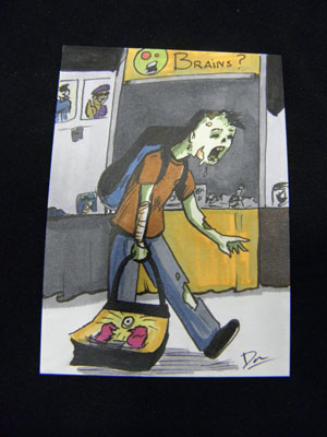
While I like the dichotomy presented and think it has a lot of merit, I can be a sucker for rulebreaking… so long as it’s done in an interesting fashion. For example, one reason the various Marvel Zombies comics are unsatisfying for me is because the “zombies” presented there are much more like vampires who just happen to be decaying and have a taste for flesh: “I’m still Spider-Man but now I wanna eat people!” Captain America and the Red Skull are zombies, but they still end up fighting and spouting one-liners at each other. Compared to them, the few uninfected people in the narrative seem all but superfluous. There’s nothing new to be had there, no real risks in narrative, so for me it is what it is: at best recycled Evil Dead style wackiness… at worst, Marvel seeming like it’s just phoning in something to capitalize on the cash flow of people who’ll pick up anything with “Zombie” in the title (not that I should be complaining about that, right?).

But if you break “the rules” in a more inspired fashion, I’ll sit up and take notice. Y’all already know of my love for “Fido“, or Bub in the original “Day of the Dead“, both examples of a more conscious sort of zed than the usual, but this last week I ran into a zombie flick that took the concept to the extreme in a way I’d never seen before.

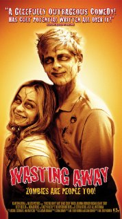
On Netflix it bore the perhaps uninspiring title of “Aaah! Zombies!!”, but it looks like the original appelation is “Wasting Away“. The poster blurb “Zombies Are People Too!” didn’t catch my imagination, either, since I’ve already seen offerings like “American Zombie ” that rolled with that to varying degrees of success.

The movie starts off in black-and-white, with the only color being the eerie neon green of the zombie-creating sludge. The usual trope sequence ensues: military experiments gone wrong, attempted cover-up and disposal, truck takes wrong turn and has accident, inflicting contents on an unsuspecting community…

The community in question being a bowling alley being currently populated by four twenty-somethings (two guys, two gals) in various stages of slackerdom. Their banter and the lack of color film brought “Clerks” to mind (albeit a much less snappily written Clerks), and it was gettin’ kinda slow… until, of course, the foursome share some contaminated soft-serve ice cream (“Does this look green to anyone else?” is a fun line), and expire in a shuddering fashion.

Then, boom! We’re in full color, and the kids wake up fine, wondering what happened. They seem to be stronger than they were, but otherwise okay, and…

And this is where the fun begins. Should I tell you? Oh, I’m sure you’ve figured it out, and if you haven’t the movie shortly shows you a back to black-and-white scene cut to clue you in: the kids aren’t all right. From THEIR perspective, they’re fine and normal, but the reality is they’ve become a bunch of green-veined, lurching, groaning undead. At appropriate points, the film switches between those perspectives, and similarly switches between color and black-and-white as a starkly effective cue.

I won’t go through the rest for you, but the filmmakers have a great time playing with the disconnect between the protagonists’ viewpoint and the viewpoint of the rest of the people in the city. The kids go into a bar to ask for help and everyone freaks out and attacks them, like they’re hopped up on meth or something. Literally. Regular humans move in a blur and talk in unintelligble sped-up chipmunk voices, and that was one of the moments I thought, “Huh, yeah, from a zombie’s perspective that *would* be the case”. The only humans they seem to be able to interact with normally are the drunks, whose brain and body functions have slowed down sufficiently to operate on a zombie’s level. But of course, drunks eventually get sober.

Is it a fantastic film? Nah. But it was fun and inventive enough to carry its weight for me throughout almost all of the runtime. Almost. It ended up going too long at the end and sapping away some of my high… but then again that makes it a film I found uneven, but with its weak points at the start and conclusion instead of the middle, and that’s not a usual occurrence.

So if you’re into the stranger side of zombie fiction (and if you’re a fan of Zombie Ranch, I suppose you well might be), you owe it to yourself to give Aaah! Zombies!!/Wasting Away a look. The concept is good enough that even at is most cliche, it can still feel mostly fresh. And let me tell you from experience, it can be mighty hard to keep a zombie fresh…

Homage a trois

Sounds a little dirty, don’t it? Or at very least, a little French. Horrible, horrible French. Frenchlish, in the same way there’s the concept of “Spanglish”.

Though come to think of it, ever since that little incident in 1066 (“Hey England, you got any Norman in ya? Would ya like some?”), English is stuffed full of all sorts of French words and concepts. So much so that the phrase above actually makes perfect sense in French: even though their spelling is “hommage”, in modern times it means basically the same thing as “homage” in English.

It doesn’t make perfect sense for this article, though, since the literal translation would be paying tribute or respect to “three”, when what I really wanted to do was just make a sleazy pun on “menage a trois” (which in English we’d call a “threesome”), while also discussing the idea of controlling your brand without suffocating it.

Interesting then that while googling I ran across a set of Flickr photos of a staged performance expressing some similar thoughts: http://www.raddanovic.com/blog/2010/02/24/hommage-a-trois/

“We work from an understanding that paying tribute establishes authority, while at the same time undermines it.”

How true that is, and how important to acknowledge, both as a creator and a fan of a work. The reaction to the tribute may speak reams about you as both a person and an artist, and furthermore these days also gets all tangled up in issues of copyrights, trademarks, and “fair use”.

For instance, I think just about everyone’s aware that companies like Disney and Mattel take a very dim view of any use of their characters’ likenesses in a way they don’t approve of, whether the end product was meant for commercial gain or not. These sorts of lawsuits generally get slapped down by courts in the United States because of the First Amendment and parody precedents, but that doesn’t stop a lot of people having to do a de facto cease and desist just because they can’t cope with the court costs of defending themselves, or because a gunshy publisher or ISP pulls the plug on them.

On the self-publishing front, a lot of creators end up with a lot of stomach ulcers over their designs being ripped off and put on t-shirts, etc., to be sold to others without any compensation or even credit to them (I honestly think the lack of credit is what hurts the most). Some like Bill Watterson just threw up their hands and never bothered with merchandising or trying to control the merchandising of their characters, and that’s why the plague of “peeing Calvins” started popping up on bumperstickers and window decals everywhere. They’re all technically illegal and violations of copyright/trademark, but no one was going to the trouble of pursuing them. Even if Watterson had, the question would then become, is this a protected parody or not? And is this interfering with your livelihood and your own marketing, or just merely a matter of you being uncomfortable with seeing your characters used in such a manner (if that ain’t enough for Mattel, it probably ain’t gonna be enough for you)?

Anyhow, where am I going with this, you ask? Well, I wanted to talk about a piece of fan art we received in response to our call a few weeks back, by the talented gentlemen of the webcomic Up to My Nipples, Will Moore and Jesse Simons. Jesse contacted me to warn me they had an idea but it was going to be racy, I basically responded “how racy are we talkin’ here?”, and then next thing you know the completed page was in my Inbox for evaluation.

I laughed, and Dawn laughed when I showed it to her, but we had a bit of a dilemma on our hands. We’ve always considered the Zombie Ranch site and comic to be something of a PG-13 experience, and although there wasn’t anything wildly explicit going on, I admit a gatekeeper part of me went “whoa”. We really appreciated their efforts on our behalf (including formatting everything perfectly with our weird comic dimensions), but after some discussion decided it would probably be a little too jarring to use straight up for a guest week.

We gave them our complete blessing to publish it on their own site, though, and they did so last week. Mildly NSFW, if you didn’t get that already, but if you’re down with that, check it out! LINK

You might even end up with the opinion it’s really no big deal and Dawn and I are being big ol’ prudes about this (especially ironic since the weekend before the preview arrived we’d been watching a Sick & Twisted Festival of Animation marathon). Feel free to share that opinion, honestly, we were just going with our instincts here. But I DID want to give Will and Jesse their due for their hard work and some referral to their own site, especially because they are genuine fans of Zombie Ranch and were very polite and generous in all our communications. Far as I’m concerned they didn’t even need our permission to publish since the source material is properly noted and the comic is obvious parody. I mean, Chuck acting as the voice of reason and prudence? Preposterous!

More than that, what they presented gave me some ideas. Not regarding rampant zombuggery, mind you, but my devious little brain has figured a way I might actually be able to reference their work more solidly down the road. Might not be this month, or the next, or even this year, but there are notes. There are plans. That’s the best part of a good parody/homage, after all, it gets you thinking and questioning. So thank you, Will and Jesse, and I can only hope this homage to your homage suffices for now.

Zombie Ranch at the big show

So we’re back, and I can honestly say this was a very, very different Comic-Con than we’ve ever experienced in the past. I don’t know why that came as any sort of surprise, since I kept repeating that to myself and others prior to last week, but it’s akin to the difference between being told that the exhibit hall is big enough to land a small plane in, and actually getting in there and seeing just how overwhelmingly big it is. We had three SDCC “virgins” this year in our immediate circle and every one of them was still shocked despite my descriptions.
Two of those noobs happened to be my mom and dad, who were able to attend for the first time ever as part of our exhibitor staff quotient for Lab Reject Studios. Mom is an old-school Trekkie (seriously, one of the houses I grew up in had the street number 1701), and dad used to take me to hole-in-the-wall comic shows in places like the Shrine Auditorium when I was a tyke, where I bought my first ever comic in the form of an issue of Groo the Wanderer. Dad and I both ended up loving Groo, and when Groo celebrated its 25th anniversary in 2007 I bought us matching Groo hats. Unfortunately, he lost his somewhere along the line, but Comic-Con gave him an opportunity to not only buy another but meet Sergio Aragones, who personally signed it for him! It’s like one of those universe-come-full-circle moments.

But back to exhibiting for the first time… wow. You get to be in early to set up, so on Wednesday I thought about walking around and checking things out before the crowds roared in and clogged all the aisles. Here’s the thing, though — the aisles are already quite clogged. Crates and boxes everywhere, forklifts rolling through, cherry pickers overhead… when you get in after it’s ready you never even really think about everything that had to happen to get those gigantic displays ready to go. When you’re there during the process, you fear for your life and I wanted nothing more than to quickly return to the relative safety of the Small Press area.

Also, they don’t turn on the air conditioning until Preview Night actually begins, so we were very smart to be wearing black t-shirts for our load-in. Toil and sweat, but luckily (at least in our case) no blood or tears.

Preview Night went about as expected, i.e. not one sale (except to my dad), and almost no one even stopping by the table. I didn’t get depressed, because Preview Night is not a night for Small Press, it’s when everyone goes swag grubbing on the other side where the big exhibitors (and their big promos) are. In fact I swear I saw some Small Press tables that didn’t even bother to show up at all that night. I was afraid that would be a big no-no, but again, not much traffic on our side of the Con.

Thursday was a different story. First thing in the morning, we got our special delivery of a custom made Zeke plushie, who would remain our mascot for the rest of our convention (you can see the pics listed on our Facebook page HERE). Rick Marson, the man behind the ZOM outbreak, sewed him up special for us in exchange for the donation we’d made to his Kickstarter project. Rick even went so far as to figure out ways to simulate the scars on Zeke’s arm and neck, despite his ZOM template not really having much of either.

Webcomic types I knew from online correspondence came by to say hello, such as Jon Del Arroz of Flying Sparks, Brock Beauchamp of Variables, and Andrew Russo of Part Time. Apparently when we left mom and dad watching the booth as we went out to lunch on Thursday, other people stopped by looking for us, but unfortunately neither parental unit took very good notes on that. Promotionally speaking, we did manage to hook up with the guys of Humerus and the gal who runs the San Diego Zombie Walk. A lot of free temporary tattoos were dispensed but so far I haven’t had any sightings in the Zombie Walk pictures, and she never made it back by our table on Sunday so we don’t know how that all went yet.

It was a whirl of a time, quite exhausting, and almost before we knew it the closing announcements were being made on the last day. In past years I’ve always had at least one amazing “high point” I could identify that made being at SDCC worth every penny, but this time there was nothing so dramatic… except, I think, exhibiting. I suppose being there, selling, was really the high point, and it just seems less intense for being spread out over several days. Other than the arrival of ZOM Zeke, from a vendor perspective I remember two moments that really stuck into my brain:

One, a lady came by and pulled out a piece of notebook paper with several entries. It was a list her friend, named Katie, had made for her of stuff to do at the convention, since Katie herself had been unable to attend. Our comics were on that list, and Katie had also gone to the trouble of baking up some homemade banana bread as a thank-you gift. Thank you for what? Well, for making Zombie Ranch, I suppose.

Two, a gentleman approached our booth, gave a quick glance over our stuff, and bought a Special Edition copy of Zombie Ranch #1. Yeah, the same one we have for offer in the store, the one that costs $20. Don’t get me wrong, we’ve sold these to people we didn’t know before, but usually only after they’ve listened to the concept, maybe checked out the samples, and decided we were cool to talk to. This guy was someone we’d never met, and furthermore who’d never heard of Zombie Ranch until he walked by the table, and he cracked open his wallet and presented us with Andrew Jackson’s blowdried mug. The marketing side of me was sorely tempted to quiz him on what prompted the sale, but in the end I figured I’d just better shut up and take the money before he regained his sanity. NO REFUNDS.

Seriously, though, I hope that he enjoys his purchase, or at least doesn’t regret it. We ended up selling more issues of the comic during SDCC than we have at any other comic convention, by a long shot. Part of that was having Issue #2 for in-person sales for the first time, part of it was a result of friends and family either adding to their collection or finally getting around to picking up print versions in support of our effort… but still, a lot of those comics went out to brand new people who seemed genuinely intrigued with our idea. And then of course there were the hundreds of postcard fliers we gave away to those who might not have had the money or inclination for a print issue but might come join the crew reading for free online. This time, unlike the disappointment of last year’s jaunt with the freebie table, I could be fairly sure the people picking up the cards had looked at what they were about.

I was also quite happy with our friendly neighbors on both sides, and the Small Press area’s prime location near both bathrooms and refreshments. Even if there were times Dawn and I lamented that we were missing out (this was the first Comic-Con where neither of us made it to ANY panels whatsoever), even if it was rough getting up every morning at the same damn time I usually get up to go to work, I’d have to say our previous attendee experience, some careful preparations and planning, and a good dose of improvisation carried us through the Big One with a good amount of smoothness for a first time. I’m really glad it wasn’t our first convention, but in any case, we’ve already turned in our paperwork and begun preparing for next year. Even though SDCC became a working vacation rather than just a pure party for us, we’re ready and more than willing to do it all over again.


“No, that’s fair.”

Every so often I run a google search on Zombie Ranch, just to see what might turn up out there in the wilds of the Internet. This past week I turned up a great review from a Western-themed blog called (cleverly enough) “Slap Bookleather”.

Hang on before I give you any link though, and let me explain what I mean by “great”… because what you’ll see early on is that he found the comic amateurish, going so far as to write, “I read the first couple of pages in shock at how bad it was”.

What was great to me about the review is this: here was a man Dawn and I had never met, with no stake whatsoever in sparing our feelings or otherwise making us happy, giving his brutally honest opinion of what he was looking at. A man who has digested dozens if not hundreds of Westerns in all forms of media, including comic form, and as a result has some pretty high standards. I’ve always wondered how I’d react to being told I sucked, since I figured that sooner or later it was going to happen. At first, there was the natural feeling of disappointment and failure, but I swallowed it down and kept reading. After all, if I’m too thin-skinned to take criticism, I doubt I belong trying to keep going with this. And you know what? It turned out that soldiering on was a really, really good thing to have done, because the whole of that sentence was this:

“I  read the first couple of pages in shock at how bad it was, then kept reading a couple more pages, then a couple more, then, inexplicably, it actually started working.”

Don’t get me wrong, though, it’s not a glowing review of our workmanship by any means. Nor does it need to be, as we’ll be the first to admit embarassment at our earliest pages, and admit that to this day we still have a long ways to go to reach what, to use a loaded term, might be considered a “professional” level of polish. I hearken back to a classic early episode of the Buffy the Vampire Slayer TV series where Oz comes across a review of his band from the guy in charge of the school paper.

Oz: “‘Dingoes Ate My Baby’ played their instruments as if they had plump Polish sausages taped to their fingers.”
Freddy: Sorry, man.
Oz: No, that’s fair.

Freddy being the writer of said review, and he apologizes, probably expecting Oz to hate him for it. But Oz thinks about it a moment, then nods and proclaims it a fair enough criticism. Similarly, as I kept reading the critique on Slap Bookleather, I not only thought it fair enough from the perspective of a man used to much more polished works, but he goes on to say that in spite of his reservations concerning the writing and artwork, he was still drawn in to the story as a whole and kept “flipping through”.

And really, isn’t that the whole core of storytelling? The ability to engage your audience, as I already talked about a few months back?

This is especially crucial for a webcomic because of the tradition of not going back to revise your early work. I’ve seen arguments for and against this, but for a lot of people one of the joys they have in reading a webcomic is being able to delve into the evolution of how far the creator(s) have come from where they originally started. We made the decision early on to adhere to that, which means someone unused to webcomics may go back and start reading Zombie Ranch and quickly decide we don’t know what the hell we’re doing. Which, to be fair, we did not. But if we can manage to grab their interest long enough (even if it’s just out of a sense of “ogling the trainwreck”) then a review like Slap Bookleather’s gives me hope that we’re doing enough things right, and improving enough over time, that we can get past the rough stuff and have them not only genuinely enjoying the tale, but ready for more.

Read it here: http://slapbookleather.blogspot.com/2011/06/zombie-ranch-diy-of-web-comics.html

Wait. You’re branding it twice?

This time next week, Dawn and I should be down in San Diego, steeling ourselves for five straight days of showing off Zombie Ranch to any and all that might wander by Small Press K-4.

We won’t be in the schedule as Zombie Ranch, however. For the first time (but hopefully not the last), we’ll be officially using the label Lab Reject Studios. We’ve been intending to make this switchover for some time now, ever since we finally came up with a name late last year that a) wasn’t taken (not easy!), and b) we could both agree on (DEFINITELY NOT EASY).

Now you might ask, why go through this trouble? Well, thing is, Dawn’s been doing her art for a lot longer than Zombie Ranch existed, and if weren’t for her persisting in said art over the years, Zombie Ranch just flat out wouldn’t exist at all. She’s been participating in the Art Show at Comic-Con International since 2004 and maintains an extensive gallery of her work both on DeviantArt and her personal site, Art of Dawn. In fact, when we made our debut exhibiting at Long Beach Comic Con 2009 (also where we debuted Zombie Ranch), I believe we used Art of Dawn as the label for our table, not to mention the Zombie Ranch #1 print issue… it wasn’t a huge amount of brand recognition, but it was something, right?

So it’s never been purely Zombie Ranch when we go to conventions, nor do we feel it should be. But Art of Dawn is, well… Dawn’s baby, so it didn’t feel right to keep everything under that name either. Beyond that we had (have!) dreams of making more comics in the future, and we needed to figure out something to put on a permanent seller’s permit so we didn’t have to keep getting new permits every show, and…

You see how it goes — but the actual going has been slow. First figuring out the name, then the paperwork, then when you sign up for conventions you’re usually doing so weeks if not months in advance… and then there’s the matter of a Facebook/Twitter/Web presence when people go looking for you. It was a lot to sort out, but we’ve finally got everything at least in a fledgling state, just in time for our listing in the SDCC programming.

http://www.labreject.com

http://www.facebook.com/labreject

http://twitter.com/labreject

All that said, Zombie Ranch will be a BIG part of our presence at San Diego, and not just at our table… our Z Ranch temporary tattoos will be part of the giveaways for the Zombie Walk. We can’t be there ourselves due to needing to man the exhibit hall, but we’re hoping there’ll be a nice herd of branded zeds at the pre-party and shambling down the avenues, and the best part is you don’t even need a Comic-Con badge to participate!

Still lots of preparation to be done. I’ll have another blog for you next week, but we’ll be making use of a generously donated (and very striking) piece of fan art to tide you over until we continue the story in the wake of the Con, hopefully for the benefit of several new sets of eyeballs (rotting or otherwise). See you then!

Sex and the single artist

If you read my blog entry last week then you know I was a tad starstruck at the idea of being invited to speak on the same panel as someone like Neal Stephenson. I carried through with it in what I hope was a professional, and, more importantly, thought-provoking manner, but there’s that word: professional.

When are you considered a comics professional? When San Diego Comic-Con tosses a badge your way? When people invite you to exhibit at conventions? When your name goes on promotional materials? Do you have to be at the point where making comics is your primary livelihood and source of income and your day job, if any, is “the hobby”? Or is it more of a mental thing? Your attitude towards the work. Your approach as you start getting a sense of how things work in the industry (or at least some part of it)? Let’s not go so far as to call it cynicism — how about “empirical experience”?

For example, have I ever told you how lucky I was to have had a willing comics artist basically right in front of my nose? I believe I have, and I also believe I’ve mentioned how many years we were together before we actually started collaborating. I just didn’t know any better, did I?

So for any of you who don’t know any better, an analogy: in the comics world, the artists are the pretty ladies at the singles bar. The writers are the guys trying to impress them, because if they don’t score a pick-up, well… if we were any good with our hands we wouldn’t need an artist.

The trend is everywhere. Any big comics-related forum usually has a message board which equates to a personals page where people are trying to find a partner for their project. Every so often you’ll get “Artist ISO Writer” (and there will be many responses in short order), but by and large it’ll be the other way around and the writer is going to have to put a lot more effort into their, ah, opening lines. Best if they’re offering generous creative credit and even some money to sweeten the deal.

Comic-Con International is hosting a face-to-face meetup which is basically structured exactly like a speed dating session. Five minutes to talk and maybe exchange cards, and at the end of it you get up and move to the next person down. There is a notice:

“Thank you for your overwhelming support of the Comic Creator Connection. We have now filled all the open spots for writers, but still have openings for artists. “

Emphasis theirs. I’m surprised I haven’t seen one of these where they offer free drink tickets to any artists that sign up. What if 50 writers show up and only 10 artists? Well, it might be awkward, but let’s just say I wouldn’t be surprised.

Go through the submission guidelines for just about any comics publisher and they’ll be more than happy to hear from an artist looking for work, but writers usually need not apply. If you have a story pitch you’re shopping around to the independent outfits, the usual first question will be, “Do you have an artist for this?”. If not, you better be an established name or it’s almost unheard of that anyone will go through the trouble of hooking you up.

So there’s a lot of writers seeking artists out there, because without one, it’s even worse than just going home alone… your comics story you want to tell is dead in the water. I’ve talked to several people at conventions where they’ve got a great idea, if they could just find someone willing to draw it. If they had the money, well, a lot of artists are ecstatic with the lot of getting paid to draw–suddenly you’re not just the random guy at the bar, you’re the random guy with the nice suit and the valeted Lexus–but a lot of writers are just as poor as the people they’re hoping to partner with. Collaborations without money involved can still happen, but you’ve got to have a fantastic personality to get past the dreaded line of “Well, when we make it big you’ll be part of that”. Artists hear that line a lot, and it’s about equivalent to “Of course I’ll respect you in the morning”. You better come off like a guy who’s willing and able to cook breakfast.

One last thing I could bring up is the conventions. While I’ve had artists come by to show off portfolios for critique and occasionally a story tip or two, I’ve never had one ask me if I’m looking to take on any new writing projects. Contrast that with Dawn, who usually has at least one new business card from a hopeful writer any time I come back from a walkabout. That even happened once when I was present, but that was at Anaheim where we each had a full table so it looked like we might both be artists. If we’re together and I’m introduced as the writer then it’s probably equivalent to the lady at the bar saying “Oh hi, have you met my boyfriend?”. But hey, at least one guy took Dawn’s business card and then contacted her later. Several months later, and in a way that seemed like he was probably sending a similar (non-paying) pitch out to everyone he had a card from that could draw–but it’s nothing to take personally. He was perfectly polite and, as far as I know, took the rejection in stride. It’s not actually sex, after all, it’s just the needs of the business.

Although really, if Alan Moore walked up to Dawn and said “Please draw my new comic”, all I would probably be able to think of to ask is, “Can I watch?”.


My Combat (Con) experience

This is one of those things I’m still trying to get used to. There’s my Hawaiian-shirted self up there as part of a panel of established professionals, discussing the merits and techniques of using violence as a storytelling tool. I’m sitting in between Bob Goodwin, the fight choreographer for Batman Begins, and Neal Stephenson, the author of several globally published novels including Snow Crash. Snow Crash, a book my friends and I all gleefully nerded out over back in our college days.

It’s one of those moments I found myself reluctant to advertise or even really talk about until it happened, because it just seemed so surreal. Combat Con wanted me on a panel with these guys? Me? Really? I kept waiting for the next email in the exchange to say “Oh, sorry, we thought you were someone else.”

I mean, we’re not talking a huge established convention here, but an invite is an invite, and it’s not like the guests were all small fish.

As for me, I didn’t care how small a fish I was, you put me on a panel and ask me to talk about storytelling and you better believe I’m going to give some input. I mean, once I had arrived in Las Vegas, and the convention, and was sitting there at the table, and Neal Stephenson had walked in and sat down next to me and talked to me, and an audience had gathered, and my brain finally, FINALLY stopped protesting that it was all just some strange, egotistical fever dream.

You regular readers of this blog know how much I like to hold forth on various topics, but I never presume that anyone’s actually listening much. At a panel, it’s an unavoidable fact… if you’re talking, you’re being listened to, not just by the attendees but by your fellow panelists. You not only are making your points on the fly, you may have to defend them on the fly.

I’m hoping I did all right with that. Dawn says I did, and of course she may be biased, but I do believe I made a worthwhile contribution to the debate, and considering some of the heavy hitters present, that makes me happy. So thank you Combat Con, and once again, thank you to any and every one of you that takes the time to read these weekly blatherings and maybe finds some interesting gems in the mix, and comments upon them. It helps even a small fish feel like he can make a splash in the big pond.


The artistic element

The debate on writing vs. visual art in comics has probably been around for as long as there have been comics. I’ve already admitted that it’s possible to have a comic composed entirely of images, with no words attached… in fact, some of the most highly acclaimed sequences or even entire stories out there are just that.

On the other hand, take away the visuals and leave the words, and you’ve basically got poetry or prose, not a comic. The art component is kind of important, and it gets even more important once you realize that the artist (penciller, whatever, I’m just gonna use artist as shorthand here) is as much of a storyteller as the writer is. Last week Dawn brought up the whole issue of paneling layouts, and while that’s something I myself like to be involved in and sometimes get very specific about, the drawings themselves are something I can only give descriptions on such as “He gazes with forlorn vagueness at the campfire in the distance”. It’s up to her how that comes out, but by and large I feel like she does a great job capturing the subtleties of human (and zombie!) expression.

That’s important for a comic like ours that often hinges on character interactions. I also enjoy her ability to change it up and get kooky for the “infomercials” (as reader Barn0wl last week termed them), so it’s always a joy to work on those with her.

Sometimes, though, I contemplate what Zombie Ranch would look like under the care of a different artist. The only way I’ll probably ever see that happen (or, truthfully, would want to see that happen) would be as a guest strip, but if you’ve ever looked at the guest strips of other comics you’ll know how much of a different feel there can be, even though it’s the same characters acting in much the same way.

Marvel Comics knows how important the artwork is in contributing to a comic story, which is why they came up early on with a “house style” that all their artists were expected to adhere to, albeit allowing for slight variations on the theme. If you’ve ever wondered why mainstream superhero comics all seem to look the same, I’d say this is a fairly decent answer to the question, whether it’s a formal set of guidelines or just a tendency only to hire artists with a certain look to their work. We’ve gotten some more diversity in recent times, which is good, but with an ongoing title I can definitely see the pluses in keeping a certain consistency of look, especially if the writer is remaining the same. If I was an idly rich, influential sort, I might try giving the exact same script to say, Ben Templesmith and Cory Walker, and seeing what the end result was with each. Or how about Jim Lee vs. Lea Hernandez? J. Scott Campbell’s Ghost World! R. Crumb’s Justice League!

You see what I’m getting at here. Comic stories can end up very, very different when in the hands of different artists, and some seem like better fits than others… like Ben Templesmith doing “nightmare dream” style horror comics. But then again, if all the stories of a genre look a certain way, that can be its own pitfall.

Zombie Ranch does not look like your typical horror comic. Or your typical western comic, for that matter. Dawn’s style is not what could be called “gritty”, and a lot of the crop out there wants that heavily pencilled and shadowed look, like dirt and sorrow were scrubbed into every panel. When other writers and publishers have approached Dawn in the past, they’ve offered her projects involving modern day romance comics a la the early issues of Strangers in Paradise. She would rather draw zombies, but she’d been told her style isn’t right for that.

Luckily, she ended up with a husband willing to write for her, and a distribution that didn’t require a publisher at all. The end result is a much different stylistic look than most of our peer offerings, which might be off-putting to some. But for me it’s good we have that difference in look, because we also have a difference in tone. This isn’t Tales From The Crypt, or Jonah Hex, or Transmetropolitan or even The Walking Dead. We’re probably closer in look and feel to some of our fellow webcomics, with their similar freedom from mainstream expectations. We’re getting the story out on our own terms, and time (and you the readers) will tell how well we succeed.